WIP - Testing Blending: not yet a tutorial but soon for beginners
-
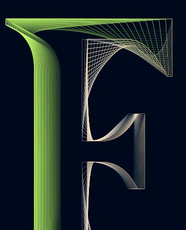
WIP, slightly better and even more difficult for VS because I've added effects (Gaussian blur, distortion).
Still a screenshot:
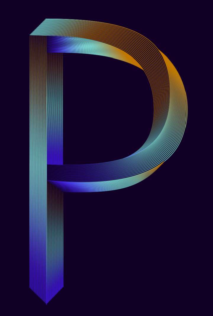
@VectorStyler VS is fine now. I'm wondering whether this can be due to the maximum sub-pixels I've selected to render the graphics and after a while rendering can become chaotic ?
-
@Pat said in WIP - Testing Blending: not yet a tutorial but soon for beginners:
maximum sub-pixels I've selected to render the graphics
Could be, but this is not affected by the GPU.
I will try with maximum subpixel antialising on Windows.
-
The idea is simply to show what can be achieved with the blending feature in VS.
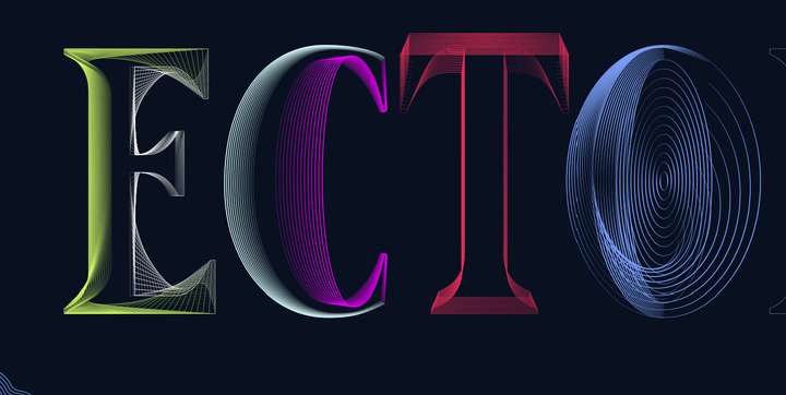
This is not particularly original; there were many tutorials with this approach in AI that I used to illustrate a book chapter at the time. These small manipulations show different renderings (and perspective) by changing the thickness of the lines/strokes, their opacity and of course their position. I don't want to bother you with too many of these figures and I will show the final version for the all word "VectorStyler".
-
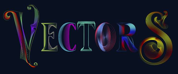
Not being sure if I can finish quickly, so here is the current status. It's far from perfect but as I wrote, it's about showing that one can be creative with this VS feature (hope you think this way
 ). Some parameters can (should in this case) be improved and one can modulate:
- the colour gradients (here could be harmonised);
- the placement of the nodes;
- the thickness and size of the strokes (can be different between the two objects used for blending);
- etc.
One could also add distortion effects (I will try later). Some of the strokes ends should be masked, etc. etc.
I hope you won't be bothered with this and that you won't find it too simple for vector graphics specialists. I don't think we need a tutorial for this but just tell me...
If this AI function is missing in the work, VectorStyler can do it

The artefacts are there because this is a simple screenshot (just click the image to get a better shot, I think).
For abstracts shapes & posters, this is great too.
-
@Pat
looks great so far

btw it is also possible to create a Patterbrush from one or more Blends,
a new functionality in VS since Version 1.0.42
-
@Subpath I didn't know but I was planning as a next step to dive into the diversity of brushes in VS and their use.
A lot of fun ahead.
-
@Pat said in WIP - Testing Blending: not yet a tutorial but soon for beginners:
A lot of fun ahead.
Indeed

Played a while ago with Blends for Pattern Brush
its here:
https://www.vectorstyler.com/forum/topic/2089/playing-with-blend-in-pattern-brush
-
@Subpath Great, I'll read the thread for sure
 Thank you.
-
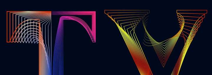
Well, I'll stop here for now. I personally find that these VS features allow to express a lot of different (creative) ideas. I don't have much time to go on but just to show that many effects are possible.
I followed a tutorial from @Devil-Dinosaur on isometric drawing and I've applied various distortions of the whole object. I still have to test the line distortions and I'm sure it will be very creative too.
If you don't have VS yet, don't hesitate to get it


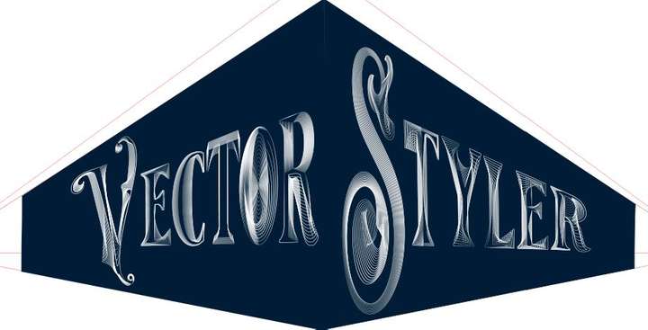
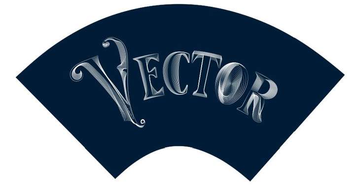
-
@Pat said in WIP - Testing Blending: not yet a tutorial but soon for beginners:
I personally find that these VS features allow to express a lot of different (creative) ideas.
I can only agree with that.
-
Just a very quick one to display another way of using VS features.

-
One very last one to show the efficiency of VS ; I have used the 'text' tool, the transform feature, the blend tool (& many options), rotation of a duplicated and mirrored original object... & I tested the colour changes this time ( effect --> adjust colour --> invert colour ; effect --> replace colour --> adjust colour).
VS is really powerful and a pleasure to use. But work is calling and I'll try to stop using VS for now
 I might have an issue with the 'replace colour' feature : I only see the preview for a few seconds & after no way to get it again. I have to use it further before posting a possible bug (but no time now).
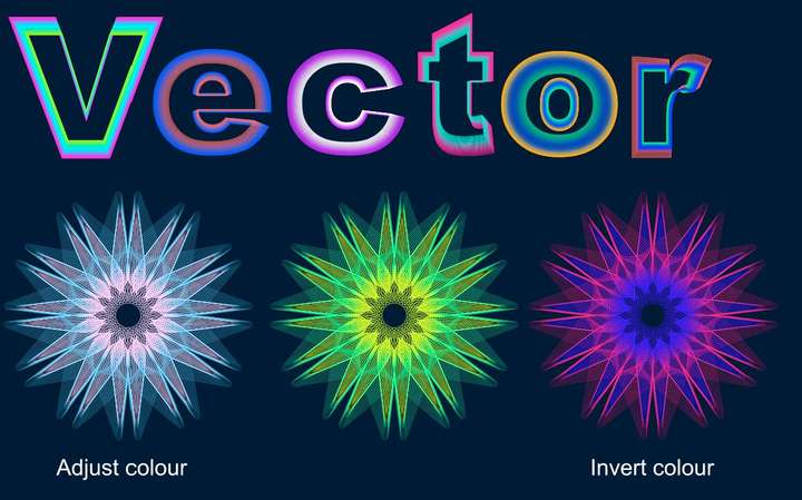
-
@Pat
nice creations
it seems to me that you are now another user
addicted to the possibilities of VectorStyler
and the ideas will never stop bubbling up
-
@Pat said in WIP - Testing Blending: not yet a tutorial but soon for beginners:
One very last one to show the efficiency of VS ; I have used the 'text' tool, the transform feature, the blend tool (& many options), rotation of a duplicated and mirrored original object... & I tested the colour changes this time ( effect --> adjust colour --> invert colour ; effect --> replace colour --> adjust colour).
VS is really powerful and a pleasure to use. But work is calling and I'll try to stop using VS for now
 I might have an issue with the 'replace colour' feature : I only see the preview for a few seconds & after no way to get it again. I have to use it further before posting a possible bug (but no time now).
I'm impressed! Very creative and inspiring!
I'd love to see a tutorial on this!
-
@Subpath Thank you but it's simply to test with a concrete case some functionalities of VS... even if I have an idea which will exploit these various useless graphic "manipulations"


Indeed, VS is very very addictive. I'm so glad to have some features back without subscribing to A*%!e for full CC.
If @VectorStyler decides to add some features for desktop publishing, those apps will be an amazing/striking duo... and then an incredible trio with photo editing in the long term

-
@Harry Thank you (making these is just a way to learn VS)

Oh, ok for the tutorial but I just need to feel a little more confident, go through the different options and I'll get to it.
-
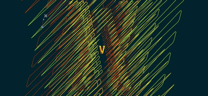
This is not at all what I wanted to get but as I have some issues with some features, I play with the multiple possibilities of VS. It looks simple but it's full of little steps.
It would look good for a poster. This will be my next challenge, to make a layout in VS for a poster for a hypothetical event (with grids, etc.).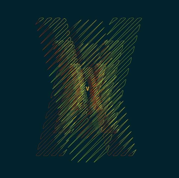
-
@Pat
this one looks so cool

well done
-
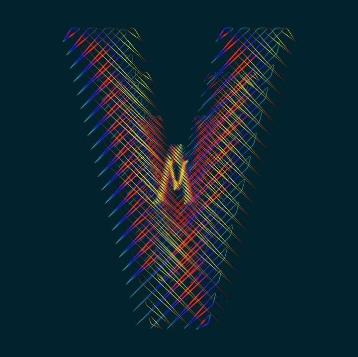
@Subpath Thank you. Can be modified endlessly. This is the V of VS of course. I'll have to spend some time on the "S"

-
@Pat
"Can be modified endlessly..." thats so very true

I like the filigree design and the extra dimension
with the objects in the background.
The gradient looks nice as well.