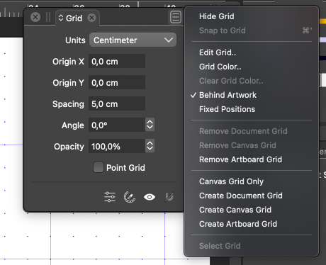
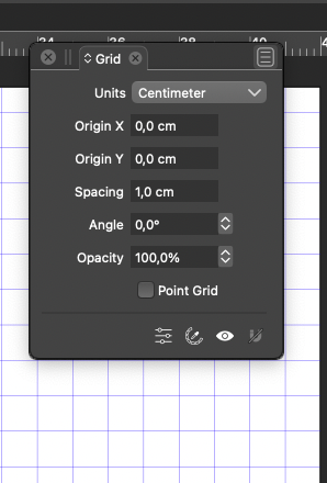
Show or hide grid icon is reversed
-
But again, an enabled toggle button that doesn't show it's a toggle, or that it is in fact enabled, that's not logic or good usability. Thats why we have checkboxes and check marks in menus.
A button with an eye that is either depressed or not will clearly signal what is active and what will happen when that toggle is deactivated.
And that's what I'm used to from other applications.
-

In the same panel we see here at the same time the menu that says HIDE and the icon that symbolises SHOW.
-
@Ingolf said in Show or hide grid icon is reversed:
A button with an eye that is either depressed or not will clearly signal what is active and what will happen when that toggle is deactivated.
If the button would have a dark highlight in the background it would indeed reinforce the idea that it is enabled:

Not sure if this is what you meant but it would be an improvement, while keeping visual consistency with the 'eye' buttons in the Layers panel.
IMO.
-
Something like that, yes. The button doesn't need to change symbol at all. It just adds to the confusion. Same eye in both modes is fine. The button just needs to signal that it's about visibility, and upon activation that visibility is now enabled. Activation is symbolized by the icon looking depressed with a background like the one you illustrated with.
Just be aware of contrast requirements for accessibility. Customers with impaired vision due to age or other reasons have reduced contrast detection. A few small differences simply hide the color difference. Therefore, there are contrast ratio requirements in software.
The button effect is also the right idea... and why it's so widely used in software... because it's based on knowledge we bring from the world. Buttons. Motion. Response. Feedback. Visibility.
That's why slide toggle checkboxes are so popular in apps and now the web. They combine movement with clear visual feedback that's impossible to miss. And even colours.
-
@Ingolf It was a quick mockup, but I agree, the pressed/enabled highlight should be a bit darker.

-
@Ingolf said in Show or hide grid icon is reversed:
I expect the button to either reflect what happens when I click on it. If I see an eye, I expect the button to activate a display of something.
One issue here is that it should be in sync with other cases of "visibility" settings: For example the [eye] icon in the Layers panel.
-
@VectorStyler said in Show or hide grid icon is reversed:
One issue here is that it should be in sync with other cases of "visibility" settings: For example the [eye] icon in the Layers panel.
Of course

-
@Ingolf said in Show or hide grid icon is reversed:
I expect the button to either reflect what happens when I click on it. If I see an eye, I expect the button to activate a display of something.
Do you also expect a checkbox to show a checkmark if clicking on it will enable its functionality, but not show it if clicking on it will disable its functionality?
EDIT: now that I've gone back and reread the conversation, I think I see what you are actually getting at: the icon is in a set of buttons which do not act as toggles, and looks like them, but it itself is a toggle, so there is no visual cue to distinguish it from the non-toggle buttons.
Of course, the same can be said of menu items with checkmarks: when the checkmark is absent, they appear just like other items.
Yes, something could potentially be done to make this distinction more visually obvious.
-
@fde101 said in Show or hide grid icon is reversed:
@Ingolf said in Show or hide grid icon is reversed:
I expect the button to either reflect what happens when I click on it. If I see an eye, I expect the button to activate a display of something.
Do you also expect a checkbox to show a checkmark if clicking on it will enable its functionality, but not show it if clicking on it will disable its functionality?
A checkbox is accompanied by a simple label: show grid. With an active checkmark, obviously enabled. Without, obviously disabled.
This is the type of logic that is totally absent with the current button.
- When you open the panel and the grid is not visible, you see a toggle that does not identify itself as a toggle
- It is represented by a hide symbol telling me clicking it will hide something - but it will show something
- Clicking it displays the grid - and the symbol turns into a eye icon that I would assume meant SHOW something - but I alread see it
- Whether something is turned on or not, I don't know. The button has no visual indication of whether something is enabled or not. And the confusion is total, as the icon's logic is reversed.
All this complexity can be replaced by a single symbol, an open eye, which at a click makes the button signal "I am activated, pressed in, this functionality is active" as is the convention in other software, and which one can hardly misunderstand.
-
@Ingolf
I completely agree that the button logic is reversed
I also came across this previously and was confused - I've also seen it used elsewhere in the app.
I don't bother with the grid panel anyway - I have mine permanently set at 10mm and have a no selection contextual menu item that says show grid and hide grid - simple and does exactly what it says on the tin (menu that is ) Just a quick right mouse click and everything's there in the one place - no hunting.
I simply love that VS allows you to tweak the interface to suit your personal preference
Neil
