Transform Panel UX
-
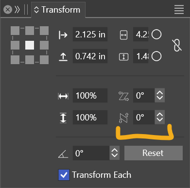
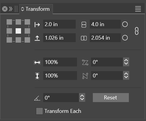
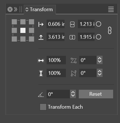
Would it be possible to make the second column of numeric fields congruent/unified with the first? It also presents a readability/UX issue when resizing the panel:

My eye naturally fixates on the first column for resizing the panel, making that second column feel even more awkward. I guess because our minds are typically trained to read information left-to-right.
I find that I have to keep it wider than I actually need. A couple of reasons I think:
- The gap in the middle feels too wide especially when the second column numeric fields heavily collapse to a smaller width than both the middle gap+iconography combined (or about equal).
- The collapsing of the second column impacts readability/clickability because of the reduced space, not being able to read beyond the first few numbers, etc.
The minimum size of the field on the first column is about as small as it can comfortably go I think without negatively effecting usage. So matching up the second with it should make it fine. And maybe shrink the space between a skosh so that the columns don't feel so separate when resizing. I do appreciate the anchor points are nice and large.
-
@debraspicher I will try to improve this.
-


