Ideas to improve the Vectorstyler Layers Panel
-
@b77 said in Ideas to improve the Vectorstyler Layers Panel:
@Ingolf If possible, can you include two screenshots with v1 and v2 of AD's Layers panel?
I searched them a bit but I'm not sure those I found are not from AD's Pixel "Persona",
which might look different (I guess).Version 2:
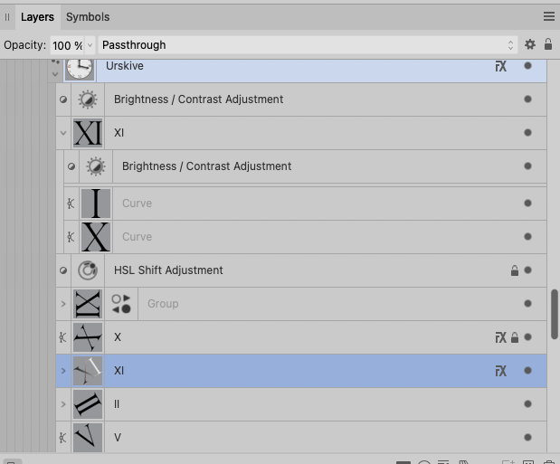
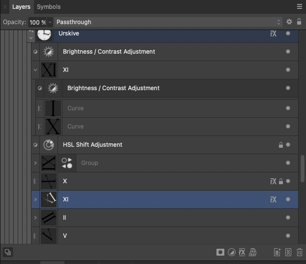
Pure crap UI:
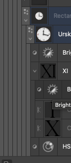
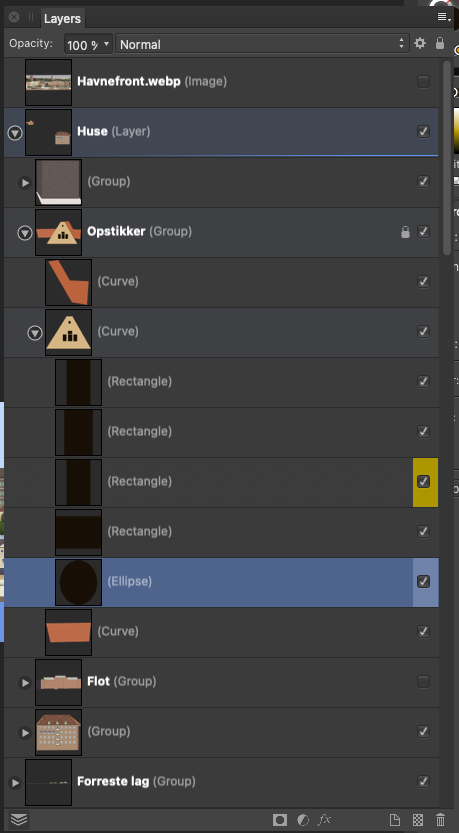
Compared to the absolute calm and no nonsense interface in version 1 I NEVER had trouble using or navigating in. Everything from this point and 'up' should be opt-in.
-
@b77 said in Ideas to improve the Vectorstyler Layers Panel:
Well, I personally still like the filled eye better.
My own take on it: checkmark for visible and printable/exportable, eye for visible but non-printing, printer or paper icon for printing/exporting but not visible in normal edit mode, none for invisible and non-printing.
Normal left click toggles between none and whatever it was set to of the three other options. Right click opens context menu to pick from all four options.
-
@fde101 I'm not sure a 'printable' button is needed? Currently if something is
not visible it doesn't get printed or exported.Except for the grid and guidelines. Hmm…

In any case, I would say that…
'Printable' → small printer button → no reading of the manual needed.
CDR has it like that — a 'printer' button for objects, guidelines and for the grid in its
Layers panel (named 'Object Manager'), along the 'eye' and 'lock' buttons.
-
@b77 said in Ideas to improve the Vectorstyler Layers Panel:
Are there other graphics apps using a validation sign in the Layers panel?
Came across this.
Nice variation. Layers panel –I suppose– on the left hand side this time. On/off (with checkmarks) on the panels right side, close to the users working center.From earlier post today: Toucan
Home/General Discussion/The first vector graphics editor built for generative design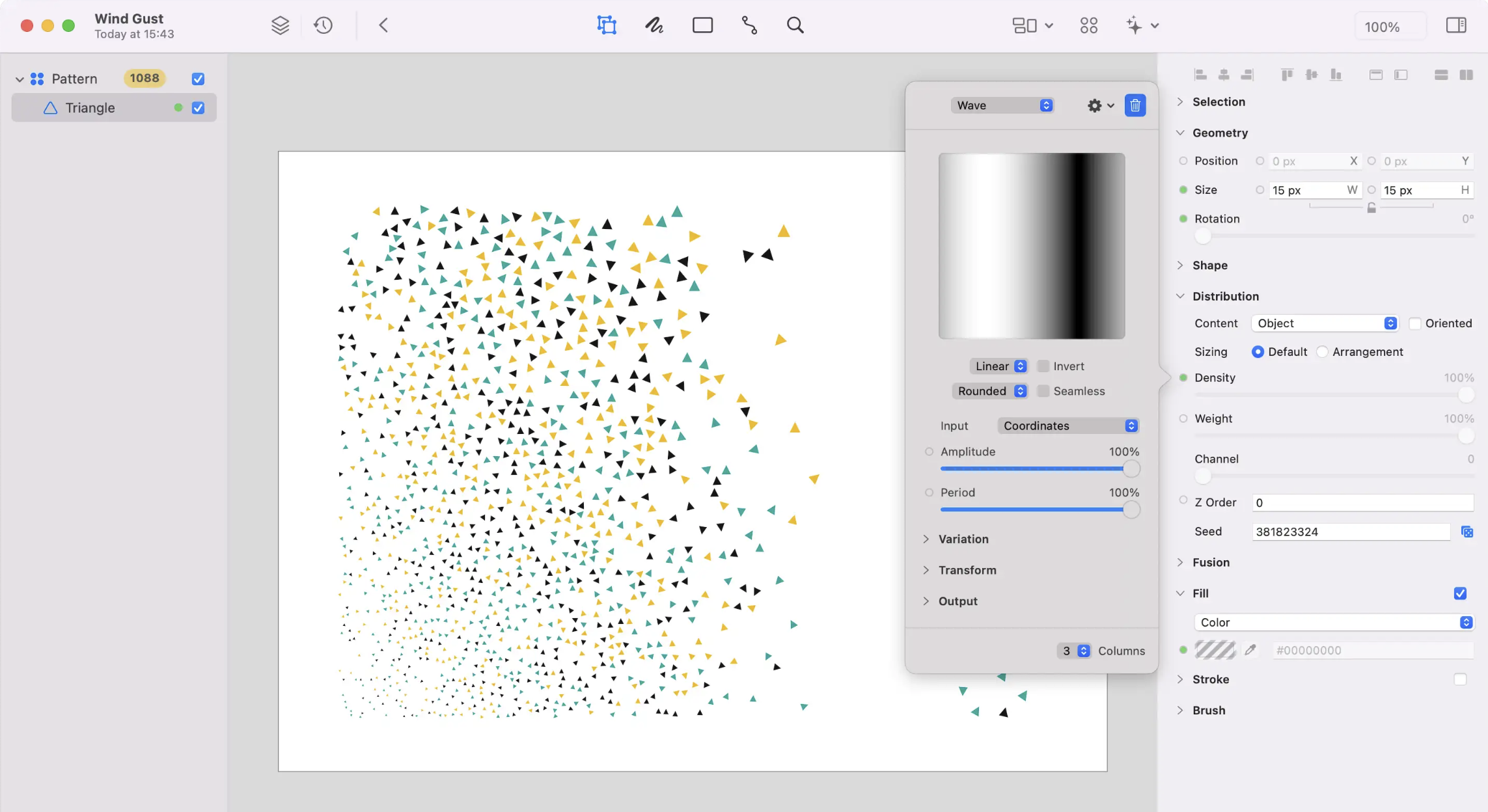
-
a final argument for the checkmark : )

-
-
All right… in all seriousness, I have to acknowledge that there are indeed
vector-based apps that use a checkmark for layer and object visibility
(and export) instead of an eye. Some because the functionality of their Layers
panel is simple, some other despite the complexity (Affinity, I guess).To me a checkmark still seems too generic (it doesn't scream 'visibility').
Besides that, there are other places in the app where the concept of 'visibility'
is used (Hidden object, Show All Objects, New View, Select All Inside View),
and I don't think using a checkmark in the icons of these commands would work.(I'm trying to make icons for these commands as well, so we could continue
the discussion when I post them on the forum. The icons won't be perfect,
I'm sure).OK, said enough about this, I rest my case.

-
@b77 Don't take it too seriously. Was just a design joke. We are all in the first place designers, aren't we?
-
@Ayo Absolutely!
-
No offense @b77 , I do like the streamlined look of the one @Ayo whipped up. It would be cool with some special effects and the cursor cross icon in there
-
@Boldline Ayo made a joke, I also made one — that's it, nothing more.
-
@b77 joking aside there's some real potential there
-
@Boldline Let's not go off-topic and mess up Ayo's thread.
-
@b77 said in Ideas to improve the Vectorstyler Layers Panel:
@fde101 I'm not sure a 'printable' button is needed? Currently if something is
not visible it doesn't get printed or exported.I'm not suggesting a separate button to waste space on the panel. I am suggesting a four-way checkbox, which allows for all four possible visibility combinations: visible on screen and printer, visible on screen but not printer, visible on printer but not screen, invisible on both screen and printer.
In most cases having these ganged together is fine, but there are special cases where you might want to override that, and moving this to a context menu on the control makes these special cases readily available when they are needed without taking up extra space against the more general usage of the panel.
You might want something visible on the screen but not the printer if you are sharing a document with others and want to provide them with instructions on how to finish something but do not want those instructions included in the final output; you may also use this to leave notes for yourself that are only available in the editing view.
A bit more rare of a special case, but one example of when you might want something to print but not be visible on the screen would be if you have some kind of framing that is distracting or making selection harder while working on the core part of the document, but which you don't want to forget to include when printing it - you could add simple guides to keep your place then mark the framing as print only, using the guides to keep the content aligned, and to see the end result would simply do a print or print preview. While in many cases you could also accomplish this by grouping the framing and toggling the global visibility, if you have a complex layering structure and parts of the framing are both above and below the core content, this avoids scrolling the layers panel; it also hides the guides you are working with (when performing a print preview), allowing you to do everything in one step.
-
@fde101 I don't disagree that a checkbox/button for 'printable' would be nice — I already wondered
about the guidelines and the grid (I mentioned CDR).
But I'm not sure a four-way checkbox is best — how should the icons for the first and the last of these four states look?
- visible on screen and printer
- visible on screen but not printer
- visible on printer but not screen
- invisible on both screen and printer
-
@b77 that is what I was answering in my earlier post:
@fde101 said in Ideas to improve the Vectorstyler Layers Panel:
My own take on it: checkmark for visible and printable/exportable, eye for visible but non-printing, printer or paper icon for printing/exporting but not visible in normal edit mode, none for invisible and non-printing.
-
@fde101 Got it.
-
@VectorStyler
If you go towards complying with such requests, so that we clutter the layers panel with things many people will never ever need to consider in their daily work with layers, then I hope you follow your good tradition of making it customizable as preferences.But I strongly recommend that it becomes opt-in because apart from the few experienced users here (and we are hardly representative of many), my experience with people checking out Vectorstyler is that they quickly become overstimulated by the interface, and that's also what I read from reviews. It's a shame if the complexity of the interface people don't like or can't take in is not something they need.
And no, people shouldn't have to learn functionality by having it shoved in their face all day. Just to get ahead of the usual Linux-like rhetoric I am met with from time to time (though never from @VectorStyler).
Cheers

-
@Ayo Question about "Step 5 Create function to move object(s) to another layer":
In this feature, after the objects are selected, the user could click on the selection knob to send objects into this location.
The problem is that the selection knob in this case would just change the selection.
Should there be a modifier key (shift or control) click to have the place into the layer?Also: do we need "copy into" version where the objects are copied into the layer?
-
@VectorStyler said in Ideas to improve the Vectorstyler Layers Panel:
The problem is that the selection knob in this case would just change the selection.
Should there be a modifier key (shift or control) click to have the place into the layer?I understand that. A modifier key is not much to ask for such a nice feature.
Freehand does something similar, clicking on the targets layers name.*
Illustrator does something similar, by (a special button for this) dragging a button to another target button.Also: do we need "copy into" version where the objects are copied into the layer?
Do not see the use of copying so much. You want to distribute, organize, clean up, make clear, what belongs to what. Creating more objects doesn't fit in this concept.
*Note FYI
From the freehand manualTo move an object to another layer using the Layers panel:
1 Select the object.
The object’s layer name is highlighted in the Layers panel.
2 In the Layers panel, click the name of the layer to which you will move the selection.
By default, clicking a layer name moves a selected object to that layer.
Note: If this procedure doesn’t work correctly, check your panel preferences. See the following procedure.To prevent selected objects from automatically moving to other layers:
1 Display panels preferences by doing one of the following:
• In Windows, press Control+H, then click the Panels tab.
• On the Macintosh, press Command+H, then click the Panels category.
2 Deselect Clicking on a Layer Name Moves Selected Objects, and click OK.
