Transparency Panel - 3 issues
-
In the Transparency Panel...
-
the Blend dropdown menu is too... wait for it... transparent

Well at least it seems to be too transparent as compared to most other dropdown menus. -
the Type dropdown menu shows "None" as both the icon selection as well as a text selection. Is this correct?
-
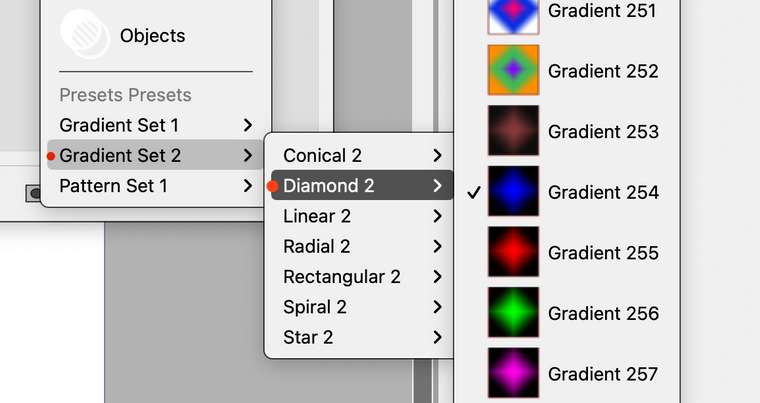
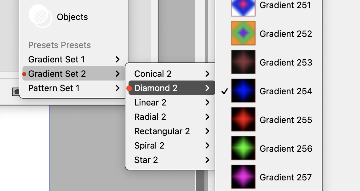
The Type > Presets shows "Presets Presets" as a selection type (hmm) and then the real issue I see here is that there's difficulty in seeing understanding where the selection is coming from - I feel there should be an indicator next to the parent. Like a breadcrumb to show me for example, Gradient 254 belongs to Diamond 2 which is under Gradient Set 2.

Further, when choosing a gradient from the Presents, many (most?) don't seem to align with what was selected. e.g. the "shapes" are all that comes up in the Type top menu ("conical") - wow.. sorry this is a rough one to describe... Probably need to make a video here.

-
-
@badcat I add this to the backlog. but will have to investigate more to understand what can be done.
A bit more example in the last issue, on alignment, may be needed
-
@vectoradmin yes... a bad description about "alignment" for sure. I meant more along the lines of aligning the concept of masking. Maybe I'm still not certain about my description. Anyway, here's a rambling movie with my experience with the Transparency Masks.
https://vimeo.com/493944695/66b5c6eaeb
edit: looks like it clipped off the second part of the URL. -
@badcat seems that I cannot access the linked video, is it public?
-
@vectoradmin I updated video link.
-
@badcat got it, thanks.
-
@badcat Most of the issues described in the video are fixed in build 198.
The only remaining open issues are: using grey preview in gradient and pattern modals when selecting transparency, and defaulting to grayscale sliders in color modal.
