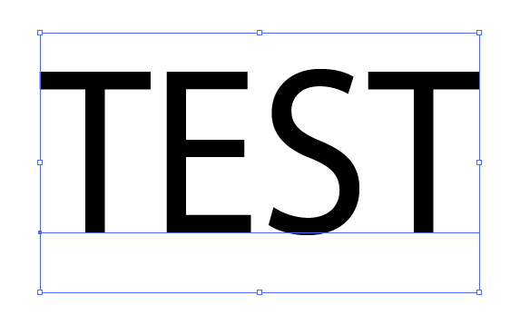
Selected Live Text just have an underline in the layer color?
-
Would it make more sense to have selected live text with the transform tool show a bounding box and just an outline below the letters in the same color as the layer color?
Right now it's showing certain nodes - but I don't think that makes it clear what tool is in use and makes the text harder to read based on what size it is on the artboardI like the option for selecting text with the shape editor tool - it gives the option to alter the direction

In Illustrator, using the equivalent to the shape editor tool, text has a simple bounding box and an underline - both in the layer color. Would this be a better more legible option in VS?

-
@Boldline This should be available in build 1.1.024