Could we go in depth with color palettes and spot colors?
-
I was hoping we could have an in-depth discussion about adding and using palettes, especially when it comes to spot colors.
For example, I have a default palette I created and imported into VS that holds most of the spot colors I use in my typical workflow.
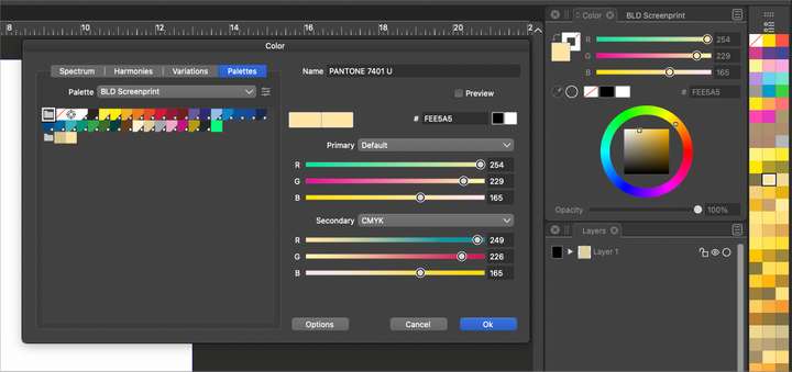
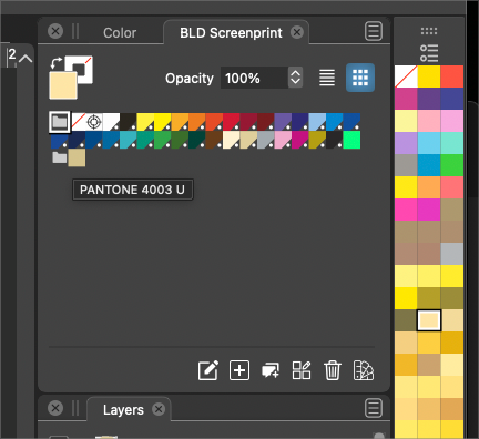
They all have the white circle in black triangle the bottom right corner that universally tells me it's a spot color. I opened a pantone acb palette file in the color bar palette on the far right side. If I choose a color from the color bar palette and then use the plus icon to add it to the main palette, it does not show with the same white circle and triangle.... If I switch to the color panel and look at it, it tells me RGB settings and not the "T" for tint which I was told was the main way to know if it's a spot color or not.
So now I'm unsure what the white circle in the black triangle represents compared to the "T" for tint and why colors from a pantone book would register as RGB and not automatically as a spot color.
There are also the options to register colors, register them as a spot color and register them by similarity. For me, this is all very complex at the moment and hard to follow logically.Earlier on I was working on a design with spot colors and somehow it was adding colors automatically to the default palette from the other palette and wreaking some havoc with duplicates.
Essentially I would like to be able to have a custom palette of spot colors as my default, use another spot color palette as the secondary palette in the color palette bar and then be able to click and add colors from the color bar palette over to the default custom palette and be understood as spot colors with their pantone information attached. Just when I think I'm getting the hang of it, something does not work
Any help would be appreciated.


