UI/UX Shape Effects Panel
-
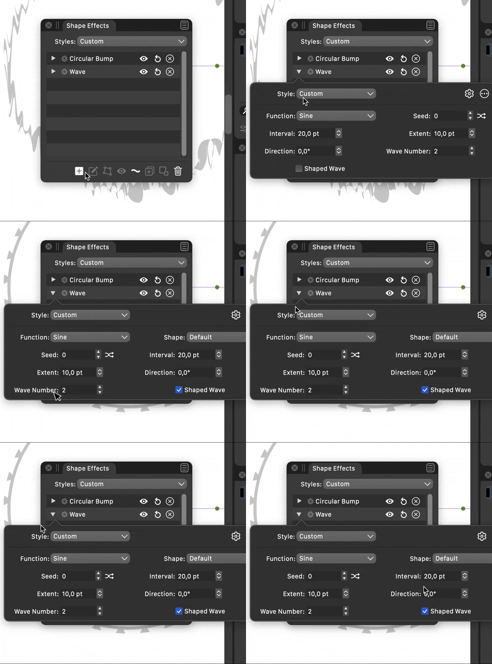
In line with the other thread, gave a spin to the Shape Effects Panel.

-
The new design looks much better, with some small observations:
- the "Create Style" and "Create Preset" buttons are much more accessible this way of course, but they take up extra space. Is that a problem?
- the popup design is actually very practical. But it needs to be kept open while manipulating the object and effect parameters. This one might take some time to implement for all the image and shape effects.
- is the bottom right icon in the popup for "More" options?
I see that the editing icons would be next to each effect. actually this is great since it is clearer which effect is edited. Reset is also there.
-
Still about the preset+style list: there are several of these in the context panel (upper row of the window) or in the Properties panel.
The pattern there is to have the "Create" options as menu commands on the top of the list, as there is no room for buttons.
On the other hand there are several places where "Save..." buttons are used (dash or stripe dialogs), as the list contains graphical elements.
I will think about this more.Anyway the new design language looks really professional.
-
@vectoradmin
- I think that a pop-up list should contain only that, the list, maybe a plus icon should suffice, which would open a modal window where you can select if you want to create a Style or Preset.
- This one could either be a Popup or a Sheet, whichever you think is easier to implement to stay on screen

- This one would be the "shape effect options view", that square text bubble didn't transmit me a "settings page" vibe

-
Hi,
build 165 brings improved UI style. The shape and image effects panels were updated to similar (but not exactly the same) design.
-
@vectoradmin wow, great work! Really impressed by the work you have done on the UI/UX! Congratulations !
 there seems to be a bug on alignment of the popup triangle in Shape Effects window
-
Yes, this may occur on resize. Added to the list of bugs.
-
Hi,
This problem should be fixed in the latest build.
-
@vectoradmin Can confirm that it's fixed, but there is still a problem which I noticed now:
1.add any effect
2.click the triangle expand
3.click the + button and add another shape effectthen you'll see that the current opened settings window is still opened, but the expand triangle has moved to the default of closed position, you have to click twice the triangle to close the shape effect setting window.
-
This can be replicated. Added to the bug list.
-
I think you should study a little UX design, which is responsible for the functions, adaptability of the product and what emotions it evokes in users. The clearer the interface, the easier it is for the user to get the result and perform the target action. Also, pay attention to the basics of UI design, the process of visualizing a prototype, which is developed based on user experience and research of the target audience. Only after you learn UX/UI design will you be able to create high-quality applications that are pleasant to the user.
-
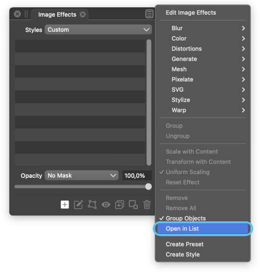
@Juandab There's an 'Open in List' option to display all effect settings stacked inside the panel:

Is that better? Or is it something else you mean?