update 1.2.064
-
@Daniel said in update 1.2.064:
Same with Gradients.
There is a gradient panel.
Same with most tools.
Lets approach this step by step: which tools.
I recommended a global properties panel akin that changes per object akin to what's found in Maxon Cinema4D or good old FreeHand.
There is a Properties panel here too.
Obviously, this will need to be rethought for the increased complexities of VS, but I am not at all a fan of navigation in VS
Please give some examples where navigation could be better.
-
I'm very open to the future of VectorStyler, because for me, the most
important thing is the tools, features, and the way i can combine
them.I'm willing to accept some cumbersome operation or an outdated
user interface for that. It doesn't have to beat Adobe Illustrator either.
I wouldn't use Illustrator anyway.But that shouldn't stop anyone from improving the user experience.
VectorStyler will be my favorite vector graphics program anyway
thanks to its great features.
-
@VectorStyler: I'm going to respond as soon as I have access to my computer. Watch this space.
")
-
@Subpath said in update 1.2.064:
I'm willing to accept some cumbersome operation or an outdated
user interface for that.Is there a UI you feel is better? To me the VS interface is not any worse than where Illustrator is at.
-
The term “outdated UI” is not really my thinking; I'm just repeating here
what others have said. I'm totally uneducated when it comes to UI design.
But I think I have a good feel if something work/flow feels good.Find that flat design philosophy quite annoying. Buttons can still look like buttons.
UI design is not so important to me as long as the tools are easily accessible and
operation is not too cumbersome. Of course, you should be able to read the icons.Customizability is important to me, and fortunately Vectorstyler offers a lot
in this respect. However, the Toolbars could be a bit more flexible. In CorelDRAW / Xara,
I always created my own toolbar. I'd rather like to use the mouse, than tie my fingers in knots
with keyboard shortcuts.I don't really know of any program where I admire the user interface, but there are
some that I don't use because of it, Adobe Illustrator is one example. Corel Draw
has abstracted its icons more and more over time so that they have become illegible
in my eyes and I no longer like working with them.I found earlier versions better in terms
of legibility.
-
@Boldline: PaintStorm, Xara, FreeHand, PhotoLine, Maxon suite, Blender, and even Affinity have each gotten many things right. VectorStyler has gotten many, many things right.
A historical aside: When Xara was first designed, it had to work with ATARI ST's 128 kb integrated RAM. This meant that they had to write extremely tight code and optimise from the first line for total efficiency and speed. This is why Xara's rendering until this very day is completely unmatched. Today, programmers complain about 8 GB not being enough RAM. Xara was also the first program to provide real time spell checking via BBC Micro.
@Subpath: agree with you. I don't understand why all design programs suddenly decided to abstract their UI to the point that all the icons practically look the same. I also have a serious problem with default dark UI. Dark UI allows focus on the main art board, sure.
But in DTP work, which is most of what I do, dark UI actually makes it much harder to work.
DTP work involves constant fiddling with parameters. Constant access to the tiniest little detail is essential.Having a light UI stimulates the eye. So having dark/coloured icons on white background actually makes it so much easier to find things. This is not even my opinion. This has been proven repeatedly in UI research.
Coming to VectorStyler, the great utility of the software is somewhat compromised by the constant need to access things through transient and modal panels or transient drop downs. This, I hope, can be changed.
-
@VectorStyler: Ideally, I will catalogue all this in a single place so you can have a complete consolidated view, rather than piecemeal feedback that gets lost in the thread. But here goes for just Gradients alone.
VS has a powerful gradient tool: the ability to change gradient curve alone is a huge step forward.
Here's how it can be improved, this goes back to that matrix I shared with the 9 principles: The ones I'm applying here are "Direct" (Allow a tool to be used directly and dynamically on the screen, without the need for extra tool settings and dialogue boxes for at least the first set of actions.) and "Extend" (Make the functions of one tool to be available to a different tool.)
The three most common types of gradients used in illustration work are: Linear, Circular and Radial (Conical). Now, here's how you can apply the Direct principle. You select G and drag, you get a linear gradient. Hold down Alt and Drag for Circular. Ctrl + Shift Drag to get Radial gradient.
Now, second degree of Direct and Extend: With the gradient stop select, allow the user to temporarily call up the eye dropper and set the colour immediately. The key I use is \ for this. As long as I hold down , the eye dropper is active. It's a transient call, meaning the tool which is active is gradient, not eye dropper. Just like you can make a transient call of node tool with pen tool active via Ctrl.
Now, third degree of Direct: Press Tab (or a user-defined key) to move to the next stop, press \ to call eye dropper and drag over anything. Press Tab to move to the next one, repeat step 2.
Like so: I am combining Tab and \ to quickly rapidly change the graident: https://imgur.com/a/gjJ4Bek
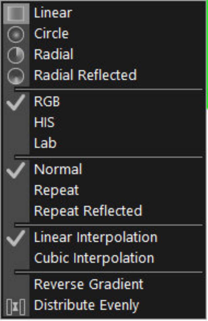
Fourth degree of Direct: Provide a context menu that contains a simple set of options to alter the gradient. Like so. All of these steps together makes for a much more convenient experience.
Second degree of Extend: Allow changes to shape whilst gradient is active. This is possible if you allow gradients to be in effect edited with the node tool. Principle Extend ( Make the functions of one tool to be available to a different tool. ) What I'm suggesting is that whenever a shape with gradient is selected with node tool, the corresponding gradient should be active too. Because this pre-empts user intention. The user has activated the node tool to change the shape, and the gradient will need to be adjusted if there are substantial changes. So, instead of having users switch tool, you make it available to them directly.
Like so: https://imgur.com/a/UIy5LPR
These are just the most immediate changes that make gradients a breeze to use. But there's more. I will catalogue them and send it across to you. It's going to take me some time.
P.S.: These might sound complex, but they're incredibly easy once you see it in live action. These ideas aren't new. They already exist. I've just curated them in a single place.
-
@Daniel I think most of these can be added, but only for 1.3
Some comments:
allow the user to temporarily call up the eye dropper and set the colour immediately. The key I use is \ for this. As long as I hold down , the eye dropper is active.
This already exists, by pressing (and releasing) M. The shortcut can be customized, the action is "Color Panel Picker" in the Edit folder of actions.
The color picking is active until the first click and can be Escaped.
In general when working with regular keys, I prefer if we do not "hold" the key down, this causes some issues on Windows.Press Tab (or a user-defined key) to move to the next stop
Will be added in 1.3
Allow changes to shape whilst gradient is active
Technically this is possible, but might cause some issues. The "gradient shape" editor is a separate tool now. If combined, there might be issues with a gradient path node overlapping a color knob of the gradient editor.
-
@VectorStyler: Please don't add them just yet. Especially the menu changes. I'd prefer for you to consider them as a part of global navigation changes and make it happen cohesively. Otherwise, it just leads to further fragmentation of UX. I'm happy to wait.
Glad to know about the colour picker thing. I also see what you mean about the gradient path node overlapping the colour knob.
To see how this behaviour feels, please check Xara Designer.
The gradient menu comes up upon right clicking the gradient line, and it is supremely easy to use. This isn't in Xara, but in PL.
There should also be an option to Overprint gradient, like in FreeHand.
So, let us curate all the possibilites, and make global changes.
-
@Daniel lots of great ideas and topics to discuss. Perhaps we should move this part of the thread to a new topic in the "Ideas" section?