Start Node - disable it from hiding the real type of node
-
After several years of using Vectorstyler, I am becoming long-distance frustrated about this. It's not an impulse suggestion.
")
Some of us - including myself, as you might have guessed - don't care about which node is the start node. We don't need the information. At least 99.9% of the time, which effectively means most of the time. Therefore, we're not particularly interested in constantly having to deal with start nodes in the user interface, where it becomes visual clutter, the same in settings.
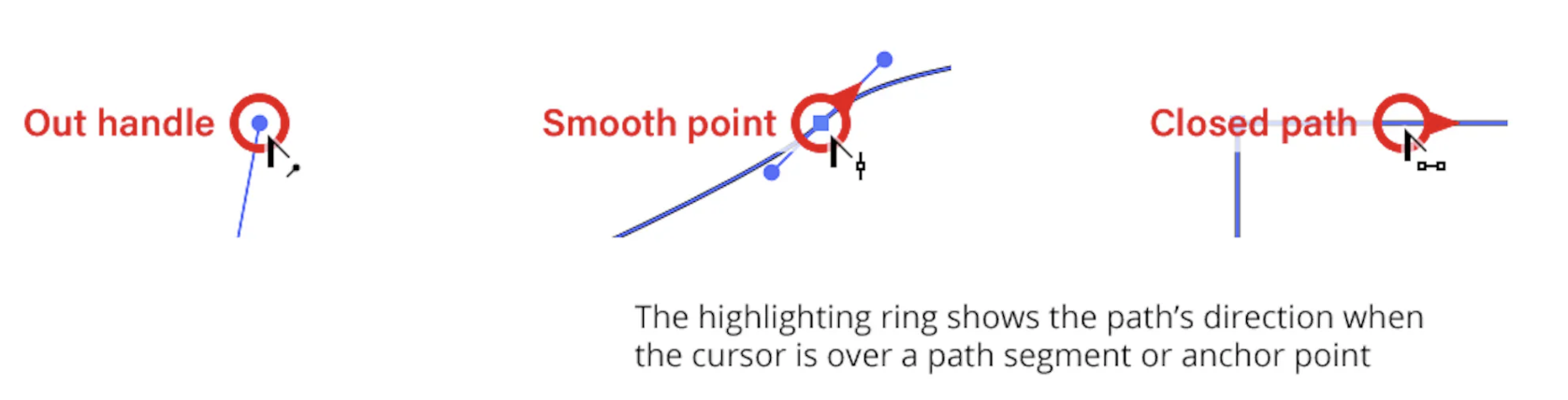
In Vectorstyler, the start node is visually distinct. I just want to know if I'm looking at a smooth or a cusp node. This adds complexity in settings, where you can choose a fixed symbol but cannot opt for a 'Show start node with this symbol' option. This means that VS actually hides the type of node in the object, which annoys me every day.
I propose/prefer a more discreet indication of the start node, perhaps just attributes like color (stroke, fill), and the option to disable this indication altogether in the user interface.
In my use cases, my eyes are constantly scanning node types during drawing and fine-tuning, and the fact that the start node isn't represented accurately disrupts me every day.
Have a great weekend! Especially the wonderfully active and diligent @debraspicher !
🍏 macOS Sequoia Apple Silicon
-
@Ingolf
Agree.
To avoid visual clutter and to serve the 1% of users who do use it, I would recommend 'show start node' as an option. If option is disabled the node behaves like any other node. No additional color or shape options please. -
Yes, agreed, but I always expect some opposition. I also think that it should really be opt-in.
-
@Ayo @Ingolf I think it serves more than just 1% to show the starting node differently. I'd leave it on by default but offer an option in settings to turn it off or allow for it to be adjusted if the user prefers with a color, etc.
I think VS needs to be set to "easy to learn as possible" by default and allow power users to make the adjustments they prefer in the settings and save those custom settings. New users are not necessarily scanning their nodes
-
@Ingolf said in Start Node - disable it from hiding the real type of node:
I propose/prefer a more discreet indication of the start node, perhaps just attributes like color (stroke, fill), and the option to disable this indication altogether in the user interface.
I find a way to do this. But it will be an option to select.
-
Much appreciated
-
@Ingolf In my work, the start node is crucial. Changing the start node in CorelDraw is quite cumbersome as it requires disconnecting and reconnecting a node. Therefore, I spent money to customize a feature related to the start node. VectorStyler is much more convenient. Just select the node and press "s" to get it done. It would be necessary to have an option to cater to different user needs, allowing users to make choices based on their requirements.
-
While I'm thinking of it, start nodes matter often when designing. They also matter when it comes to blending objects together
-
@Ingolf
Sometimes, for some users, certainly not indispensable. Remember that the triangle symbol besides start or also symbolizes the direction of the path. Sometimes useful for even/odd fills, winding rules, text on path and maybe more. -
@Ayo Yes, but I have never needed it over several decades. In my use cases, having it visible is a burden. I've created billions of complex illustrations, but this particular feature has never been relevant to me. I can't be the only one nor a minority.
I think we should take a broad look at the customer segment today, that vector illustration programs have become commonplace, and that there are many quite ordinary illustrators out there for whom many classic features in vector programs are not daily relevant. Furthermore, in my experience, they are less likely to frequent forums. For example, in Serif's forums, you won't find many regulars who don't happen to know programming languages like JavaScript or even more advanced. I find it hard to believe all Affinity customers both create art and code.
An option would be fine. No option, a pain.
-
I like having it, but yes sometimes it gets in the way visually.
-
Personally I think it would be best to find some way to keep it on, but as an indicator on top of the "normal" indicator - put a differently-colored dot in the middle of it or just make the outline thicker or something - visible enough to stand out, but not block the normal interpretation.
The end point probably doesn't need to be specially marked as long as the start can be identified.
-
@fde101
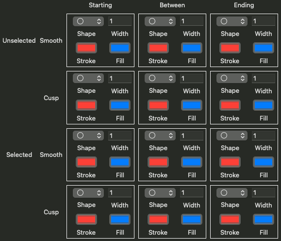
Sounds good if the starting node manifests itself as a smooth or cusp node for what it is. I think that's the main goal. Option to outline/color it differently in: Settings > Indicator Styles > Path Editing Indicators, is up to the user.
End node can be dropped as a special node symbol, my idea or I must overlook the function.The only problem left is the path direction indication.
Dit is usually logically solved with a triangle/arrow shape, but with the convention of cusp=square and smooth=circle an additional dot does not provide this information in these symmetrical shapes. In addition, an extra dot does not contribute reducing visual clutter (Initial issue). -
@fde101 I remember Astute graphics.
It shows a direction indicator when hovering over a node or path. Something like that (+ a modifier key) could be an option.
From the PathScribe Documentation -
Of course the other way to handle this is to split the "Path Starting Node" and "Path Ending Node" options into "Path Starting Cusp" and "Path Starting Smooth" (or "... Ending ...") options (and similarly with "Selected..."), maybe add a rounded triangle shape and one or two others to give more variety... and allow each user to handle it through customization. Maybe split the color options as well between cusp and smooth (or between starting and other)?
-
@fde101
This looks a bit over-engineered to me and doesn't make things easier for the user (cockpit panel fighter jet) -
I'm fine with it being a toggle in a panel or a toolbar. I don't need to be able to change it to the batwing symbol or anything. Though that would be cool.
-
I just need to be able to hide it 100% in a way that is also remembered between program starts. Sticky.
I simply don't need tons of visual information that is not relevant for me, ever. Once I disable it, I will never enable it again.