Making Brushes Organization more Intuitive
-
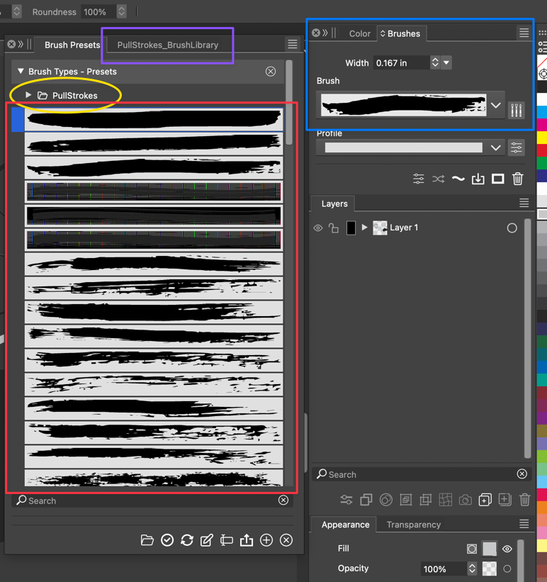
The brush preset panel does not seem to be as straight-forward and intuitive as I believe it could be. (If I am missing something, let me know)
By default, VS opens with a set of grunge-like rough brushes, but they are not inside of a sub-folder to help keep them organized. If I open a new brush set, it adds them as a new panel and not inside the main "brush presets" panel. This becomes confusing because I would expect them to be under the umbrella of "brush presets".If I append a new brush set, they are individually loose and intermix with the default ones.
From my perspective, it would make more sense to have the default brushes be inside a subfolder by default. Adding an existing brush set would create an automatic named folder inside the "brush preset" panel.
-
@Boldline You need to enable' Group Folders' from the panel's menu / Display for that.
Should this be enabled by default?
