Reduce less used options on menu bar to a single icon with dropdown
-
I was thinking about the options to accommodate for smaller screens and it feels like certain options could be reduced to a single icon with a dropdown showing all related options, like the pixel view/vector view/wireframe view are not commonly used with anywhere near the frequency of others such as the "rotation options" or the "move inside"
Another example would be the "bring to top/send to back options

Moving these under a single icon with dropdown at least for a "small screen" setup option would help with space issues
-
@Boldline Added this to the backlog.
-
I don't know if it is needed. I tried the 150% scaling and even with that there is still room to resize the window to a smaller format, without losing icons in the top menu.
That said I also think a dropdown for different views will be sufficient. The other example of the bring to top/back I don't know if that one should be in a dropdown. I would prefer for that one to let it remain the same.
Windows 10 | 1920x1080 | 125%
-
would prefer that the "bring to top/send to back" options
stay at it is, that are options i often use
and i find it cumbersome to put them in one icon
and then every time you have to open thembtw working on 1920 x 1080 resolution
with no scaling in Windows ( just 100%) -
@FastVector said in Reduce less used options on menu bar to a single icon with dropdown:
The other example of the bring to top/back I don't know if that one should be in a dropdown. I would prefer for that one to let it remain the same.
@Subpath said in Reduce less used options on menu bar to a single icon with dropdown:
would prefer that the "bring to top/send to back" options
stay at it is, that are options i often use
and i find it cumbersome to put them in one icon
and then every time you have to open themAt the risk of overcomplicating VS and with the idea of making room and in some ways simplifying the UI, perhaps there is an option to reduce them or expand them in settings under the customization - much the way we can now reduce down panels to icons already
Or what would be better still, the option to reduce or expand out the options of that set the way we can currently do with panels - like the stroke panel can be extended from minimal settings, to medium number fo settings to full settings with a click or double or triple click on the panel title bar - this would be optimal in my mind - no need for extra settings to bog down the settings area - easy for any user to simplfy the menu bar for what they use most
-
@Boldline said in Reduce less used options on menu bar to a single icon with dropdown:
Or what would be better still, the option to reduce or expand out the options of that set the way we can currently do with panels - like the stroke panel can be extended from minimal settings, to medium number fo settings to full settings with a click or double or triple click on the panel title bar
here i am more on this side
a option to set that bars to different states
think 3 are fine
Laptop, Standard and Big Screensxxxxxxxxxxxxxxxxxxx
it may difficult to choose, but i see it as a no good way
to torture normal or big screen user with single button Icons
only because Laptop users have Problems because of
the Screen resolution.btw never had a big Problem with the state of that bars
as it was in VS 1. But i generel have no problem with UIs
which others see as visual overloads, or as too complicate.i am a bit busy now, will post in the evening
how Xara handle this for inspiration -
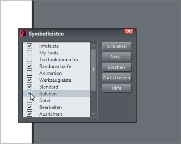
Here, just for inspiration the way Xara offers
You can create your own toolbars in Xara like in VS.
But unlike in VS, each one can be used in Xara
either horizontally or vertically and can be turned
on and off very easily.And the most needed toolbars are already there
and do not need to be configured by the userHere a Video for inspiration, which shows the difference.
Btw Coreldraw work more ore less the same as Xara.
(the Artifacts in the Video is because of Recordit, ignore them) -
@Subpath I like that! I also like the ability to turn off any "section" if the toolbar or move it around independently like that
-
yes, I also like that you have virtually independent groups of functions
that you can switch on and off as needed. Or you can put them together as needed.