Allow settings panel to be sized by user - also add scroll bar for topics
-
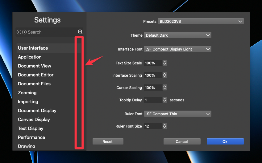
I love the way the Settings panel is now broken down manageable and understandable sections. It feels a little claustrophobic personally because I cannot grab a corner and enlarge it to see more options and/or to add more buffer space. I kept finding myself grabbing a corner and trying to pull it. It doesn't really bother me if it's this small by default, but would love the ability to change it
Also, I'm not seeing a scroll bar on the left side for the settings topics. I'd love to see that added in and only have it disappear if the panel has been enlarged enough to fit all topics listed on the left side in view
🍎 macOS Tahoe 26.2, Mac mini (M1, 2020), Chip Apple M1, Memory 16 GB
Cintiq 27QHD Display and LG Ultra HD Display -
@Boldline The problem with resizing is that the main section (right side) is not resizable and will not have any content if enlarged.
-
@VectorStyler Boldline is partly right — the Settings window looks
a bit cramped.There needs to be some space between the Presets dropdown,
the actual settings and the [Reset - Cancel - OK] buttons, so just
making the Settings window a bit taller by default (but not resizable)
would fix this and also avoid ending up with lots of empty space: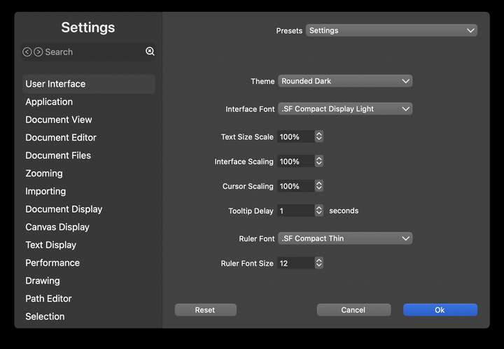
I would also use SF Pro SemiBold for the 'Settings' title.
And a bit of blurred transparency for the column on the left, if possible. -
@b77 said in Allow settings panel to be sized by user - also add scroll bar for topics:
Boldline is partly right
@b77 only "partly" right? MOSTLY right or TOTALLY right sound better!
")
@VectorStyler I agree with what @b77 added in terms of the buffer around the settings on the right side. It would feel less cramped to increase it, even if we can't personally re-size the box
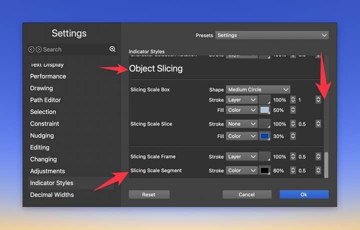
It gets a little more tight for space when using boxes within boxes, further reducing the buffer and making it feel tight like this example:
@b77 what did you mean specifically when you said this, "And a bit of transparency in the column on the left, if possible."? the words themselves being lower brightness? something else?
-
@Boldline
Not totally because I disagree with making it resizable. Other than that… 
Regarding transparency: something like the blurred transparency of the left column
in the Music app: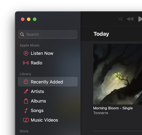
-
@b77 oh ok i see what you mean with the transparency now. I like that and agree that should be added for greater clarity of what section title is selected