WIP - Testing Blending: not yet a tutorial but soon for beginners
-
@Subpath Exactly

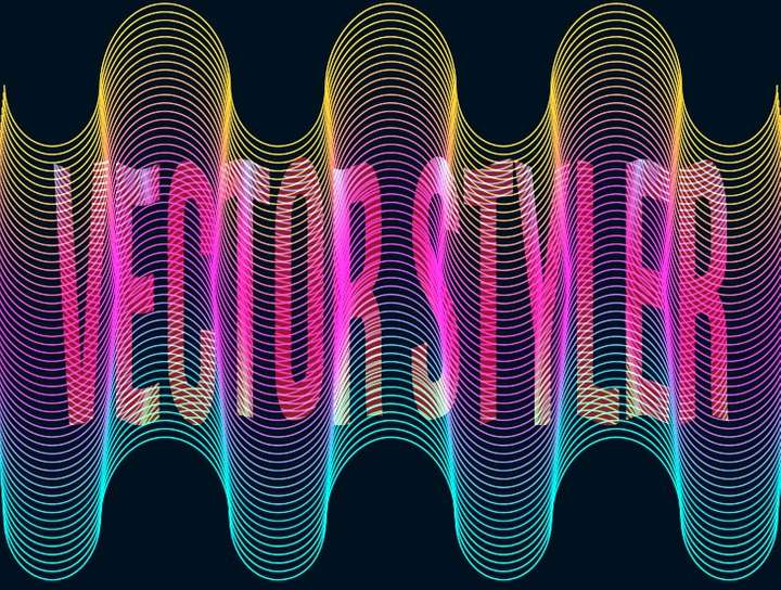
When one superimpose different designs with different colour blending (between layers this time
 ) - just a print screen
-
@VectorStyler update 1.1.082
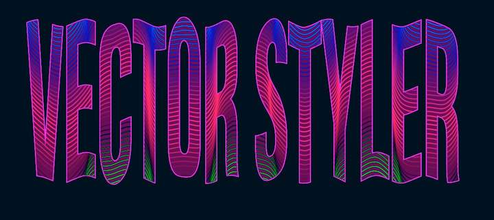
It is fixed... & now everything should be editable!
-
@Pat
isnt it crazy

-
@Subpath that's brilliant


-
@Pat
what i like a most is
"still editable!"
-
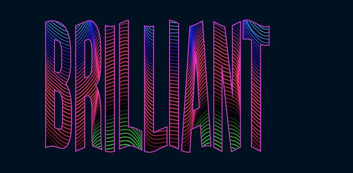
@Subpath Yes... all aspects of the design, text, nested object, colours, blends etc.
-
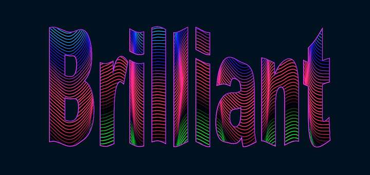
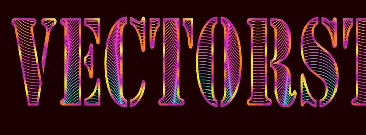
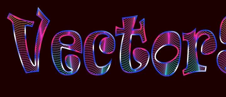
@ ... & the font:
-
With a gradient applied to the stroke... endless... lots of fun and creative experimentation

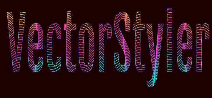
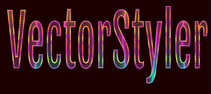
-


 :
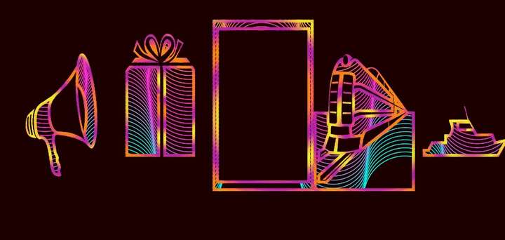
:
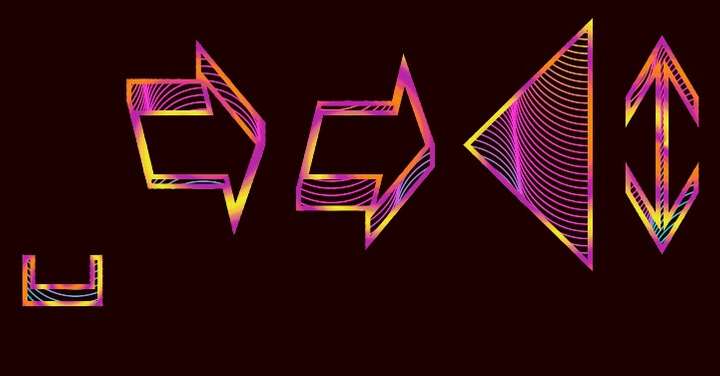
-
@Pat
seems you have fun

the first one is my favorite
-
@Subpath yes, just by changing the fonts and the colours gradients.
I didn’t think about this yesterday but I could have done a mask to achieve what I wanted. I don’t know yet how to proceed. I’ll look later.
-
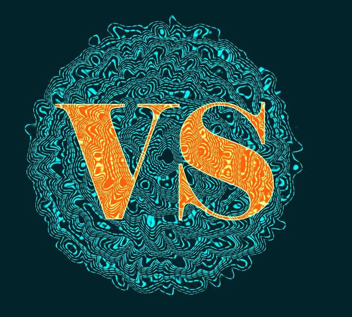
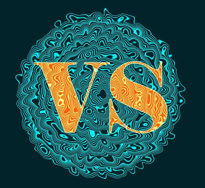
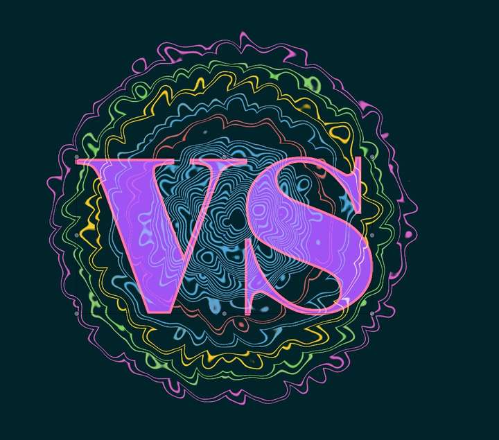
I wanted to replicate a scheme done with another app (did not succeed yet) & I did come with this that I like for a poster let say, entirely done in VS with the transform feature, blending, shape effect & all editable:
-
One can really play with many features & we can't (always) predict what we're going to get:
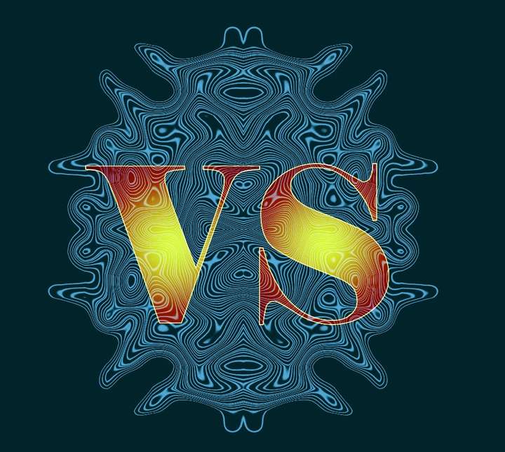
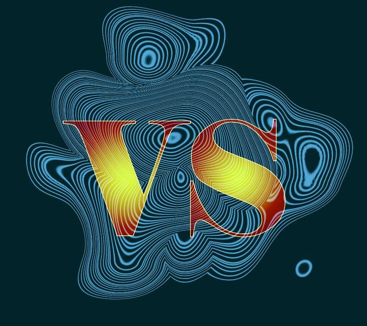
-
@Pat
Great texture
I like the third image because of the color gradientwould love to see the texture clipped into the Letters
(third and fourth picture)
it would probably look good too
well donewhat transformation tools did you use
or is it all just done with blends?
-
@Subpath I did try to clip the texture within the letters/shapes but I've got some issues at the border:
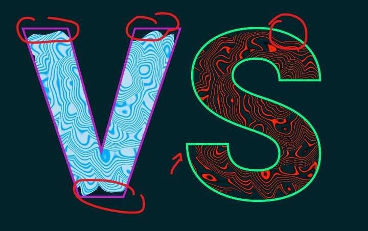
I also get some issues with the union boolean:
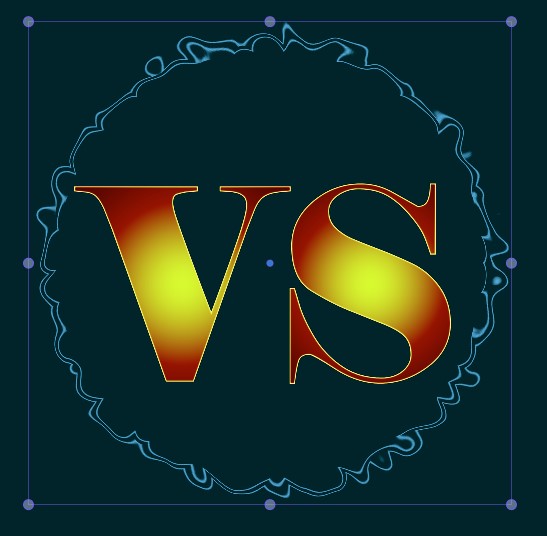
The shape effects are 'distortions'.
-
@Pat
curious, probably some heavy stuff for VS
but it also looks good as a frame
the second one
-
@Subpath Could be... but I assume more a bug. I can send the file to @VectorStyler if needed.
Anyway, several possibilities. I still have to read your tuto on brushes to start using them

-
@Pat Send me the file.
-
@VectorStyler I've sent the file.
-
@Pat
i love the wave like look
