Font and interface sharpness
-
Hi again
Still impressed by VS on Windows. Question: do you have any control over interface anti-alias? It is rendered a bit soft here compare to every other program I have.
Both text and icons appear soft and when I am then not positioned in perfect viewing distance from the monitor it appears even softer.
Compare to how all other programs and Windows itself it is a pretty significant difference.
-
@Ingolf No such settings at this time. I add this to the backlog.
-
@Ingolf Disabling anti-aliasing will not work, especially for the icons.
I think the problem here is with the default dark (and maybe light) theme contrast.
-
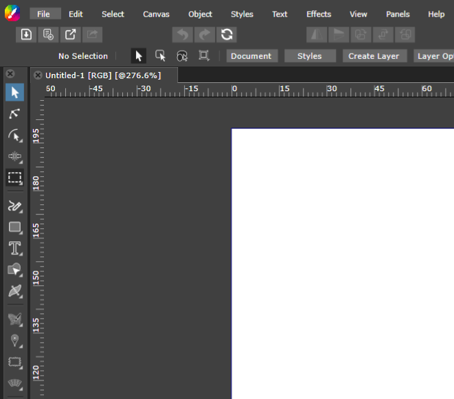
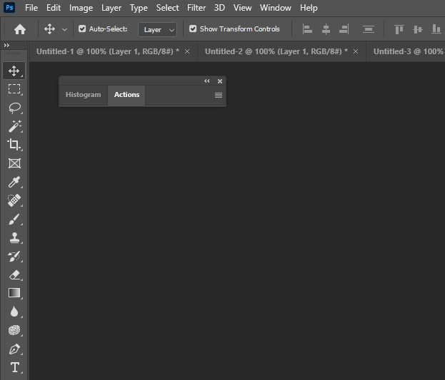
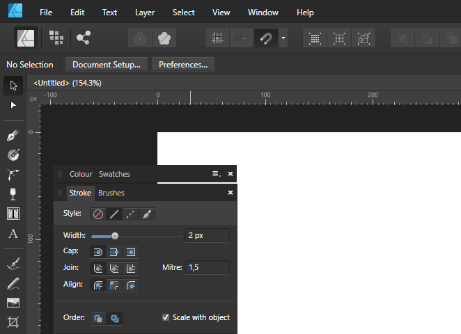
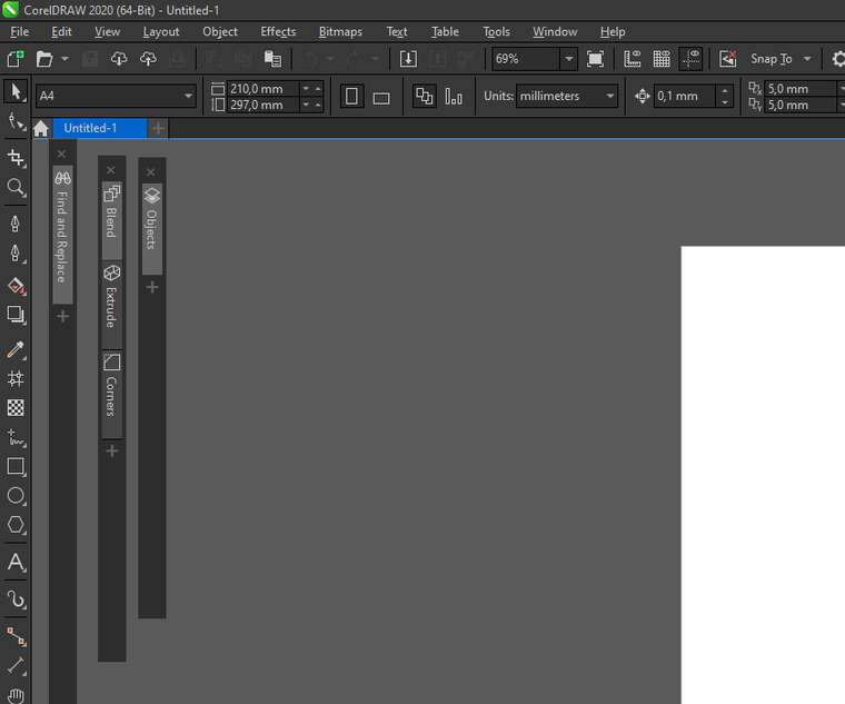
Here you can see the difference, I hope. Gravit is also a little blurred... to the/my limit I would say. Best viewed at 100% in new tab.
In VS the icons are somewhat affected but the text rendering bothers me. As you can in see other programs lines are thinner and borders are well defined/rendered sharper and clear.
Have a nice weekend btw

Vectorstyler:

Photoshop / Illustrator

Designer

CorelDRAW 2020

Gravit Designer / CorelDRAW.app

-
Good work! Build 209 is now crisp and pro looking!!
-
@Ingolf Build 209 contains two extra themes for higher contrast.
-
Also great
