Usability issue when drawing gradents (.054)
-
I'm still not good friends with the gradient tool, but I recognize it might make the most sense if you're coming from Illustrator. I am continually annoyed and disturbed by the two endpoints that make no sense to me, I constantly confuse them with gradient stops, and they clutter up an already complex user interface. There, I vented again.

But the observation I just made is more in the way, and I'm thinking it's a real problem. It also kind of illustrates the above. If you look at this video, I'm drawing my gradient from a stressed point I've clarified with a guideline.
When I draw my gradient, the starting point from the very point where my gradient is drawn is not shown, but rather the outer point. Only when I release the mouse and my gradient is finished, I see the first gradient stop. This is very confusing.
I think it should be the other way around, that when you drag the gradient you only see the first and last gradient stops, which are the only ones you really have to deal with as a designer, and only when you let go do you see the outer points.

And to again illustrate my favorite gradient tool that is easy to understand and use:


-
@Ingolf I added this to the features backlog. I will try to figure out a good solution.
-
@VectorStyler Can you just make the handles different? Smaller than the color stops and squared would help with visual differentiation.
-
@b77 said in Usability issue when drawing gradents (.054):
Can you just make the handles different? Smaller than the color stops and squared would help with visual differentiation
Yes, this can be done easily, added it to the backlog.
-
@VectorStyler Invisible and non-existant please!

Modern programs don't use this model, it is from the era before usability. Even the fugly gradient tool in CorelDRAW doesn't have it.
In Illustrator these end points are smaller and it looks like shit. And I don't need them. Bigger or smaller and rectangular would also look like shit.
Please, please, nuke them.
CorelDRAW, Affinity, Gravit Designer, Figma, whatever don't use them. I don't see why we need them in VS.

-
@Ingolf Tell him how you really feel about gradients! lol
-
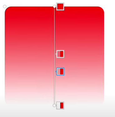
Figma (Ugly but modern)
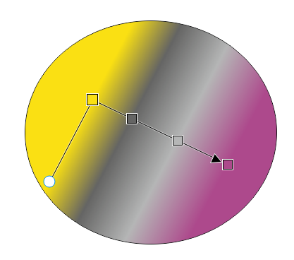
CorelDRAW (Ugly but modern)
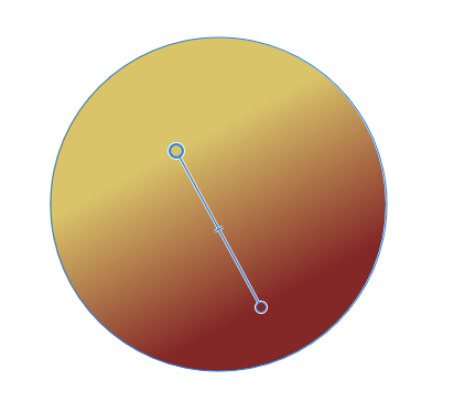
Affinity:
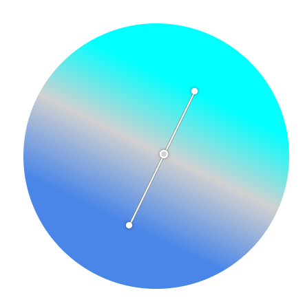
Corel Vector / Gravit Designer:
Inkscape:
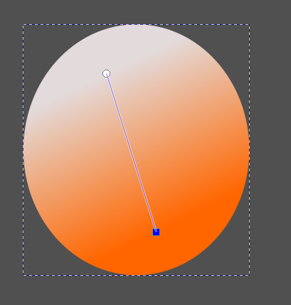
Easy to understand, works exactly how the Joe Average or expert expects it to work.
And then two programs, Vectorstyler and Illustrator, have to stand out like this:

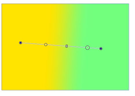
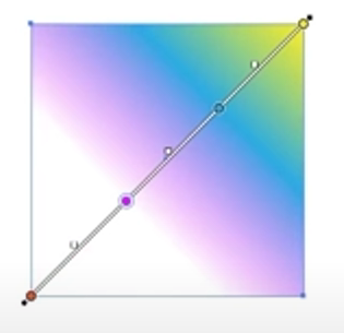
It is by reducing unnecessary complexity and visual elements that Vectorstyler can compete on more than just raw features.

-
@Ingolf Thanks for the screenshots — will upvote your post.

But!
Handles are needed anyway — think about the case where the start or end color stop doesn't coincide with the start or end of a gradient. You do need a visible handle to grab and adjust the gradient angle, isn't it?
And if handles are not displayed separately for "normal" gradients (those with the both start and end stops at the start and end), I guess the poll I made last week missed an important fifth possibility — Option-drag to "unglue" a color stop from the start or end of the gradient? Because you need this.
How do these apps do that on the canvas? I mean: how do you move a start or end color stop from its location?
-
@b77 You have to try one of those programs, it is impossible to explain the action and experience in a post.
Let's just say it works great in all these programs, and no one has ever requested the Illustrator model ever in any context I've witnessed.
-
@Ingolf You should be able to find and write how is the action I described done in CDR, AD and the others. It was an honest question — I'm genuinely curious.
-
@b77 said in Usability issue when drawing gradents (.054):
@Ingolf You should be able to find and write how is the action I described done in CDR, AD and the others. It was an honest question — I'm genuinely curious.
I know

-
@Ingolf said in Usability issue when drawing gradents (.054):
Let's just say it works great in all these programs, and no one has ever requested the Illustrator model ever in any context I've witnessed.
Not satisfied with 'Let's just say it works great in all these programs' and with bandwagon arguments ('CorelDRAW, Affinity, Gravit Designer, Figma, etc don't use handles).
If they don't use handles, how do they do that necessary operation? With a modifier key?
-
-
See how easy it is to work with (and understand), plus how easy it is to switch between gradient types in the context toolbar.
That's the kind of thing that makes you effective. And happy with your tool.
EDIT: New video
-
@b77 said in Usability issue when drawing gradents (.054):
Handles are needed anyway — think about the case where the start or end color stop doesn't coincide with the start or end of a gradient. You do need a visible handle to grab and adjust the gradient angle, isn't it?
And if handles are not displayed separately for "normal" gradients (those with the both start and end stops at the start and end), I guess the poll I made last week missed an important fifth possibility — Option-drag to "unglue" a color stop from the start or end of the gradient? Because you need this.
I'm with you, even though gradients in Vector programs I used don't have such handles.
The way VS does it has never bothered me much, even if it was a bit unusual at the beginning.
-
Aha. I hear no arguments or business case for the extra handles being there. On the contrary.

-
Let me make it easier for you. You are a product owner at Corel, Serif or Figma, and need to write a user story explaining to the development team what needs to be developed and why (this is done so that the programmers fully understand the value to be added, which in turn helps to achieve a better common understanding between customer and developer of the 'Definition of Done'):
Template:
As a <type of user> I want <feature> implemented to achieve <business value>Finish this:
"As a designer I want handles a'la Illustrator/vectorstyler added to gradients to achieve" <business value>?? Exactly what?
This is how I work daily with our software engineering team as a product owner.

-
@Ingolf said in Usability issue when drawing gradents (.054):
Aha. I hear no arguments or business case for the extra handles being there. On the contrary.

I wondered if the question was meant for me or @b77 ?
-
Anyone may have a go at it.
-
@Ingolf said in Usability issue when drawing gradents (.054):
Aha. I hear no arguments or business case for the extra handles being there. On the contrary.

Uh…
 I did mention the limitation that arises from having the gradient handles "under" the start and end color stops — you wouldn't be able to move any of these two stops away from the gradient ends with the gradient tool.
Unless a keyboard modifier is assigned for this, the user has to go to the Appearance or Gradient panel to do it.
You might say: "Please no more shortcuts, it's OK to do this operation only from the panels — most people won't mind". And you might be right.
But the app still needs visually different handles for these cases — both with the current detached handles and with "hidden" handles (your suggestion).
……… . .
Btw, my CDR 2021 trial expired last week, so I could test moving start or end color stops only in Inkscape v1.2.1, and… I don't see any such possibility with its gradient tool — it can be done only from its 'Fill and Stoke' panel, and the gradient tool displays no detached handle at that end after you do that… this last part is terrible if you ask me.
I also tried to do this in AD on iPad, and… I couldn't even find a Gradient panel equivalent, so I guess it's not possible.
……… . .
@VectorStyler Are combinations of dragging + two keyboard modifiers possible/allowed?