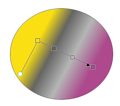
Usability issue when drawing gradents (.054)
-
@b77 said in Usability issue when drawing gradents (.054):
@Ingolf said in Usability issue when drawing gradents (.054):
Aha. I hear no arguments or business case for the extra handles being there. On the contrary.

Uh…
 I did mention the limitation that arises from having the gradient handles "under" the start and end color stops — you wouldn't be able to move any of these two stops away from the gradient ends with the gradient tool.
You did but I am not sure what limitation that would be.
Could you demonstrate with a side by side example from one program like VS and one like the others what you can achive with these gradient ends that will be missing if they are removed?
-
@Ingolf Yes, here is a quick comparison:

(Btw, I love these GIF compression artifacts!
 ).
).So in VS I can drag the start or end color stop easily and without disturbing those three color stops in the middle.
-
@b77 said in Usability issue when drawing gradents (.054):
@Ingolf Yes, here is a quick comparison:
Ah, that makes some sense, granted. And now I understand your love of screentshots.
 Much easier to understand.
Still, if I need the middle nodes to "stand still" I insert an extra gradient stop and get same result. I don't remember that as an issue/need, personally.
So I'm neither completely convinced nor with a winning argument. I can certainly say I enjoy using programs that remove as many controls and noise on the screen as possible, so I can focus on the drawing and exactly what needs to be done by the user interface, and would rather have the "modern" model any day.
@VectorStyler If you keep the current model, then the model used in Amadine might be worth considering for gradient end nodes. Here I don't think their choice of symbol for gradient ends is particularly logical either.

-
(However, the advantage of the Amadine model is that the gradient start-end symbol and first gradient stop stand exactly next to each other, beginning at the same place, which is much more logical than the Illustrator model.)
-
@Ingolf Oh, I did think about that workaround.

But since it adds an intermediary color, it's not "the same result" — it's not the exact color of the closest color stop. Which might not be a problem sometimes, but sometimes it is.To recap, from my POV:
-
If the current "detached handles" model stays, the handles should look visibly different from the color stops — smaller and let's say squared.
Or maybe the color stops should be bigger. -
If the simpler "no visible" handles model is implemented, I hope there is a way to easily "unglue" the start or end color stop from its location.
Not a must, but it's nice to be able to do this from the gradient tool, not only from a panel.
And when one of the start or end color stops is moved, the handle that becomes visible still needs to look different in size and shape. (I hope everybody agrees on that).
-
-
But please for the love of all wonderful, no fugly symbols like CorelDRAW:

Like arrows and squares.
 I am asking for less details. Then I'd rather stick to the current model
CorelDRAW take me back to a distant fugly past with lines and noise ad libitum:

-
@Ingolf Oh God… where did you find that last screenshot?

Upvoted anyway.

If CDR would keep those squares rotated with the gradient angle, it wouldn't look terrible. But of course it would look much better with round color stops.

-
@b77 said in Usability issue when drawing gradents (.054):
@Ingolf Oh God… where did you find that last screenshot?
I don't know what weirdo that posted it on the Internet, but it was disturbingly easy to find.

If CDR would keep those squares rotated with the gradient angle, it wouldn't look terrible. But of course it would look much better with round color stops.

Not great, not terrible.

... I think Gravit, Affinity and Amadine did it just beautifully and that there is not reason to try to invent own logic and design. Also for the sake of easy adaption for newcomers.
-
@b77 Interesting point about the extraneous end stops for that particular operation.
Another way to handle that without needing the extra end stops would be to let the user drag a stop with a modifier key to duplicate that stop, keeping the same color. That way you could move the end point in as a duplicate point (with the same color) to get the same effect, and would get some additional functionality which may be useful to support other cases as well.
-
@fde101 OK, interesting idea. Let's see:
Option is instinctively the key you expect to press if you want to duplicate something (we're used to Option-drag for objects).
But with the gradient tool, Option is used to pick a color for the selected color stop.
Shift is used to rotate the gradient in 45° increments (or whatever value is set in Prefs > Editing Options 1).
Is the Control key better for picking a color for gradient stops, so that Option-drag can be assigned to duplicating stops?
-
@b77 said in Usability issue when drawing gradents (.054):
@fde101 OK, interesting idea. Let's see:
Option is instinctively the key you expect to press if you want to duplicate something (we're used to Option-drag for objects).
But with the gradient tool, Option is used to pick a color for the selected color stop.
Shift is used to rotate the gradient in 45° increments (or whatever value is set in Prefs > Editing Options 1).
Is the Control key better for picking a color for gradient stops, so that Option-drag can be assigned to duplicating stops?
Control on the Mac is normally used to open context menus, and indeed does so in VectorStyler in this context. It would probably be an ok choice on Windows, maybe using Command for this on the Mac?
The problem with this, of course, being that Command currently functions as a momentary switch to the Transform tool.
Is the tab key actually doing anything in this context? A bit unique, but maybe that would work?
It seems the ultimate limitation is as usual a lack of modifier keys to play with.
-
@fde101 When in gradient editing mode I'm not sure how useful/needed is the Ctrl/right-click menu…
On the other hand, momentary switch to Transform with Cmd is definitely useful.Which key is used on Windows for momentary switch to Transform? If it's Ctrl, we're stuck.

I would use Tab for switching between modes/nodes/things (Object <–> Node editing, or similar).
I doubt it can be used in a hold down + drag combination.(I hope the developer is not annoyed by us continuing the discussion with these details).
-
@b77 said in Usability issue when drawing gradents (.054):
Which key is used on Windows for momentary switch to Transform? If it's Ctrl, we're stuck.
yes, the Ctrl key is used to switch to Transform Tool
Alt Key picks color with the color picker
-
yes, the Ctrl key is used to switch to Transform Tool
Oh…