Standard and advanced New document setup mode
-
Granted, I haven't spent weeks on my research, but a good while, and I'm still struggling to understand and apply the canvas and artboards model in regular work. I can't be the only one, and to be honest I think it makes the interface so incredibly complicated to understand when you want to create new page via New document setup that it critically stands in the way.
I dare to guarantee that it needs to go through a major UX overhaul.

That's not to say it's not usable. I'm more concerned that all customers should encounter it by default. Even more worried that it scares people away.
Just to plant a seed (more) in the head of our dear developer, I suggest to consider - and not just here - a split of New document setup into advanced - and standard interface. Which one can easily switch between. It doesn't have to be crazy fancy implemented, but I imagine two versions of New document setup
The idea may sound like hard work, but I'm pretty sure it's a price you have to pay as a developer and a company to get a broad customer base on board when you've made a program like Vectorstyler.
It also doesn't have to be every possible place in the program; but the place where the commonly used and the very advanced (and rarely used) are widely different. For example, I have also asked for a simple version of the repeater that is straightforward for traditional needs and usage scenarios.
The user scenario of simply creating a document in a plain paper format or custom size in pixels or physical units means that the customer has to go through several tabs filled with confusing choices. And I dare say that this user scenario fills close - but not quite close - to a triple-digit percentage.
So think about a quite simple and traditional New document dialog box with a visible ADVANCED button that brings up a (hopefully also redesigned) advanced dialog. It's all about people only encountering advanced choices when they need them.
There is a lot of good stuff in the backlog and roadmap, but were I product owner (which in the real world company is owner and or project manager, not developer) I would have this user story in highest, almost critical. Not because of technical blocking, but potentially sales blocking. It tends to get changes pushed forward into the next release.
There is a tendency that the Affinity forum is filled with simple hobbyists and that we few (!!!) in here are used to very advanced programs and functionality. I would like to focus on the large segment between these two extremes, as the program covers almost everyone's needs on the market. Just not usability wise, and it can cost.
-
I actually sat for a while with a user interface program trying to redesign the New document setup dialog, as it quickly became apparent that there were too many advanced options for it to be reduced meaningfully for everyone's use.
-
@Ingolf There is a plan to have some sort of visual "template" selection model for new document (as in other apps), in the future (besides the advanced mode).
But it is after 1.2
-
I think the visual template selection model would be a great solution. It would be nice however, if one model could be still be set to default so the whole visual template selection did not have to be pulled up every time. 99% of the time I need one setup.
-
@Boldline, totally agree with that
-
Visual selection is also good, but visual can also end up complicated. My main point is one for simple needs and one for advanced needs, visual or not.
And yes - one that remembers as well.

-
@Boldline said in Standard and advanced New document setup mode:
did not have to be pulled up every time. 99% of the time I need one setup
The current plain "New Document" command will reuse the last confirmed document setup.
-
@Ingolf said in Standard and advanced New document setup mode:
My main point is one for simple needs and one for advanced needs, visual or not
I don't think it needs to be super complicated and have two versions - simple and complex - If there were a few pre-made templates available by default with the option to add your own and pull in any of the defaults you like, I would think that would suffice. It would be easy for a new person to quickly grab a common template and veteran users could use pull downs to select more complex ones
As time goes on after implementation, I'm sure there will be a number of additional templates created by users that will be made available for others to download from this forum or other places
-
@VectorStyler said in Standard and advanced New document setup mode:
@Ingolf There is a plan to have some sort of visual "template" selection model for new document (as in other apps), in the future (besides the advanced mode).
But it is after 1.2But be careful where you find inspiration. This model from Serif, created and executed by a simpleton, might be just as good as a detailed list in one or two columns. Actually I would prefer a list.
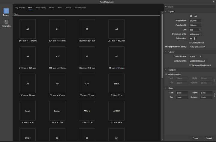
The company - without specialists and with too few resources - has completely missed the benefits of the visual. And it's not even easy to use. The eye has to search long and hard. Search? None.
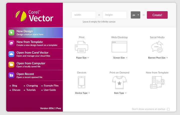
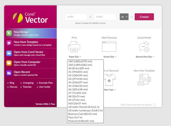
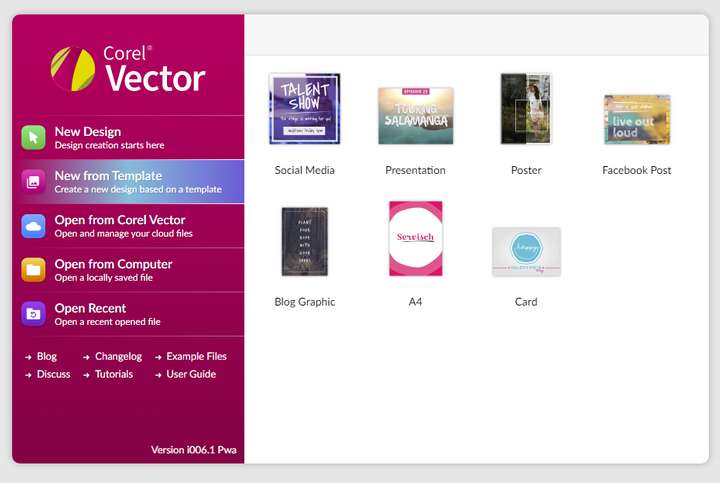
Corel Vector (before Gravit Designer) uses a more logical visual model, which I don't exactly love myself, but I can actually navigate it easily and quickly, and the symbols are helpful.
It's made for younger designers, and a different type of designer than the VS average user probably, but the team behind it has grasped the concept and even got templates included in a sensible way, without them getting in the way of all those starting from a blank page:
-
@ingolf I agree the affinity approach with the same icon for every option misses an opportunity. At the same time, the Corel example with the visuals looks really tacky and unappealing- unprofessional. I'm sure a happy medium can be achieved
-
@Ingolf said in Standard and advanced New document setup mode:
It's made for younger designers,
Obviously aimed at folks like myself then, I'm only 18 (in my head, the body is more like 53 higher than that
 )
)I don't actually mind this type of arrangement where there is a simpler grouping of document types along with a drop-down list. Again, as long as it's all eminently adjustable and you can add your own - why not. The likes of Apple Pages (among many others) also use this kind of arrangement to good use for everyone. It's well to remember that professionals are only amateurs that get paid for their services

Neil
-
@Ingolf said in Standard and advanced New document setup mode:
This model from Serif, created and executed by a simpleton, might be just as good as a detailed list in one or two columns. Actually I would prefer a list.
Affinity's new document panel works very well for me because I find it simple and logical:
- It lets me pick an output intent from the top menu (print, press-ready, web etc.) and it selects the appropriate color and resolution settings automatically (if press > then CMYK @ 300 dpi.; if web > RGB, 72dpi)
- It lets me pick a preset layout size. It does have a search field, BTW.
- Finally it allows me to customize the settings, if necessary.
Three quick, easy steps.
-
I'm not saying it doesn't work, but it's a quick piece put together in a hurry to have the same functionality as other programs and some form of access to templates. But it is a poor, incomplete and clumsy copy of the more elegant, simple and focused dialog from Adobe:
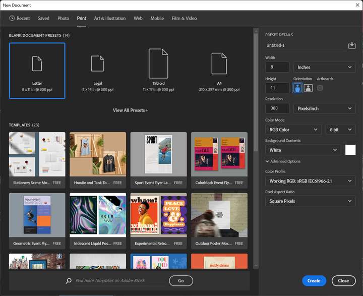
Now that Serif wasn't skilled enough to fill the pane with anything but similar giant icons, they could have provided access to a nice list view as well.
-
@tudor Those are good points about the Affinity document setup model.
Clarifying my earlier comment where I feel they missed the mark is the large repeating rectangle icon for each size - it's the same icon for every size option within each category. that to me just wastes space. the sizing is small in comparison and below the icon
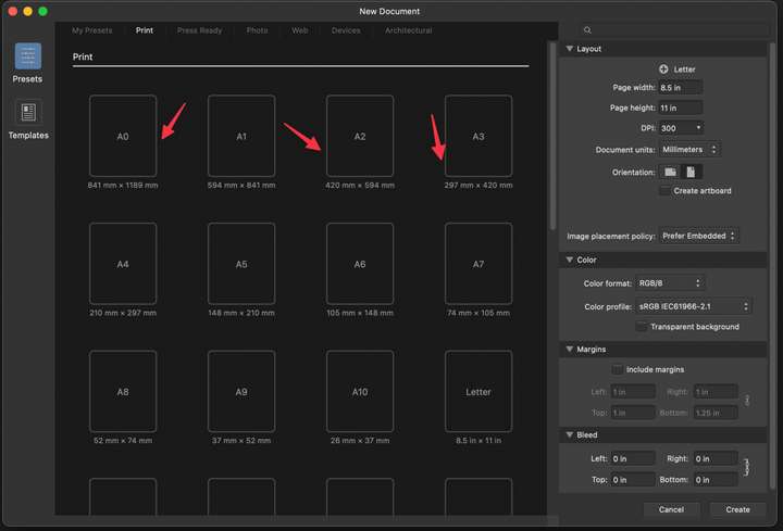
-
Any post that includes a screenshot gets an upvote from me, even if I might disagree with the post.

-
That's so funny that @Ingolf and I were posting on the same topic at the same time with screenshots lol
@b77 so all this time I thought you just really supported my ideas but in reality you just like pretty screen shot pictures?

-
@Boldline Yes, I like big screenshots and I cannot lie.
