Draw tool sticky settings?
-
Must say it again, i really like your way of creating
hatchings with Brushes (really cool idea !!!!)
-
Thanks Boldline & Subpath

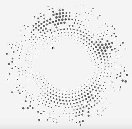
Just been messing around with repeater and I'm blown away with what can be achieved now I've got my head around it -- for dot halftones it's ACE --- initially when I first used it, I found it would slow to a crawl and just thought it was for making fills similar to the pattern fill tool, and had no idea how well it works on raster art or photos even gradient meshes or when using raster effects on vectors - once expanded and unified this is great for t-shirts --- I know Boldline does a lot of t-shirt work and has probably mastered the repeater, but had no idea how powerful this is - this is now part of my workflow for this kind of stuff rather than using Clip Studio Paint / VectorRaster /or the halftone options built into Image Vectorizer ------ACE
-
@VectorStyler said in Draw tool sticky settings?:
@Subpath said in Draw tool sticky settings?:
would it not a little more helpful if we could use the Pen Tool direct also for Vector Brushes ?
Yes, this could be easy to enable. But, it might result in confusion as all other apps differentiate between the Pen and brush tools.
It's a bad, bad, bad idea to mix the two!!!! For this reason and many other reasons. It is an absolutely bad idea. And a pen tool is a science in itself with lots of complexity - more than you think. It should be kept completely isolated from other tools. It is a discipline unto itself and a tool unto itself.
I strongly recommend that instead you can easily switch between pen and brush visibly, easily and intuitively without the two ever getting mixed up.
Just as easy as switching between black and white color in fill and stroke with X in Photoshop. One press of a key - or an icon in the context bar.
-
In continuation to what @Ingolf said:
If the Brush contours dropdown would be available in the context bar when you pick the Pen tool, this would allow those who want to draw brush strokes directly with the Pen tool to simply switch to a brush contour and get to work. Would this not be acceptable for everybody?
-
Sorry, I don't understand these concerns.
Why on earth should this not be possible.
Just for the reason of keeping a Pen-Tool pure?
Should a user stick to program design standards rather than have creatively usable tools ?As Vectorstyler said, it would be an option. After that you could still use the Pen Tool
in the way you are used to.For now, nothing has changed about the Pen Tool, after all.
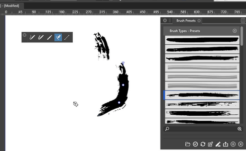
And we have already two Methods where you can already use the Pen Tool with a Vector Brush.As this Video proves (VS 1.1.049)
(And this Methodes are build in long before.)The only difference would be that we could use a Vector Brush a little bit more direct with the Pen Tool.

-
@Subpath said in Draw tool sticky settings?:
Just for the reason of keeping a Pen-Tool pure?
I think the primary (and good) reason for this is to have the Pencil and Brush tools behave as in other apps, according to expectations.
But this does not exclude the possibility to have an option (preferences) for these to work in new ways.
-
@VectorStyler said in Draw tool sticky settings?:
@Subpath said in Draw tool sticky settings?:
Just for the reason of keeping a Pen-Tool pure?
I think the primary (and good) reason for this is to have the Pencil and Brush tools behave as in other apps, according to expectations.
But this does not exclude the possibility to have an option (preferences) for these to work in new ways.I can live very well with such an option.
-
@VectorStyler said in Draw tool sticky settings?:
@Subpath said in Draw tool sticky settings?:
Just for the reason of keeping a Pen-Tool pure?
Just for the reason of keeping things simple. Especially the user interface. VS is the most complex program in my collection - and by far - it simply can't stand any more complexity.
There is no need to join GIMP and Inkscape like interfaces.
-
I'm sure nobody bothered to consider my idea because I didn't bother to post a mockup.

There you go — show the Brush dropdown in the context bar when picking the Pen tool, before even placing the first node:

-
I don't understand that instead of weighing things
up and conceding the other side their interests too.Why you create threat scenarios with Inkscape and Gimp
and talk down the Idea this way.
-
appreciate your Idea, but i am not really shure
if i get it right.If i use the Brush Tool it looks already that way
like in your Picture.And your Idea seems that the same should show up
when we use the Pen Tool, its fine for me
-
@Subpath Conflict of ideas are inevitable because we have different priorities — scales with different weights.
Time permitting, I would also like for @Ingolf to expand a bit the part about GiMP and Inkscape.
Is it the way things are organized or just the general look of the UI (which I dislike as well)?
-
@b77 said in Draw tool sticky settings?:
There you go — show the Brush dropdown in the context bar when picking the Pen tool, before even placing the first node:
I added this to the backlog.
-
...Conflict of ideas are inevitable because we have different priorities
— scales with different weights....I totally understand that and i appreciate @Ingolf Ideas
and Knowledge about Ui Interfaces.But should we really stay on one point, just for the sake of a Paradigma ?
Sometimes it makes more sense, in my eyes, to overthink Rules and Paradigmen
or put them aside for while.I must say that I am very open to unusual / creative UIs.
as long as they are useful for creativity.
I have seen and used many programs that would make
UI designers pull their hair out. But I appreciate all of them.
-
I have seen and used many programs that would make
UI designers pull their hair out. But I appreciate all of them.Tell us which was the worst.

-
You won't believe that I never liked the Adobe Illustrator UI.
(Well, I don't use Illustrator since version 8, that was a while ago).Liked Corel Draw UI from the beginning because of its configurable UI and other features.
Kai Krause plugins back then, was nice from a creative point of view.
But the UI was so tiny and not scalable, it was terrible.Corel Painter could also be mentioned - I would say
it gets the award for the worst UIPaintstorm Studio gets a positive special mention
because of his resizeable and very configurable UI
and thats in a App for 20 $
-
A very interesting Vector Graphics App
( apart from VS of course )
)Is "Cavalry" very unique UI, because of the animation capabilities.
but you can also create still images with it.
Kind of Mograph (Cinema 4D) for Vector Graphics.There is a free Version where you could render (save) your
Result as SVG. You need to create a Account.Here a short but impressive Video Example:

Some of this would be doable in VS but not all

-
This is seriously the worst idea in a long time.
With the brush enabled in pencil and pen mode - How exactly would you explain the difference between
- the pencil tool
- the brush tool
in the documentation? They look identical to me.
And why mix and confuse the Pen tool with those instead of merging them and adding a bit of pen control options as well?
UX assistance is seriously needed in this project - and more than ever. I've just had a professional one at my screen to reality check my own claims (he's an Illustrator user). Not disagreeing with me.
-
@Ingolf Just to clarify my opinion:
I don't like the Pencil-as-a-brush idea either — it's confusing because these tools share the same drawing method (drawing strokes with the mouse/trackpad/stylus), so where is the differentiation then?
However, since the Pen tool works differently than the Brush and Pencil tools, I don't see where is the problem (the confusing overlap) in being able to draw with a brush contour directly.
It's a long thread now, so I'm re-including the context bar mockup for the Pen (not Pencil) tool, just so it's clear what I'm referring to:

(The idea is to display the Brush dropdown in the context bar when picking the Pen tool, before even placing the first node, so you can choose a brush contour if you want to).
-
@Ingolf said in Draw tool sticky settings?:
This is seriously the worst idea in a long time.
With the brush enabled in pencil and pen mode - How exactly would you explain the difference betweenI respectfully have to disagree. I would say it is an experimental idea.
The thing is that the VS is complex and one way to tackle complexity is customization.In the future there will be much better workspace management features and it will be possible to easily switch between various working modes.
This would be a bad idea if it would be the default mode of operation, but it will not be and there will be settings to control these tools.