Grouped items with lowered opacity shows as 100% - should that be the case?
-
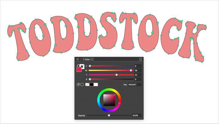
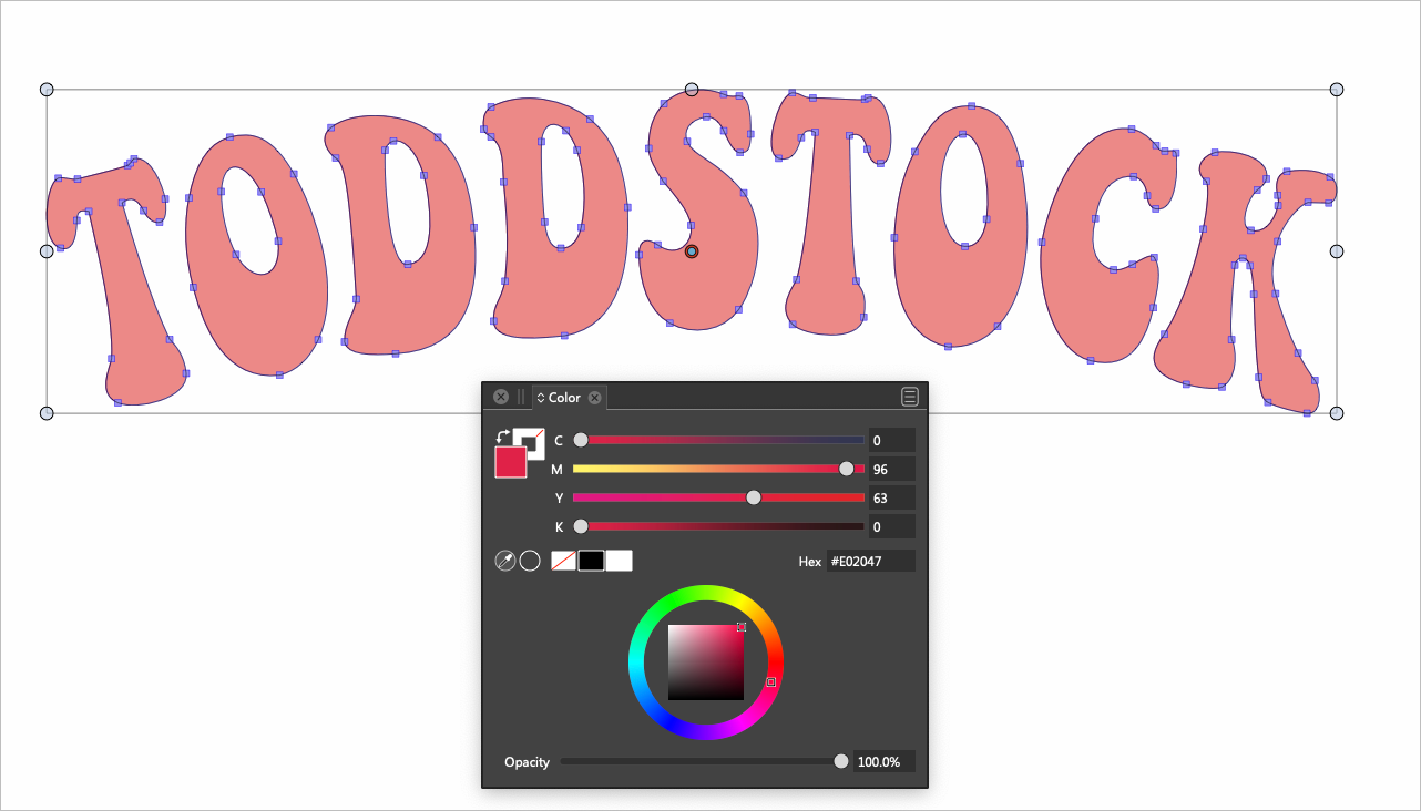
I was curious about the way grouped items that all have a lower opacity than 100% are treated when they are grouped together. In this example you can see the word "Toddstock" shows a 100% opacity when grouped. When you look at it, it's obviously less than 100% opacity.
When I break up the grouping, each letter shows it's true opacity as 50%I know this is common behavior in vector programs, but I don not understand the value of it. Wouldn't' it make more sense for it to say 50% even when grouped?


-
@Boldline OK, but what should happen if the shapes in the group have different opacities?
It would be inconsistent to display an opacity value for the group when its shapes have the same opacity (say, 50%), and to display a 100% opacity value when they are different.
-
@b77 I understand where you are coming from. To me I'd rather see an "incomplete" there if there are multiple opacities grouped together. If they all have the same opacity, then show the actual opacity. It's similar to how I think VS should handle selections of multiple sizes of live text. Instead of only showing one, show an incomplete sign instead -like a dash so the user knows there are multiple sizes involved.
-
Group opacity and object opacity are two completely different properties for totally different elements, and they must therefore be adjustable (and readable) independently of each other, and must never be mixed together. This is quite elementary layer functionality in all applications, and therefore it works like this in all programs.
-
Any time there are multiple objects with varying sizes, opacities, colors, fonts etc, included in a selection, it would be most helpful to have it display a dash or some form of an "incomplete" so the user knows there are mixed items within that selection. This is a feature in Illustrator for example, and it can be very helpful when selecting similar objects, to know they are not the same
Whether or not that should be a different result when objects of various sizes, opacities, colors, fonts etc, included in a grouped selection - I'm open to hearing debate on. Playing devil's advocate, I can see how a grouping of multiple opacities puts that grouping at 100% for itself and any more or less on the opacity would affect that grouping as such... so if I took that grouping that was multiple opacities and lowered it by 20%, I can see how 80% makes sense - still it's confusing
-
As long as the slider is simple, I agree with @Ingolf that it's better for object opacities to be kept separated from the group opacity.
Unless such a double-slider would help with all this, maybe as an option?

It's not the best animation, but I think it shows that this would allow the user to change both "ends" of the opacities and all values in-between, that is, when they are different.
Obviously, this should work for multiple selections, not just for grouped objects.
……………………
LATER EDIT: You should be able to drag the left slider all the way to the right to full opacity for the semi-transparent objects, and the right slider all the way to the left to complete transparency. I didn't show that in the animation — it's too complicated… -
@b77 that's a really cool idea - thanks for mocking that up.
I was also thinking on a more simplistic level just adding an asterisk to the result. an easy way of knowing that not everything selected is exactly the same
-
A good rule of thumb is that when there is no problem, there is no problem to solve.
Here we have the unique opportunity to obfuscate the very basic and easy principles behind layers and opacity, and make the user interface of something so simple totally incomprehensible to everyone. No thanks, I say.
We're right back in the Illustrator 101 classroom:
- An object's opacity refers to that specific object and nothing else.
- The opacity of a group refers to the opacity of the group object and nothing else.
The opacity value you see for a group is the value for the group as a whole object. The group may contain other groups, and may contain objects with different opacities. It may also contain objects with various effects. The group is therefore a unique object in its own right. Groups are not a pseudo-object that just bundles the objects below and displays information about them. Groups ARE an object that has its own properties that the experienced designer can actively use.
It is quite normal and old practice to have objects in a group that may even have been copied around in the design, and locally dimmed further, which you then do by setting lower opacity for the individual group. It is also very common to use blend modes on groups, where the opacity of the group is also adjusted.
If you have a group of letters, each of which needs 50% opacity, and you want to see this value displayed for the group, then the solution is to set them to 100% individually and reduce the opacity for the group to 50%.
As the attentive reader will have gathered by now, it would be confusing, misleading and completely contrary to the logic and functionality of the layer panel to state that the group has 50% opacity when it has 100%, just because all elements in the group have the same opacity value.
It makes no sense to build additional functionality and illogical complexity into an already complicated program based on a fundamental misunderstanding of how layers work in any design program. Which, by the way, is pretty trivial and quickly learned.
-
@Ingolf said in Grouped items with lowered opacity shows as 100% - should that be the case?:
A good rule of thumb is that when there is no problem, there is no problem to solve.
What one considers a problem, someone else may not. We see this often on the forum and a good debate helps find the best solutions.
@Ingolf said in Grouped items with lowered opacity shows as 100% - should that be the case?:
The value you see for the group shows what opacity the group has as a TOTAL entity, and that's information that's important.
I can understand in a way, the idea of a group containing multiple opacities within for example, being referred to as "100% opacity". it can be a confusing concept and one that caused great difficulty in illustrator to be able to return them all to 100% or adjust them otherwise. new users especially, get confused by this concept.
I'm not necessarily saying it has to change, but I would like to think of at least some way to make it clear to users what the group opacity is when the parts of the group may have different opacities within

