Dynamic cue card panel
-
@Ingolf said in Dynamic cue card panel:
The target audience is users that knows the tool well - but need a simple list of shortcuts immediately.
I would venture to guess this is more your personal opinion and situation and may not fully reflect on what others need or could use. Your views are valued and appreciated, but keep in mind others are not going to always agree and the views of others are equally important, even if you disagree with them.
I think there are good points to what you are suggesting - shortcuts and tips should be in the documentation in some capacity. there is also the need for including breadcrumb locations.
Maybe a help panel that when opened will flip to a description of the tool selected and show applicable hints and a small paragraph about the tool.
Super direct youtube videos can also help. -
I'll just say that a "minimalist" cheat sheet (horizontal at the bottom of the screen or vertical in a panel) is easier to implement than a dynamic Help panel with images, shortcuts and explanations.
Simply because it can be implemented sooner, a "minimal" dynamic cheat sheet can be of greater help than waiting for an extensive contextual panel that takes much longer to be implemented.
Both are welcome from my point of view, but I prefer the concise one, or the concise variant of such a Help panel.
(As some of you know, CorelDRAW has both a status line with the shortcuts at the bottom and a contextual Help panel with images and descriptions. But they also have a much bigger team than VS, so I guess it was easy for them to task someone with the Help panel).
-
@Victor-Vector said in Dynamic cue card panel:
@Ingolf, how about this idea:
Have a Help Panel like FontLab, with contextual results, so it is always on topic. Now, similar to our conversations around Panel Sizing the often overlooked customization, The panel would have 3 sub sections (divided by the horizontal lines):- The first sub section would be a brief description of the tool/panel.
- The second sub section would have a list of all the keyboard shortcuts.
- The third sub section would have a detailed description.
Using the double arrow icon next to the tab title (a.k.a. "moving along a number of states" icon) you can click-cycle through it to get one of the four states 1 - 2 - 1,2 - 1,2,3 - back to 1.
This way the help panel can be tailored by experts and noobs alike, or simply minimized, or even hidden.Again, just brainstorming, I realize that someone would have to generate this documentation, so it's far from an instant implementation!
For as long as it is easy to read and navigate in I don't mind. Yes, I understand it is a brainstorm.
 For the best result I recommend always starting out with a minimum viable product:
A minimum viable product, or MVP, is a product with enough features to attract early-adopter customers and validate a product idea early in the product development cycle. In industries such as software, the MVP can help the product team receive user feedback as quickly as possible to iterate and improve the product.
Brainstorming in a lab (or forum) generates a lot of ideas and traditionally far too many or conflicting suggestions. The MVP is great for testing the idea as such and for collecting feedback for improvement (ideally on real users). You let end users do some of the work - and you can improve the product step by step to everyones satisfaction. Or alternatively fail fast. In either case the developers do not code unnessacary features.
It's a fascinating way to work and create software, which is why I'm looking forward to showing up at my workplace with hand-picked professional colleagues and team players on Monday morning.
Lets see what NumericPath decides to do in the future. Maybe the status bar feels more attractive.

-
@b77 said in Dynamic cue card panel:
I'll just say that a "minimalist" cheat sheet (horizontal at the bottom of the screen or vertical in a panel) is easier to implement than a dynamic Help panel with images, shortcuts and explanations.
I would say the same amount of code and work is needed - roughly. The status bar is ALSO dynamic. Panels are dynamic already. They know what line width your object has; they update themselfes all the time. We are talking about a little request "What tool is active" and then displaying some simple data. They pain in the ass part for a developer would be to insert customized shortcuts instead of the defaults, but I have a good feeling that the architechture @vectoradmin created allows for an elegant solution.
You don't have to present the tips with images like a printed manual; it is mostly a bullet list with words, you don't have to go all in with symbols for Command and Option key.
So in either case:
- Code the panel / status bar with an "integration" to the active tools (which one is active)
- Create an XML file with the text strings to be presented
- Make sure OS specific keys are inserted in the XML in a way the Windows or macOS version present correctly
- More stuff only @vectoradmin knows
The status bar is a concept with limited use. The panel has more future potential. Either concept would help me remember quickly what keys do what. I would just personally go with the panel.
-
@Ingolf True, the dynamic cheat sheet might take the same amount of code like a contextual Help panel, but putting together text and images for the latter takes more time. That's what I meant.
So we basically agree — a concise dynamic cheat sheet as a panel should come first, simply because it doesn't need extensive text and images. That can come later, and as an option or second mode.
-
@b77 said in Dynamic cue card panel:
@Ingolf True, the dynamic cheat sheet might take the same amount of code like a contextual Help panel, but putting together text and images for the latter takes more time. That's what I meant.
So we basically agree — a concise dynamic cheat sheet as a panel should come first, simply because it doesn't need extensive text and images. That can come later, and as an option or second mode.
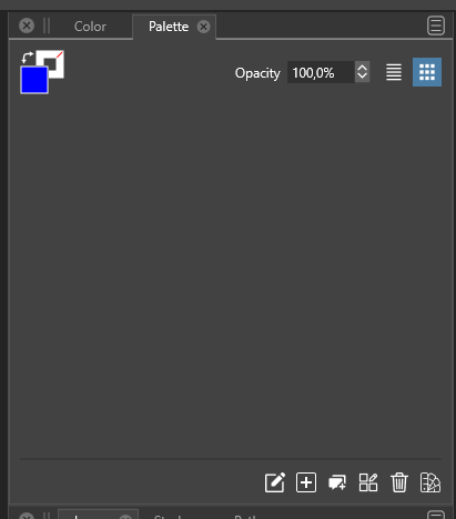
Yes. It was just a quick idea for @vectoradmin who I think (memory may fail me here) is considering a status bar like in AD or Inkscape. I don't know what information he intends to put in it besides keyboard shortcuts but anyway when I closed all documents in VS this panel cleared itself:

And this empty 'sheet' of grey paper looked like a more elegant place to present some hints listed vertically instead of in the tiny status bar. A panel is also easier to position, resize or hide. Well, just a few input and ideas for @vectoradmin

-
@Ingolf I add this to the backlog with the status/info bar idea.
-
As I mentioned in a previous post,
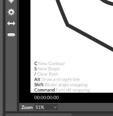
Cavalry PC/Mac (a vector graphics program for motion design, similar to Mograph/After Effect).
has found a nice way to present keyboard shortcuts to the user, that i like.

But i like also the Idea to use a Panel for that.
Here's the old post about it:
https://www.vectorstyler.com/forum/topic/1371/a-way-to-show-keyboard-shortcutsBtw. Cavalry has also a free Version.
-
@Subpath said in Dynamic cue card panel:
As I mentioned in a previous post,
Cavalry PC/Mac (a vector graphics program for motion design, similar to Mograph/After Effect).
has found a nice way to present keyboard shortcuts to the user, that i like.

But i like also the Idea to use a Panel for that.Here's the old post about it:
https://www.vectorstyler.com/forum/topic/1371/a-way-to-show-keyboard-shortcutsBtw. Cavalry has also a free Version.
I would probably prefer the panel in order to keep a clear view - but then again... one approach is to add a button on the existing status bar that toggles it on/off (the on screen display). With a keyboard shortcut for toggling the on screen display on and off it could be a solution as well.
Constantly showing it on top of the drawing wouldn't work for me.
-
Well, everthing has its pro an cons.
I am also fine with your idea of a panel and like it.
Because it can contain more content.
