Making different instances for the same panel less confusing ( accumulated )
-
Notice: Accumulated into mega-topic.
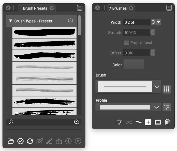
Take for example the "Brushes panel". It has two different appearances afaik, one where you can set the width, profile etc. and one with a search field. A VS user can't know which is which, when choosing a panel via the arrow next to the stacked panels, since they're both named the same. I suggest semantic augmentation via parantheses for example.
-
@Nils If are referring to these:
one is a preset ("Brush Presets" title) panel, the other is the main Brushes panel.
The titles are different, but if there is little space, then of course can be mixed.Please clarify how to make this better with an example


-
@vectoradmin I wasn't referring to the brush presets panel as the second one. I'll post a gif.
-
@vectoradmin Here's the gif.

-
@Nils Got it. That is the Brush Styles panel, I will fix the panel title.
It is empty because there are no brush styles in the document (styles and presets are different).