Customizing workspace
-
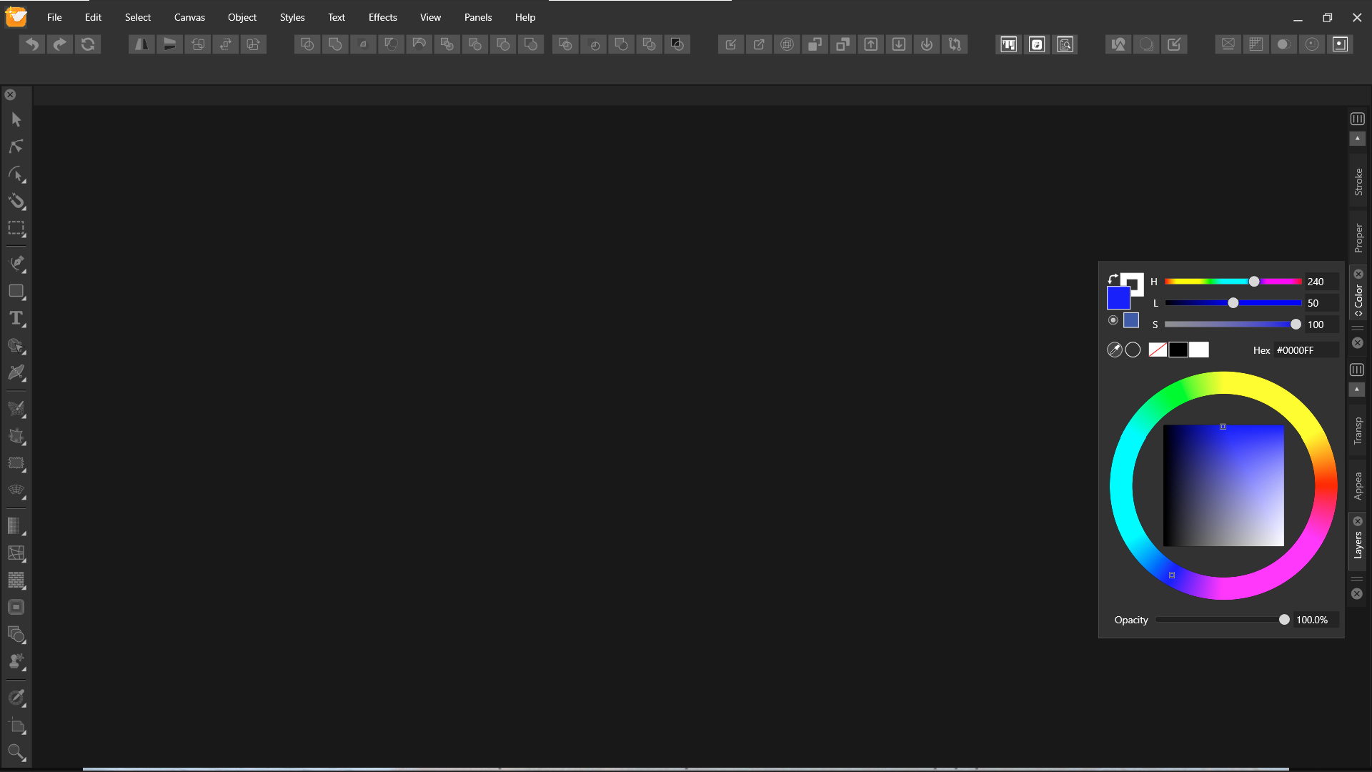
I know we have freedom of customizing VS as our need. Most of the time I work on a laptop with a 14" screen. Is there any way we can customize VS this way manually? This will give an extra space for smaller screen.

-
@Jayanta-Das No such option at this time. But I think this is an interesting UI pattern, and could be implemented in the future.
-
Ouch - that solution I know from somewhere (CorelDRAW!) and I really, really don't like it. Rotating some of the user interface to save space requiring me to tilt my head.
 On top of it all I think it looks ugly.
But I fully support the concept of hiding parts of the interface like @Jayanta-Das suggests. Even on a high-res screen.
I think there are better solutions. My favorite from Affinity is that the TAB key that hides all panels and the toolbar
o r
just the panels with SHIFT + COMMAND + H. This could be supplemented by a toolbar button.Some programs also offer a hide-show docked panels button in the middle of a thin bar, barely visible here in OpenOffice (next to spacing settings, there a tiny arrows pointing right - I am not crazy about that either.

Better suited for saving space is icons. I think symbols works the best when something is minimized. Rotating a label of text doesn't make it any easier to decode and use.
In Photoshop the big panels:

Turns into this when the small arrows button is clicked:

This could in VS be reduced further to just (could be a preference) and with tooltips of course:

-
@Ingolf said in Customizing workspace:
Turns into this when the small arrows button is clicked:
Yes thats what I meant and not exactly what I show in the screenshot. Icon with/without name would be much better.
-
The improvements I assume@vectorstyler will be making at some point to the organization of panels is something I'm excited about. What we're discussing here is similar to other discussions about alternative default panel layouts, the ability to save custom panel layouts, to hide all panels, to minimize down the panels to symbols, etc.
When I'm working on projects in vectorstyler, it's very common for the panels to get disorganized from use. The ability to have them be quickly reset to a clean arrangement is a huge thing to me.
