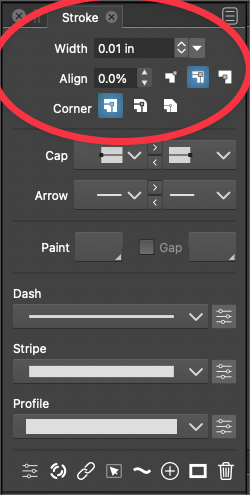
Center up this part of the stroke panel?
-
Would it look better aesthetically, to have the top portion of the strokes panel be centered? And actually, the middle section as well?

-
@Boldline I will try
-
@vectoradmin It's not crucial - just an idea
-
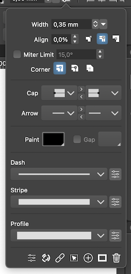
@Boldline Here I also have the 'Miter Limit' checkbox and its angle value:

…
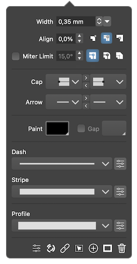
Would aligning the input fields like this while moving the Corner buttons after Miter Limit be better?
(The 'Corner' label might not be necessary, since the buttons are self-explanatory, and I just needed to make the panel slightly wider so the Miter Limit label and checkbox would fit).
-
@b77 I appreciate the mock ups -I agree it would be nice to have the width, align miter limit and stroke alignment and corners in a smaller panel together... the goal is to save space, but the doubling up of the settings seems to add confusion in my opinion...
-
@Boldline Which 'doubling up of the settings' do you mean?