Usability tweak - move none closer to fore- and background color
-
A small request for consideration

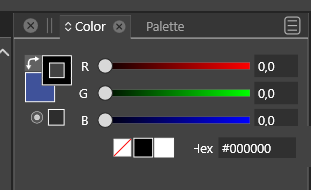
In the color panel, None, black and white are right-aligned as far away as possible from the back and foreground selectors as they could possibly be. The HEX value input field is closer. My guess is that this field is used less often than none and black and white. The distance is just unessasary and adds up when drawing for hours.
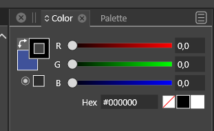
Moving them around doesn't look too good:
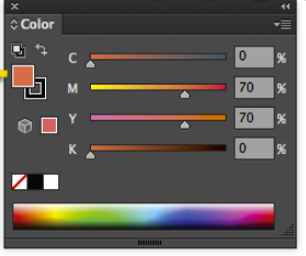
In Illustrator they placed them to the left, though, for the reasons I just outlines, I guess:
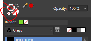
Affinity placed another small NONE option right next to them which is works great for me but it is a UI hack which adds more elements to the UI:
Another solution cold be that CTRL + click sets the fore/background color to none. But that is of course an invisible option - no one will probably discover it.
-
@Ingolf this request had come up before in the forum around a year ago. We had requested the white, black and none be on three left side closer to the fill and stroke selections. For some reason, that was not possible at the time. I'm not sure if things have changed since then that would allow it to move to the left side now.
You can right click on the white, black or none currently and it will make whatever stroke or fill option is currently in the background that result. I believe this was a feature in Corel draw that got suggested by someone from a Corel background, @Vector-Rock -
Oh, I know that from CorelDRAW but still too far away for comfort. Still, not the end of the world.

I just noticed it immediately while drawing.. "Why so far away" etc. Every time I need to set a border to none.
-
@Ingolf I've always preferred them to remain as close to the fill and stroke control as possible. I was more just informing you that this was not the first time this request had been made specifically. It's certainly worth asking again at this point.
-
-
@vectoradmin When VS was in Beta, the space on the left of the Color panel, under the Fill and Stroke color buttons, was occupied by a big ''Swap Fill with Stroke Color' and the 'Map color into gamut' buttons, that's why there was no place to move the 'None/Black/White' buttons on the left. This was the issue.
But now the 'Swap Fill with Stroke Color' button is where it should be, 'Map into gamut' moved up, so there is space to move the three buttons on the left like this:
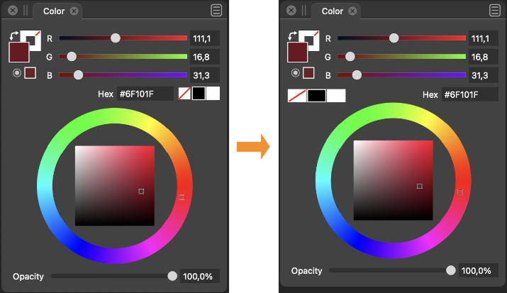
(I also made these three buttons wider — easier to hit — and moved the color wheel up a bit, which lets you make the panel a bit shorter).
-
@b77 That looks pretty good!

-
@b77 nice job summarizing what caused the beta to not allow for more intuitive placement! I like your mockup! I prefer the black white and none be squares nor rectangles, but that's just personal preference
-
@Boldline Well…
 Personally I would prefer the color bar to be slightly wider when docked vertically and its color swatches to be shorter rectangles. Then the wider None/Black/White buttons in the Color panel would make sense visually — they would look the same:
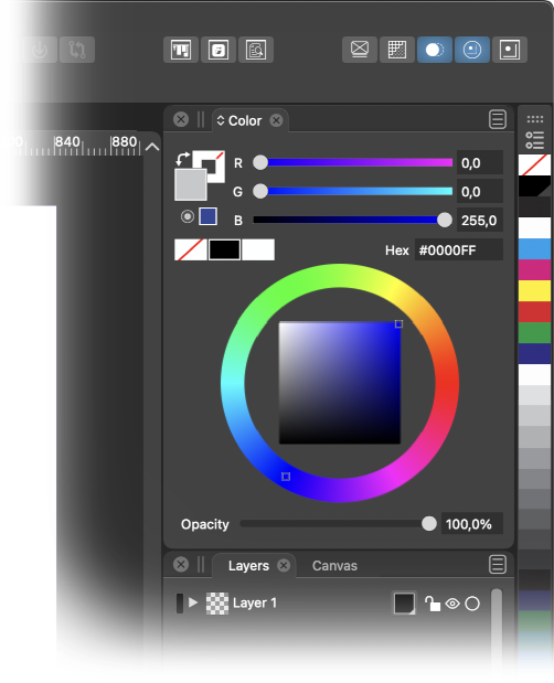
-
Also remember this current humble panel configuration (just hiding the spectrum) where left-aligning none-black-white would make sense and still look good.
There could even be room for re-arranging the elements so the sliders took of the full horisontal space which makes it much more fun and convenient to pull the sliders and observe the result (easier to make small increments).
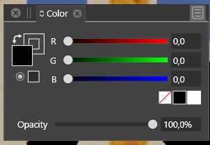
Speaking of smaller increments. Capture One Pro has a nifty feature - while holding ALT and dragging sliders the sliders uses smaller increments - are more sensitive. Any such thing possible in VS?
-
@Ingolf Not possible to drag with smaller increments.
The slider extent (width) represents the range of the color components.
Maybe holding a key and scrolling over the number will help, once it is available. -
@vectoradmin said in Usability tweak - move none closer to fore- and background color:
@Ingolf Not possible to drag with smaller increments.
The slider extent (width) represents the range of the color components.
Maybe holding a key and scrolling over the number will help, once it is available.That would also work. Low low priority though for me.
What I perhaps miss more is that the button up-down symbol also workes as a value up down control. The slider that appears is wide, and I have to move the pointer to the far left. The value max is pretty high, and when I want to use the slider (buttons), I always just want to make a minor adjustment.
Further the scroll wheel on the mouse doesn't work in the input filelds. In point number fields, yes, but otherwise no.

-
@Ingolf New color panel layout available in 1.1.002 (beta)
-
@vectoradmin And it is great, thanks!