XLS for features and ideas - Megathread
-
@Subpath: what it essentially does is to change the interaction of blend modes and gives you greater control. In some FX, for instance blurs, it lets you invert the blur by setting it to negative opacity and produce sharpening for specific areas of the image, combined with masking.
In photo editing, negative opacities are useful for producing sharpening effects too. In liquify layers, it allows you to create very fine displacements. These are just some of the ways I use it.
The potential is endless. PL is a vastly superior program compared to PS. Consider for instance that entire portable app is just 70 odd MB. But the trade off in flexibility is somewhat less user friendly experience.
-
@Daniel said in XLS for features and ideas - Mega Thread:
negative
I also think gradients should have an intensity slider alongside opacity. Opacity controls the transparency of individual stop. Intensity controls the transparency of the gradient as whole. This is completely independent of layer opacity.
So there are three levels of transparency: stop transparency, gradient opacity, layer opacity.
-
@Subpath @VectorStyler: https://imgur.com/a/9b5I2DS - Here's just a very simple example. The liquify layer can have overset opacity. Invert the liquify effect in both directions. +/- 100. Not only can you liquify it this way, you can even nest liquify layers into liquify layers. This is just one example how over setting opacity helps.
-
@Daniel, thank you
I feel a little more enlightened
-
@VectorStyler: just noticed your comment on the appearance panel. I don't think it's merely about appearance. It should also show group level. Text objects should have text settings underneath. Selecting the object at outermost level should should transform options. Selecting a whole layer should show Layer settings. Clicking on clipped objects showed show clipped object and clipping shape. So on and so forth.
-
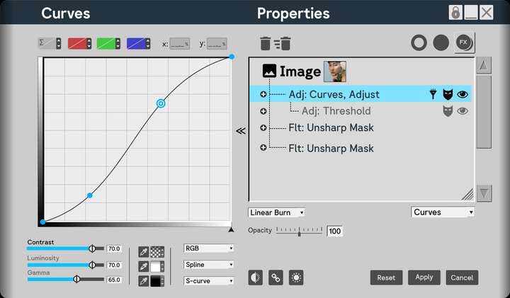
Here's how the panel would look like for complex FX. Notice that you have the option to show masks and hide FX too. You should also be able to simply scroll to zoom in and out the contents of the properties as well as resize the properties section individually, apart from the size of the panel itself. This is what the hatches in the corner are for. The dropdown in the right hand side corner allows you to change the FX at the chosen level. For instance, I may create a curves adjustment, and decide I actually want Unsharp Mask, for instance. I don't need to delete it. Simply change it. Finally the reveal arrows should let me close the enlarged view without losing access to blend mode and opacity.
The details can be tinkered with. The idea is solid.
I replicated elements from PL to show that even the most complex FX can fit in.
Anyway, that's everything from me for the time being. I genuinely think this will make navigation in VS so much easier.
-
@Daniel But why not having the list on the left side and the effect options on the right?
The effect has to be selected first to have its options visible. -
This post is deleted! -
@VectorStyler: that depends on where it is docked. The settings can pop out from any side. If it's docked to the left, the settings pop to the right, and vice versa. I'm right biased. I split my screen into two halves. All tools on the left. All contextual panels such as layer, FX and so on to the right. There's no hard and fast rule.
-
New suggestion addeed:
F: Vector Network
Source Software: Figma
Reason to include: Allows to make complex vector edits very easy.
Principle Used: Expand: If a tool can be made more useful either through additional modes or compatibilities, add such modes and compatibilites.How to include: Vector networks are one of the most useful concepts. Only Figma has it. And vgc.io has it as a proof of concept. The code is available freely if you wish to refer. Figma's own implementation is fairly limited. The idea is extremely simple: Allow multiple paths to share a single node. This should NOT be a separate tool, but an option available both within Node and Pen Tool. Here's one way of doing it. Say I wish to create a network.
In pen tool, I should have a mode called vector network mode. With this mode active, I should be allowed to create a curve, then click out of the curve, and insert a new node in the middle of that curve and draw a new path. Now that node is shared between the two curves.
In node tool, it should happen similarly.
-
@Daniel said in XLS for features and ideas - Mega Thread:
Vector Network
I added ths to the backlog, but probably it will be after 1.3
-
@VectorStyler: thanks. This is fairly low in priority to be honest.
I'd like if possible to address the quality of life challenges in VS first. VS already has a vast and rich array of tools, more than any designer will ever use in the course of their daily workflow. That's a compliment.
Now, what's needed is a solid improvement to workflow and responsiveness.
-
Two more suggestions for improvements added: On screen toggle for switching between dark and light mode, like in Lunacy and other apps. On screen slider for reducing dithering for complex documents, like in XDP and many other apps.
-
@Daniel said in XLS for features and ideas - Mega Thread:
On screen toggle for switching between dark and light mode
In VS there are multiple light/dark themes and also a few "gray" ones. I have to figure out how to do this.
On screen slider for reducing dithering for complex documents
Can you send me a screenshot of this?
-
@VectorStyler: Here's one way to do it. Allow the user within the program settings to choose their preferred dark and light settings. Now these are the only two options that show up when you toggle on screen.
Or even clever: Allow the user to drag a grey from the colour line, and holding down Alt, drop it on the UI. This changes the colour of the UI to that grey. Have 60% value difference for contrast between UI and text and icons. That is, when the user drops 80% grey on the UI, the text and icon are set automatically to 20% white. 70% UI Grey, 10% Text and Icons. 60% UI Grey, 100% black. You get the idea.
In XDP, you can drag and drop a colour from the colour line onto the artboard and background and change it to whatever colour you want. You can even drop patterns and bitmap. This is because XDP also publishes fully functional websites in HTML5 format.
I will record a video for the slider.
-
Heck, why should it be gray alone?! Drag and drop any colour you want onto the UI!
-
@Daniel said in XLS for features and ideas - Mega Thread:
Allow the user to drag a grey from the colour line, and holding down Alt, drop it on the UI.
This is a bit problematic, as the theme should contain other colors that are in harmony with the main background UI color
-
@VectorStyler: Fair enough. Just grays alone should be great then. Also, I misspopke. I meant to say, anti-aliasing slider, not dithering.
-
@Daniel said in XLS for features and ideas - Mega Thread:
anti-aliasing slider
In VS there some anti-aliasing options in View->Subpixel.
It is also possible to set the anti-aliasing grid size of one pixel in View -> Display -> Display Options -
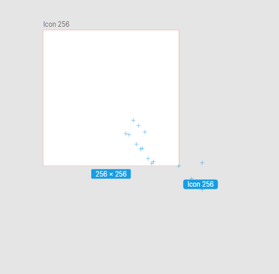
F: On-screen snapping points for common page and screen sizes along with labels, when resizing canvas. See Lunacy for a very elegant implementation. Along with this, allow content to resize with canvas if this is turned on. Like so. Notice those +, they're snapping points for common sizes.
The way you can improve on this is to allow users to create custom sizes as presets and allow these to show up as snapping points with the related label.