Corner editor cursor
-
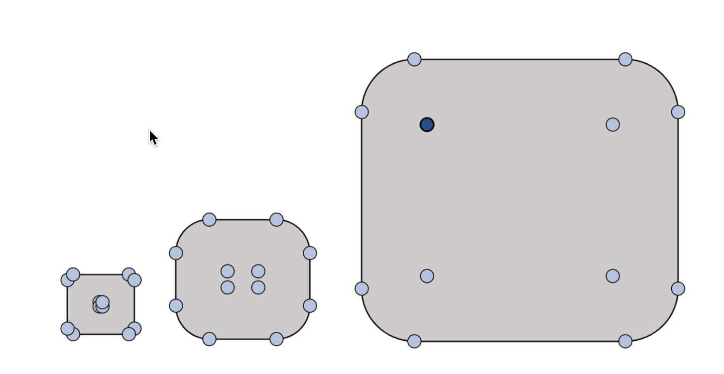
Currently cursor changes to Semicircle with a + indicator as one scans outside the corner circle. Challenge here is, one have to move the pointer around to find the lock and apply the effect. Also the indicator is hardly visible if the backdrop is grey or dark colored.

The corner indicator circles are big and don't scale proportionally, getting in the way of design, sometimes overlapping.

About Bucket tool:
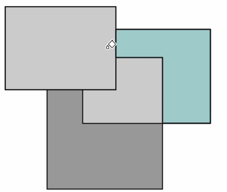
In the Bucket fill tool, the shape on the opposite side of the cursor gets selected, can be confusing sometimes.
-
@Kumr The black part of the cursor needs to be thicker and the white contour as well,
for better contrast with any background.But I'm not sure about the part with the handles(?) being too big. They don't seem too
big to me, unless the object looks too small itself because of the zoom level.In this case perhaps hiding these round handles after you start dragging them could help.
-
@Kumr said in Corner editor cursor:
In the Bucket fill tool, the shape on the opposite side of the cursor gets selected, can be confusing sometimes.
I cannot replicate this. What is the zoom level, and was the bucket fill tool started filling (first click)?
-
@VectorStyler This is what I mean by scanning curser lock.
https://recordit.co/1csONPfssU
Bucketfill tool on A4 at 65% zoom level
thanks
-
@Kumr I will try to replicate these issues.
-
@VectorStyler thank you
-
@Kumr @VectorStyler I previously reported the issue with the Bucket Fill tool.
https://www.vectorstyler.com/forum/topic/3628/the-icon-of-the-vector-bucket-fill-tool-is-drifting -

