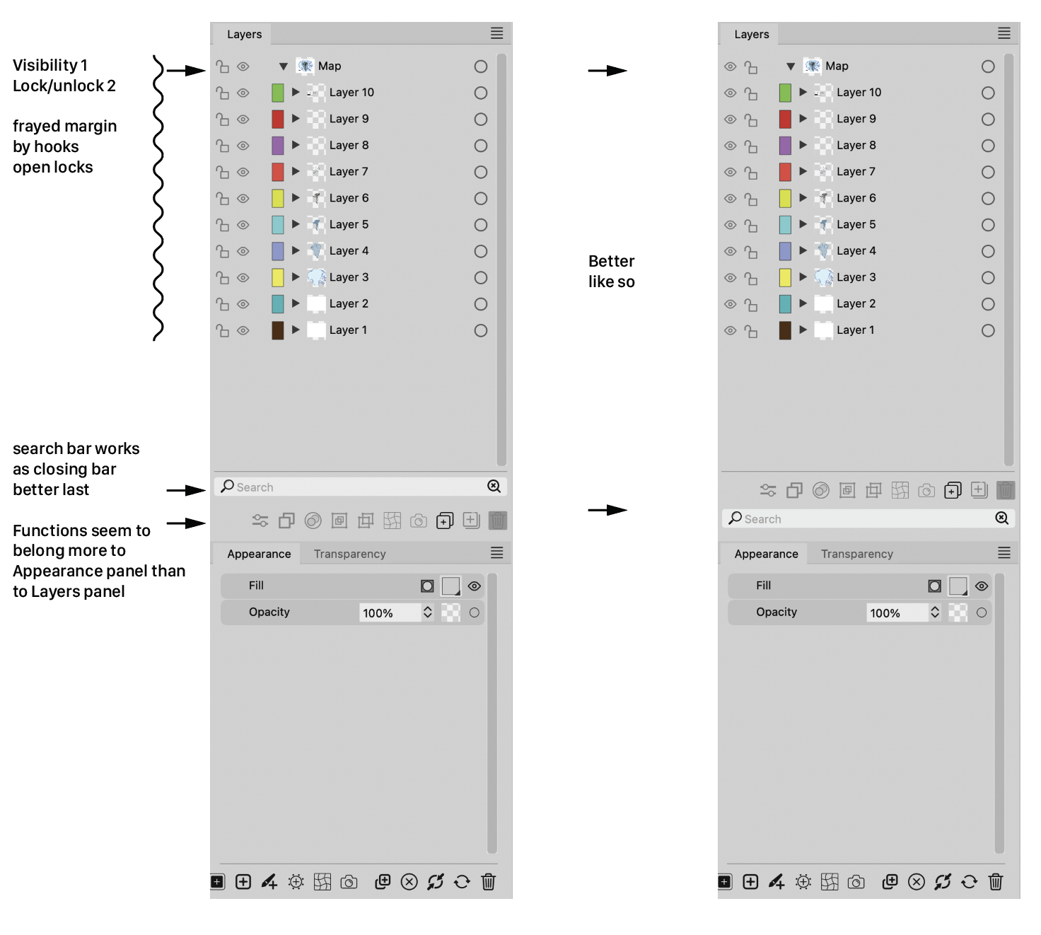
Some comments and advice about the Layers panel
-
Except that I like the idea of the eyes on the far left side and think it's better.
I wouldn't have a problem with it if the icons remained above the search field.
In that case, I can live with whatever @VectorStyler decides here.
I have to anyway")
-
@Ayo The Glyphs, Presets, Styles and Symbol panels each have a search field as well.
But anyway, if all other panels have the buttons at the bottom, why be visually
inconsistent here with the Layers panel? -
@Ayo said in Some comments and advice about the Layers panel:
I also wonder why there is the need for two magnifying glasses. One seems sufficient to me. Symbol on the right with the tiny cross is probably intended as a 'Clear' symbol. In that case, a simple cross will symbolize its function more clearly.
I agree, a simple X is enough, and ideally should not appear when the search bar is empty.
-
@Ayo said in Some comments and advice about the Layers panel:
Ai has it on top, above the layers. Seems to me the most logical place from a user functionality perspective
I think the top is a better place for the search field.
-
@VectorStyler said in Some comments and advice about the Layers panel:
I think the top is a better place for the search field.
Do you mean: top, above the layers or top bottom group?
-
@Ayo said in Some comments and advice about the Layers panel:
top, above the layers
I was thinking to move these search boxes above the list, if that is how it is done in other apps (expected behavior).
In my view, a search box should always be below a list, but this is just an opinion, so lets see what are the preferences.
-
@VectorStyler
And also how it is done in your own font list!
-
@Ayo said in Some comments and advice about the Layers panel:
And also how it is done in your own font list!
Yes, I admit it
-
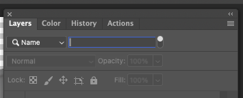
Assuming different opinions are still welcome:The font list needs the Search field at the top, to be closest to
where you clicked to open it.This is not needed for the Layers panel and the other panels (Glyphs,
Presets, Brush Presets, Styles, Symbols, etc) because they are not
temporary lists/popovers opened with a click on a button.Also: having a dark field so close to the darkened background of
the Layers panel (the part behind the tab) would look like the
image on the right: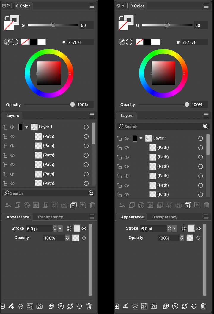
I for one already don't like that the horizontal divisions between
panel groups are gone in v. 1.2… -
Just opinions and examples from me:
Example Adobe:
What matters in their example is that the search field is only displayed when you actually search which is cool and how iOS apps often work. What is less cool is you often have to know how to activate it. I am not happy about the need for "In Photoshop CS6 and newer, you can press Shift + Ctrl + Alt + F (Mac: Shift + Command + Option + F) to search for a layer by Name."
I mention this because I prefer the top placement IF the search field is only displayed when I click an icon (or use a shortcut). Otherwise it is distracting. I rarely search - and in that case the search field is just clutter. That is probably why iOS and Adobe hides the field when not needed. And they display it in the top ONLY because I actively requested a search and thus indirectly accepted more user interface controls visible for a time.
The current bottom placement is therefore my favorite when it is displayed permantly. I actually forgot it was there because it never distracted me.
So all in all I prefer it in the bottom if it will always be visible.
-
@Ayo said in Some comments and advice about the Layers panel:
I also wonder why there is the need for two magnifying glasses. One seems sufficient to me. Symbol on the right with the tiny cross is probably intended as a 'Clear' symbol. In that case, a simple cross will symbolize its function more clearly.
@Ingolf said in Some comments and advice about the Layers panel:
The current bottom placement is therefore my favorite when it is displayed permantly. I actually forgot it was there because it never distracted me.
So all in all I prefer it in the bottom if it will always be visible.Same for me.