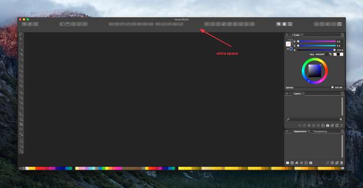
how to clean up space at top of VS screen?
-
I had tried a while back to move the alignment panel up into the top section of the VS screen - it didnt work there as well as I had hoped, and after I removed it, it left a large buffer of space there that the red arrow points to in the attached image. I tried resetting the workspace and that did not fix it. Sometimes I see more options partially obscured right above where the open file names are located.... they are not there in this pic.
Where would I look to remove this extra space? thanks
@vectoradmin now that I think of it, perhaps this unwanted buffer space is the cause for the boolean operation icons looking squished compared to the other icons nearby?
-
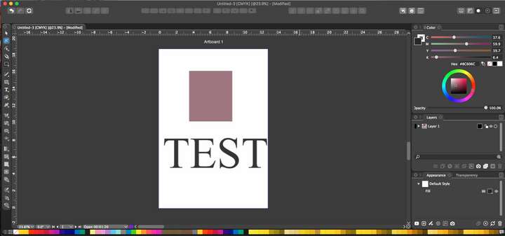
@Boldline If a document is opened, and some objects are selected, that space should contain some options regarding the selection.
-
@vectoradmin - ok... is this how your screen looks when you have a couple selected items on the screen?

-
@Boldline That is a problem, the context panel is missing. I will try to replicate on El Capitan.
-
@vectoradmin ok yes! that's what's missing! I guess that would not ordinarily be refreshed if I hit the "refresh workspace" would it...
-
@Boldline Couple of thing to try:
-
restart the app, and create a new document, draw a rectangle and select the transform tool (first in the box). Is there anything showing up in that region (under the button).
-
if not, try reset by holding Shift+Option+Command and then starting VS, and then repeat the above.
I just checked it on El Capitan, and it looks ok, but it is not used extensively on it so it could be that something got shifted in the workspace.
-
-
@vectoradmin Thanks! the Shift-Option-Command ultimately solved it.