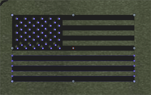
"Selective" selection highlighted nodes inconsistent in my opinion
-
I have come to appreciate the selective selection indicators in VS (rather than where every single node is highlighted and paths are also highlighted. That said, it confuses me at times like the example below of the american flag. the entire flag is selected, but the upper right side is not showing any indication of such.
Is there a reason for this that I am missing? is there a way this could be improved so at least one node in each section is highlighted so I know the whole thing is selected?
-
@Boldline Not sure what is going on here. Can you send me the file.
-
@vectoradmin Just emailed you the file with the issue in it
-
@Boldline Got it. For some complex (or composite) shapes, only the first node is shown to avoid rendering too many nodes.