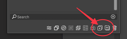
Create New Layer Icon Too Similar to Create New Sublayer" Icon
-
Atheistically, the "Create New Layer" icon is too similar to the "Create New Sublayer" icon. I end up second guessing which is which more than I want to admit and have to hover over them to remember.
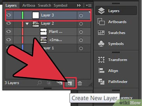
This is what Illustrator has used and it easily recognizable at first glance what its purpose is. I'm not saying it HAS to be this
Here are three potential solutions to the icon that I roughly assembled that could work as a "new layer" icon and give that quick look contrast to the adjacent symbol for "Create New Sublayer"

-
@Boldline I will try to improve this at some point
-
@Boldline thank you for highlighting this. It will definitely improve VSectorStyler's UI and enhance workflow.
-
No reason not to build directly on the current VS "regime" that is comparable to the interface in Illustrator:

Here, Illustrator wins on visual simplicty, though. I can only imagine the VS icons can be simplyfied a bit too. A plus sign in a single square icon is all we need.
Sublayer? I dunno, just as gymspiration:


BTW icon tooltip says new sublayer, right click menu create layer inside.