Organizing VS for easier understanding and use of styles and presets
-
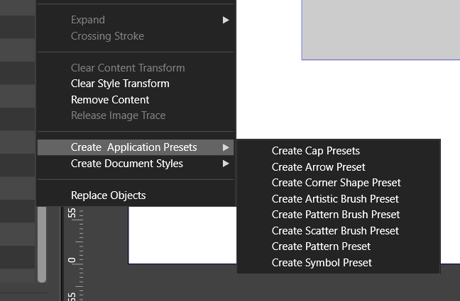
Maybe just a separate menu for styles and presets and adding only for the menus 'document' styles and 'application' presets. Then you don't have to change to much about the naming. So that those who don't want to much changing are satisfied. And it makes it clearer and organised.

-
is not that i am against changes
but they should make things clearer than beforeLike your idea with "Document Styles"
i am a little unshure about "Application Presets"
but could live with it -
@FastVector said in Organizing VS for easier understanding and use of styles and presets:
Maybe just a separate menu for styles and presets and adding only for the menus 'document' styles and 'application' presets.
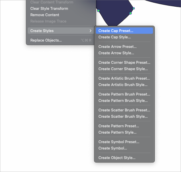
This would help for sure. This is more what I envisioned instead of the long list of alternating types of styles and preset options
-
Well if VS needs a way to save preset attributes/configurations locally to a document and globally to the app, my only interest are names that are descriptive and easy to understand.
I think that would be far more effective than Subpath's user example of actually memorizing "what styles apply to individual documents and presets that can be used globally". That seems like a lot of work.So yes, call them something descriptive and short, give them an intuitive icon, and that would be great!

-
@Subpath Either 'Application Presets' or only 'Presets' would work for me. Because I'm not totally new and have already used the presets multiple times. I would go for only presets, because it is shorter and therefor looks cleaner. But for a total beginner or if you almost never have used this function the longer one is more descriptive.
-
Since I wrote that I can live with this “application preset”.
Is this term okay for me -
@Subpath Yes, I also can live with it. But I quess that I prefer 'Presets'.
-
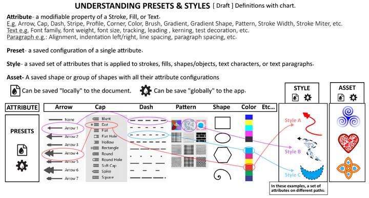
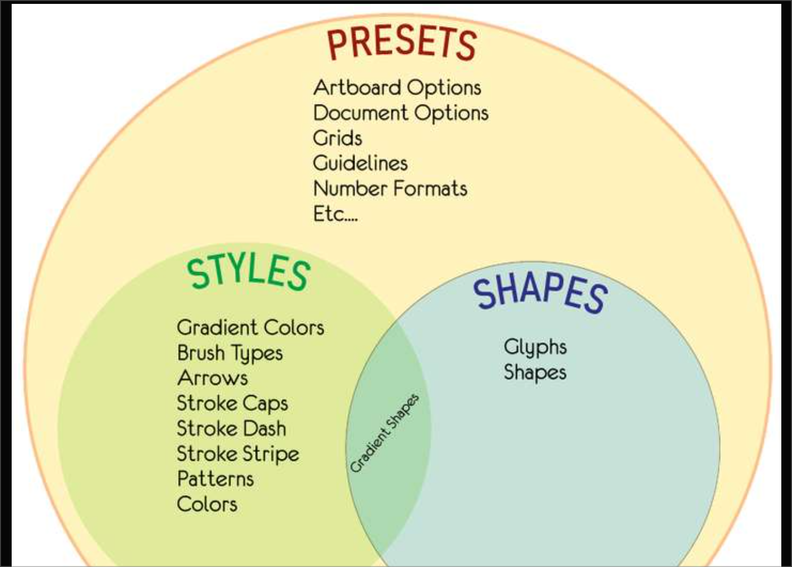
I was trying to get these terms straight in my head, and I thought that a chart may help. I ask you to keep in mind that this is just brainstorming, I am not trying to force ideas, I am hopefully contributing to them.
So these definitions are rough, these ideas are conceptual.
What got me excited about this chart was that it delineates the concept of Presets and the concept of Styles, and removes them from being associated with WHERE they can be SAVED.
So I used icons (they are placeholder, not set in stone) to represent a "local" document save and a "global" app save.
A Preset can be saved in BOTH ways.
A Style can be saved in BOTH ways.
This would simplify all of VectorStyler's menus. When a user goes to save a Preset or Style and they are in the window to name the item, there could be two checkboxes for each choice:

Hovering over the icons would reveal the tooltip explanation for them.So have a look at the definitions. I am sure they are close, but not exact. Please chime in and help shape them. My hope is this will help us get to a common understanding of these elements and then we can figure out how best to organize them simply and elegantly.
-
@Victor-Vector Just a suggestion — deciding which naming is better should come first,
then figuring out which icons fit the naming better comes second.It's not easy anyway — in the app we have the Fill concept (for which a droplet icon would
work best, IMO), then we have the Appearance concept and also the Style concept, which
are more difficult to describe with icons:
I would assign a painting roller icon for the 'Appearance' panel, but then which icon would
work for 'Style'? -
And… there's no need for icons in the 'Save Style' dialog — a checkbox with a
text label that says 'Global' (or anything descriptive) would work great, IMO.


