Artistic Text tool request
-
I am looking for a text tool to draw the size of a text - ie using guides - quite normal for posters and other designs where you are working with a single word and the space available for it defines its size. Sometimes I use guides for this, sometimes a scanned image.
Something similar to this:

The tools I found in Vectorstyler are frame based. Creates a text frame then I have to adjust the font size. Did I miss something? Otherwise I request such a tool.
A much faster and intuitive tool for creating artistic text.
-
@Ingolf I added this to the backlog.
-
Press&hold Option/Alt. I'm not sure if snapping works.
https://recordit.co/26T6hjvHAF
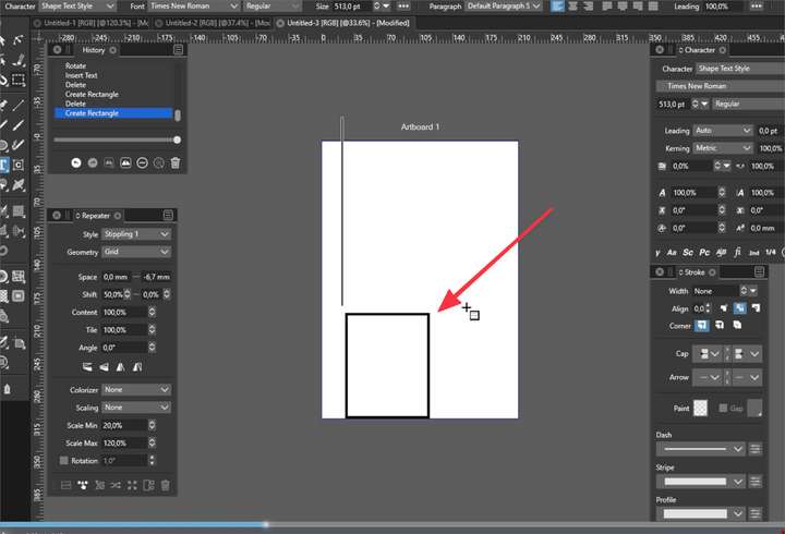
@vectoradmin Could you check what is going on with that rectangle? It appears often in left bottom corner. -
@Ingolf I had the same question as @encart , is what you are looking for accomplished using the recently added feature @encart demonstrated in the video link? If not, can you explain a little more what you are wanting it to do? I'm all for improving things like this as I use large sized text multiple times a day
@vectoradmin Borrowing from @encart's video, what is the square box at the bottom of the screen that pops up when creating text this way? I've noticed it before when I do it as well. I had posted about it on the forum but I might have missed the answer. thanks!

-
@encart There are problems with snapping.
-
@Boldline That box could be a missing glyph. I will try to replicate this issue.
-
@Boldline It looks like a missing glyph to me. Changes depends on used font.
-
An artistic tool is the user interface for ALT + dragging. Again, invisible features hidden by invisible shortcuts that one has to study manuals and remember like Rainman to use again is not intuitive. Not user friendly. Not selling. And it is thinking like in 1996.
With an artistic text tool @vectoradmin then has the option to add further features to the user interface when an object is created with the artistic text tool to assist the creative proces - making these features visible, accessible. For example that the text object then has handles/buttons for various bending and distortion tools.
A lot of VS is really easy to use and well thought out by @vectoradmin but I also see direct inspiration from especially Illustrator that comes with workflows from another era. Sometimes looking elsewhere as well for inspiration is wise.
Illustrator has the great features - but not the user interface that makes creating fun and fast. @vectoradmin has total freedom to add a much more modern and powerful user interface on top of the same features.
-
@Ingolf I can't say I disagree with you that this approach involving the Option/Alt key is not intuitive. Case in point: I didn't know about it.
But just to clarify things a bit:
The app has an 'Artistic Text' tool — it's the first tool among the Text tools in the toolbox. The shortcut is T.
If you simply click with it on the canvas, it will create an artistic text object — a default 'Lorem ipsum' scalable text.
Since the 'Area Text' tool has no shortcut, the developer made clicking and dragging create a paragraph text object instead. (I might have been one of those suggesting this).
And as @encart wrote, pressing Option/Alt lets you create an artistic text object when clicking and dragging.
The problem is that the way it switches to the Area Text tool when clicking and dragging is not to everyone's liking.
… . .
So… should the Area Text tool get its own shortcut instead and the 'Artistic Text' tool should create artistic text with simple click and also with click-and-drag — no switching to paragraph text? -
@Ingolf - I appreciate your thoughts on this even if we occasionally disagree.

My ideas and opinions are not any more or less important than your views and with the goal of an open discussion, I've shared them below:I am assuming based on your comments in this thread, your prior comments about the selection modes not being hidden in the transform tool pullout and your mentioning that you pull out the pen tool from the toolbar for when you do your work, that you prefer a workflow of clicking on your tools with the mouse cursor and not reliant on keyboard shortcuts. If I am wrong, please let me know.
I seems that "click on the tool" workflow mentality is shaping your views here and may not be in line with the keyboard-shortcut priority that seems to be commonplace.I would be interested to hear more about what you feel is a "workflow from another era". In what way is VS's and Illustrator's UI not "fun and fast"? Do you believe adding more tools to the toolbar makes it faster to use? I certainly do not think Illustrator is the gold standard (I always preferred Freehand)
I'm not sure how adding more tools that overlap existing features makes VS more accessible. If there are enough new features added to justify a new tool be added and take up more real estate, then I can understand that. Your example of the text object tool idea that "text object then has handles/buttons for various bending and distortion tools" is already covered with the warp tool. If a bigger new feature was added, such as adding 3D depth to a selected vector shape or letter and altering the size and thickness, I could see that justifying a new tool.
If every potential feature needed to be tied to a tool that is displayed on the UI it would look like as complex as the gauges and dials in an airplane cockpit; this would not encourage intuitive use or be user friendly, especially to new users. You don't want to alienate veteran designers by catering VS to beginners only either. Already there are those who think VS's UI is too complex (I disagree) but they are commonly users of Affinity with it's simplistic UI and far fewer features.There are levels of understanding to any design program. New users start with the basics and work their way up to learning the shortcuts. A new user may not know for a long while that the option modifier will provide an immediate opportunity to size the text as it gets created.... they may spend a good amount of time typing it in like normal and then sizing up after. Over time, they have a solid foundation and can learn more shortcuts.
Keyboard shortcuts have always been the intuitive speed and efficiency answer for designers both in 1996 and today. I know every class I've taken over the years has stressed the importance of getting to a place of comfortability with the basics of the program and then making keyboard shortcuts a priority. Most experienced designers use keyboard shortcuts as much as possible and prefer it over different tools for each task.None of the essential tasks in VS are keyboard-shortcut-only. You don't need to memorize the key command for building a shape or changing a selection mode. All of the most common tasks have a toolbar icon or are found in the contextual menu, etc. As a result, new users do not have to immediately know the shortcuts to be immediately productive. No one learns the VS program or the tools much less the shortcuts overnight. It would be great if we could all be Rainman when it comes to shortcuts but memorization happens over time with practice. Intuitiveness comes with practice and repetition, not by adding a tool for every effect.
@b77 I do think the keyboard shortcuts do need to be highlighted in the VS documentation so users can add them to their workflow as they feel comfortable. I know there have been some of the keyboard shortcuts and the like added in the notes for each update and I either did not know to look or understand fully what it all was tied to.
-
@b77 said in Artistic Text tool request:
@Ingolf I can't say I disagree with you that this approach involving the Option/Alt key is not intuitive. Case in point: I didn't know about it.
So… should the Area Text tool get its own shortcut instead and the 'Artistic Text' tool should create artistic text with simple click and also with click-and-drag — no switching to paragraph text?All that is really for @vectoradmin to decide. Maybe it is rudimentary to implement, maybe not. Maybe he agrees, maybe he doesn't. Switching to paragraph mode is probably not a major issue. I don't think it should hijack the current shortcut for area text.
What I know is that when you are not designing paragraph based text a more intuitive way of dragging and designing the words is much more meaningful. And fast.
If I made this poster an artistic text tool would fast track creating the words:

or this

-
@Ingolf The snapping issues have been fixed in build 1.1.008
There is also a new option Preferences -> Document Editor -> Shape Text on Frame Dragging to enable drawing artistic text without the modifier key (and with the modifier key draw text frame).
-
@vectoradmin said in Artistic Text tool request:
@Ingolf The snapping issues have been fixed in build 1.1.008
There is also a new option Preferences -> Document Editor -> Shape Text on Frame Dragging to enable drawing artistic text without the modifier key (and with the modifier key draw text frame).
World class, thanks!
