VectorStyler
    • Categories
    • Unread
    • Recent
    • Tags
    • Popular
    • Register
    • Login

    Usability tweak - move none closer to fore- and background color

    Scheduled Pinned Locked Moved Implemented Features
    14 Posts 4 Posters 21.3k Views 3 Watching
    Loading More Posts
    • Oldest to Newest
    • Newest to Oldest
    • Most Votes
    Reply
    • Reply as topic
    Log in to reply
    This topic has been deleted. Only users with topic management privileges can see it.
    • VectorStylerV Offline
      VectorStyler @Ingolf
      last edited by

      @Ingolf @Boldline I will check what is the issue with these being left aligned. It might be the the previous problem was something else.

      b77B 1 Reply Last reply Reply Quote 1
      • b77B Offline
        b77 @VectorStyler
        last edited by b77

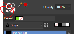
        @vectoradmin When VS was in Beta, the space on the left of the Color panel, under the Fill and Stroke color buttons, was occupied by a big ''Swap Fill with Stroke Color' and the 'Map color into gamut' buttons, that's why there was no place to move the 'None/Black/White' buttons on the left. This was the issue.

        But now the 'Swap Fill with Stroke Color' button is where it should be, 'Map into gamut' moved up, so there is space to move the three buttons on the left like this:
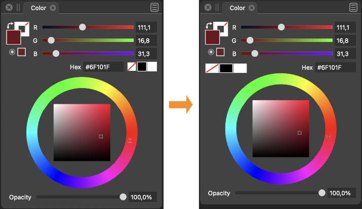
        0_1637316931412_cpanel.png

        (I also made these three buttons wider โ€” easier to hit โ€” and moved the color wheel up a bit, which lets you make the panel a bit shorter).

        MacBook Pro (Intel) running Monterey 12.6.4

        IngolfI 1 Reply Last reply Reply Quote 2
        • IngolfI Offline
          Ingolf @b77
          last edited by

          @b77 That looks pretty good! ๐Ÿ™‚

          ๐Ÿ macOS Sequoia Apple Silicon

          1 Reply Last reply Reply Quote 0
          • BoldlineB Online
            Boldline
            last edited by

            @b77 nice job summarizing what caused the beta to not allow for more intuitive placement! I like your mockup! I prefer the black white and none be squares nor rectangles, but that's just personal preference

            ๐ŸŽ macOS Tahoe 26.2, Mac mini (M1, 2020), Chip Apple M1, Memory 16 GB
            Cintiq 27QHD Display and LG Ultra HD Display

            b77B 1 Reply Last reply Reply Quote 0
            • b77B Offline
              b77 @Boldline
              last edited by b77

              @Boldline Wellโ€ฆ ๐Ÿ™‚ 
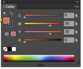
Personally I would prefer the color bar to be slightly wider when docked vertically and its color swatches to be shorter rectangles. Then the wider None/Black/White buttons in the Color panel would make sense visually โ€” they would look the same:

              0_1637326833299_color_bar.png

              MacBook Pro (Intel) running Monterey 12.6.4

              1 Reply Last reply Reply Quote 0
              • IngolfI Offline
                Ingolf
                last edited by Ingolf

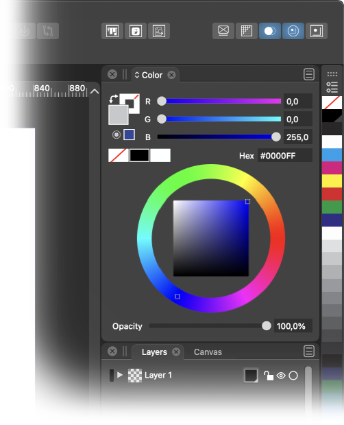
                Also remember this current humble panel configuration (just hiding the spectrum) where left-aligning none-black-white would make sense and still look good.

                There could even be room for re-arranging the elements so the sliders took of the full horisontal space which makes it much more fun and convenient to pull the sliders and observe the result (easier to make small increments).

                0_1637335666663_b0f33a30-cdfb-4924-acf6-0ae0683ff487-image.png

                Speaking of smaller increments. Capture One Pro has a nifty feature - while holding ALT and dragging sliders the sliders uses smaller increments - are more sensitive. Any such thing possible in VS?

                ๐Ÿ macOS Sequoia Apple Silicon

                VectorStylerV 1 Reply Last reply Reply Quote 0
                • VectorStylerV Offline
                  VectorStyler @Ingolf
                  last edited by

                  @Ingolf Not possible to drag with smaller increments.
                  The slider extent (width) represents the range of the color components.
                  Maybe holding a key and scrolling over the number will help, once it is available.

                  IngolfI 1 Reply Last reply Reply Quote 0
                  • IngolfI Offline
                    Ingolf @VectorStyler
                    last edited by

                    @vectoradmin said in Usability tweak - move none closer to fore- and background color:

                    @Ingolf Not possible to drag with smaller increments.
                    The slider extent (width) represents the range of the color components.
                    Maybe holding a key and scrolling over the number will help, once it is available.

                    That would also work. Low low priority though for me.

                    What I perhaps miss more is that the button up-down symbol also workes as a value up down control. The slider that appears is wide, and I have to move the pointer to the far left. The value max is pretty high, and when I want to use the slider (buttons), I always just want to make a minor adjustment.

                    Further the scroll wheel on the mouse doesn't work in the input filelds. In point number fields, yes, but otherwise no.

                    ๐Ÿ™‚

                    ๐Ÿ macOS Sequoia Apple Silicon

                    1 Reply Last reply Reply Quote 0
                    • VectorStylerV Offline
                      VectorStyler @Ingolf
                      last edited by

                      @Ingolf New color panel layout available in 1.1.002 (beta)

                      IngolfI 1 Reply Last reply Reply Quote 2
                      • IngolfI Offline
                        Ingolf @VectorStyler
                        last edited by

                        @vectoradmin And it is great, thanks!

                        ๐Ÿ macOS Sequoia Apple Silicon

                        1 Reply Last reply Reply Quote 1
                        • First post
                          Last post