Color indicator+selector in layers panel superfluous
-
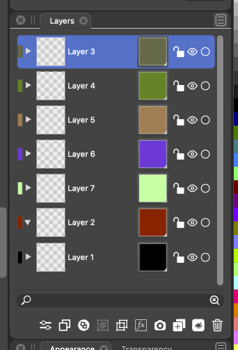
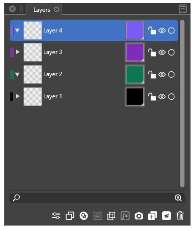
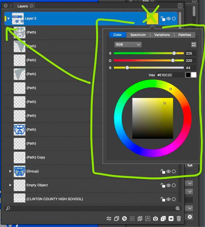
I find the huge color indicator+selector box in the layers panel (next to the lock symbol) very distracting - the leftmost indicator is more than enough. The layers panel looks more like a color palette at times. And this element is only used rarely but colorful and on-screen constantly. It is like a flashlight in the night.

I would personally do it like in Illustrator: Leftmost to the left of the layer name, as tall and perhaps a few pixels wider than in Illustrator (easier to hit with pointer). And I would not make it an option.
") It is simply not necessary.
It is simply not necessary.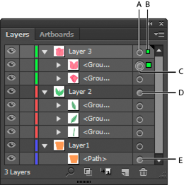
🍏 macOS Sequoia Apple Silicon
-
@Ingolf I agree the color boxes on the right side are not needed - especially if the shapes on the far left side are made a little wider as you mentioned.
Out of curiosity, I went and checked out Affinity's layer panel and was surprised to see it lacked the color coding entirely
I am glad VS has a color coding system for the layers themselves as I use it frequently as I design. That's something Illustrator got right as well.
-
It is there - right click a layer to add a color - but it is just for color coding the layers in the panel. Nothing else. One of many examples of half-assed minor features added to Affinity products shortly before deadline for the sake of adding SOME new functionality in a release after many complaints from beta users (customers!).
(Check out a document with layer colors in VS in outline mode if you wonder what I am missing in Affinity!)
-
@Ingolf Oh gotcha! yeah.... well with VS I know I was one of the ones advocating for color coded layers that also translated into corresponding selection boundaries and path selected lines, etc to be added to VS. You're preaching to the choir about the value they have!
-
-
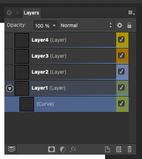
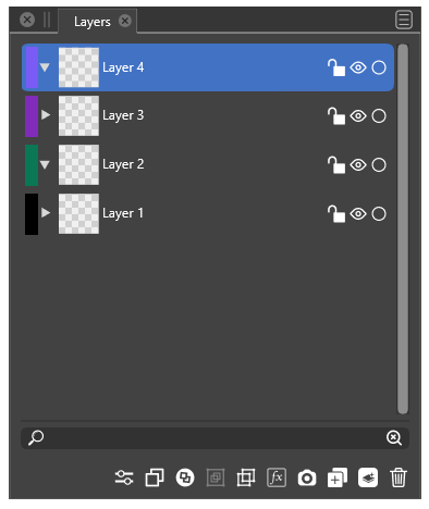
My thoughts visualized:
VS today:
My idea:

When pointer hovers the colored rectangle the pointer changes like in Illustrator:
-
like this idea
-
@Ingolf I agree with you on layout for this part - when you mentioned the full squares on the right being superfluous - enlarging the rectangles on the far left a little more made sense
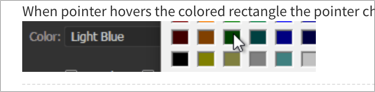
On your idea for a color selection method using those smaller left-aligned rectangles, why can't it stay what it currently is? When the cursor hovers the colored rectangle the same color wheel menu appears like it does already with the large squares. I love the flexibility of choosing a color that way. Opening a menu of static squares feels clunky and limits the color options
-
@Boldline The could also be right-aligned - but I would prefer it placed next to the scroll bar - not next to the lock icon. Next to the border of the panel it looks less intrusive.
-
@Ingolf I think we agree on that part. I prefer the color rectangles as you displayed them in this image -on the left side of the layer tabs - making them a little wider than they are right now.

I was hoping we could keep the existing layer color picker as it currently is and just move it over to the small rectangles on the left. Like I am trying to demonstrate in the pic below

I was less excited about switching the layer color picker to a set of static clunky boxes of color lol
-
Well, ultimately not my decision
Just moving the huge box? Eh, no thank you. Personally I find it horribly big - huge - the colors catches my attention all the time, no matter where they would be, the small rectangle doesn't. And it is more than enough to hit with the pointer.
NOTE: I didn't at all suggest introducing the color picker from Illustrator (it is the ancient Windows color picker it activates, yuck), that is what happens in Illustrator, just showed how the cursor switching to a hand above the rectangle indicates that you can adjust something here. Elegant nudging at work.
To clarify: when the cursor changes to a hand symbol, click once and the current VS color selector appears.
-
@Ingolf I'm not following what we disagree on then. It sounds like we're asking for the same thing. Removing the color square on the right side of each layer tab.... making the existing rectangle of color on the left side of layer tab wider and being able to click on that left-aligned rectangle to change the color. When you click on it, the current VS color selector appears (which is the same 'large" color box in the image below)
@Ingolf , you mentioned "To clarify: when the cursor changes to a hand symbol, click once and the current VS color selector appears." - Isn't what I am showing in the picture above the current VS color selector?
-
@Ingolf Layers panel layout is improved in build 1.1.008