New VS user, help with the interface?
-
@Subpath said in New VS user, help with the interface?:
This Pie function was exactly what I was looking for.
Haven't found it in my attempts.
Too bad it is so hidden for new users, not very intuitive.Maybe a hint in the Tooltip could be helpful.
We can all agree learning a new software program is not an easy process. It can be helpful if we already know a similar program. VS becomes more intuitive as you use the program and begin to understand how it is organized. It begins to "slow down" as they say about sports when you begin to get comfortable with it.
For example, now that you know you can double click on a toolbar icon to get a dedicated panel of options, you can assume that's a possibility with other tools as well. When you realize you can edit a shape after creating it, you then connect that the rectangle tool and other shape tools offer their own similar options. Once I understood how panels worked, it was easier for me to go find the things I needed; much the same way Affinity Designer has View>Studio and Illustrator has it's "Window" tab - they all function like a central hub.I think once you get a sense of the layout and organization of VS, as you find new tools like the pie tool in the ellipse panel, it will feel more intuitive for you.
I agree with you there's a lot that needs to be updated and improved upon in terms of a VS documentation. An option to turn on tooltips would be very helpful, especially when you are first learning. We're in a unique position at the moment because we're seeing VS built up around us; we're contributing to the formation of this awesome program with our ideas, user feedback and testing. On the flip side, we also have to put up with outdated documentation, bugs, a lack of tooltips, tutorials and a lack of 3rd party tutorials, videos, books, pdfs, etc. I remember when I learned Illustrator (pre-Youtube), it was mostly through books and trial and error on screen. When I learned Affinity Designer, there were already a number of people sharing tutorials and the like online and Affinity had a solid collection of video tutorials as well. With VS, we're still at the beginning of the journey. We're going to have to do a lot of digging and asking questions on the forum and trial and error on screen.
I'm sure the developer would love to have tooltips added already, the documentation up to date and a larger more complete collection of tutorial videos online. With the finite amount of time he has, based on what he's shared with us, it seems he's been focused primarily on stability, bug fixes and adding/revising key features and tools. I'm sure the documentation and tutorials and the like will improve in due time...In the meantime, keep asking questions on the forum - there are no dumb questions!
-
As I have already said in some posts, I am not an inexperienced user.
I really worked with a lot of vector programs and have fun trying new things.I also have the patience to figure out how VS works. And I always make
notes when I find something and have no problem to ask about it.I like VS, despite all its unruliness. For me it has so many nice and useful functions.
Sometimes it is like a dream came true.But I find it a bit of a shame that often simple hints are missing.
( User guidance )
I would not mind if the tooltips contained more such texts/hints.
That would save a tedious search. The call of the Pie Function in
VS is only one example of many.Of course I also know that the developer already has enough to do with
the program maintenance and further development. -
@Subpath It sounds like we're on the same page with most of this. Out of curiosity, I searched for "pie" in the current documentation and it came up as expected. I opened the ellipse panel and saw the pie option is there and when you hover over it, it has a tooltip already. What more did you want to see different using the pie example?
It seems to me the pie example covers everything you were wanting already; easily found in documentation, tooltip already in place.
I think having tips and tricks is a great thing, but I don't know what more you'd add or do in this example.
I could see a tips section of the documentation one day, where less common things like making a pie shape are covered. I think as tutorials grow, it would get easier to google "make a pie graph in VS" and a step by step instruction would walk you through that process.
On a related note, I hope at some point for more extensive descriptions in the documentation of the individual preferences settings, things like normalize winding, and settings in tools that are not immediately understood, for example, within path brush options, what does inverted velocity offer? things like that . -
@Boldline
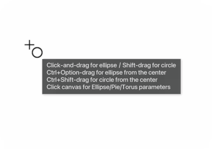
I guess @Subpath refers to a tips area in the UI (already requested), where if you hover the tool or selected it already, you can see a concise explanation about how to use it and what it can do. Something like…Click-and-drag for ellipse … Shift-drag for circle … Ctrl+Option-drag for ellipse from the center … Ctrl+Shift-drag for circle from the center … Click canvas for Ellipse/Pie/Torus parameters
Tried to make it as short as possible and it's still long… Can it be made even shorter than this?

-
@b77 Ok, I think I understand - sort of like what Affinity has at the bottom of their screen with suggestions for what you can do next with whatever tool you are using?
-
@Boldline Yes. Or would a(n optional) tooltip tied to the cursor be too much?

-
@b77 That feels like overkill to me. I'm not even a big fan of Affinity's model for doing that. Personally I feel like just listing the name and super pithy description is sufficient and then have a robust documentation pdf that explains more than what is in the current documentation. One small example of this for me is more use of the "breadcrumb" map- showing the steps to get to a certain item ie: Panels>Editing>Guidelines
If @vectoradmin made available to the most dedicated VS forum members, the current documentation in a google docs shared file for example, could we all contribute to its expansion? Then at some point the developer could go in and copy and paste applicable new information and reworked sections to better expound on topics?
-
Well, it might be difficult to choose what to mention and
what not to mention. For me, a short note like "Double-click
on Ellipse Tool for more Options" would already be enough -
You are right, the option for the Ellipse tool can be found
by looking in the help file. But nowhere before is even the
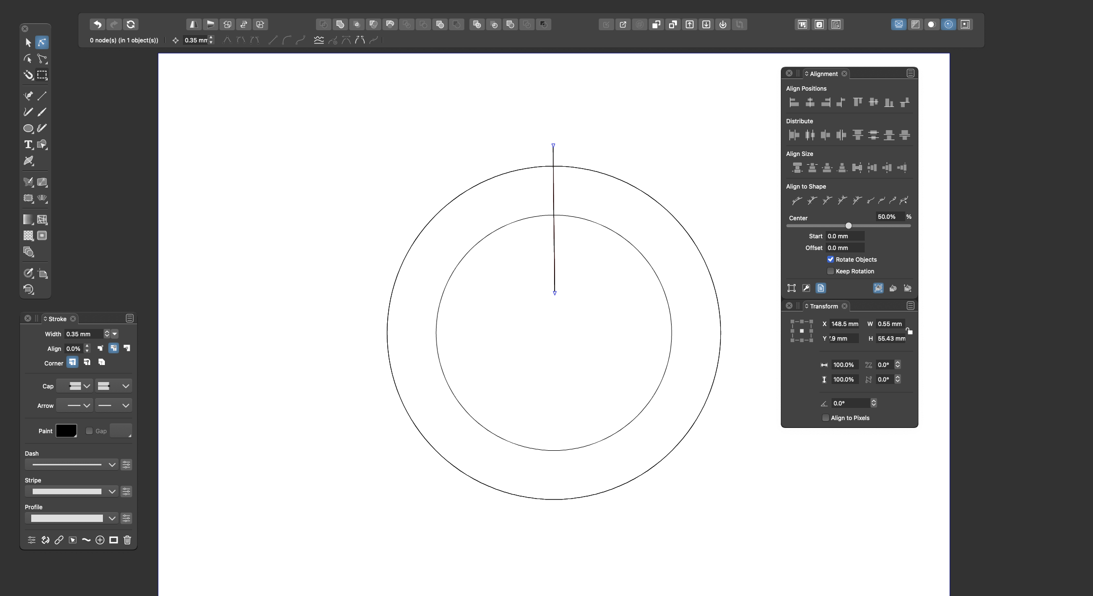
slightest hint that this option exists.Here is a picture of how easy it is in CorelDraw to find out
such things. Create a circle. Look in the context sensitive
toolbar. Done.
Anyway, when I look up functions, my first path is not to
look at the documentation. First I look in the
contexsensitive toolbar. Then in the Menu > Objects.
But I am someone who looks at the documentation bit by bit.
However, I don't like that the help is only online and only works with Google search.
( Have already in a thread to vectoradmin suggested an offline (PDF ?) version. )If b77 hadn't posted this tip, I wouldn't have known about
this option until today. -
I work closely with usability specialists every day and I remember when we didn't. If I could only let them help VS for a months.
But contrary to a stubborn company in Nottingham, leaving suggestions for VS results in an instant response and often in changes in the user interface.
@vectoradmin
An observation I made this week that fits perfectly into this post is:Bug:
If I select a new shape/tool: Context sensitive toolbar is currently updated to reflect a selected shape AFTER drawing the shape. The context toolbar should change to reflect the active tool every time I select a new tool.Consider UI update:
This is a love or hate feature, so probably a preference: when a tool is selected, auto-show or activate the panel with further settings for the tool/shape. At least consider how to let the interface link the tool and the panel and help the user to discover it and use it in a workflow. Naturally. Of couse this shouldn't be necessary if the context toolbar (instantly) offers the relevant and most used features which I much prefer to the above automation. -
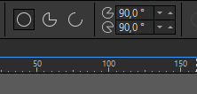
@Subpath I agree, having buttons for each Ellipse mode, followed by their specific settings, all immediately visible in the context bar when you select the tool (thanks @Ingolf for pointing that) could be a solution:

Some parameters would be shared among all modes, others will change depending on the mode.
@Ingolf In my opinion this approach might be better than having the panel with the shape settings pop automatically when you select one of these tools.
-
@Ingolf In my opinion this approach might be better than having the panel with the shape settings pop automatically when you select one of these tools.
Absolutely.
-
@b77 said in New VS user, help with the interface?:
@Ingolf In my opinion this approach might be better than having the panel with the shape settings pop automatically when you select one of these tools.
I agree that the contextual menu could/should be more dynamic, but I like the way the setup of things is now with a double click on the toolbar menu to bring up the panel for that tool for fine tuning settings.
One of the things new users often mention is the idea that the UI of VS is busy and overwhelming. I can't imagine adding more to the contextual menu bar helps de-clutter the UI.
Like I've said before, once you learn certain behaviors in VS, you can assume they carry over into the rest of the program. So knowing a double-click brings up a bunch of extra controls for the specified tool, you can safely assume that is built in to most other toolbar tools, etc -
@GlassWorkshop Sorry for hijacking your thread…

@Boldline Invoking the settings window/panel with a double-click on the tool and having special buttons for the different modes of the shape and its specific settings can both coexist.
Also, I didn’t want to suggest the developer should cram all the settings of each mode in the context bar at the top — just the most relevant are needed.
The special button to access them all in the settings panel should definitely stay, and also the double-click on the icon in the toolbox/single click on the canvas.I could say that the advantage of the visual buttons is that you don't need to consult the documentation for advanced or "hidden" features.

-
@b77 no worrys mate,. Im all back of the bus and paying attention to the conversations.. thanks for the latest video ..
-
-
Maybe a single button could be enough ?
Something like this "Opt." ?Ore first alternative:
A hint in the tooltips I still find a quite good idea.
This would leave the interface as it is.Ore second alternative:
Maybe a special ToolTip/Help mode for new user would
be possible ? Which you can switch on and off in
the preferences. -
@Subpath Do you mean something else that the button that opens the Ellipse settings?

-
Ouch!
Yes, exactly such a button. Thanks!
I "swear" I was looking and searching, for something like that. -
Common methodology:
-
Activate tool
-
Context bar updates to show essential options for this tool
-
Context bar has open panel button if a panel exists for this tool (far right)
-
If several panels are relevant (I doubt it, but if, button is dropdown with relevant panels listed, focus!)
-
Context bar has options button (far right)
-
Probably access to some of these features available via right click menu (for full screen work)
-
no double click on toolbar for other options, non-standard, certified confusing and often not discovered method
-
Keep it simple
-
Keep options within the workflow UI (see above)
-

