VectorStyler
    • Categories
    • Unread
    • Recent
    • Tags
    • Popular
    • Register
    • Login

    Improving the aesthetics of the temporary shift guides

    Scheduled Pinned Locked Moved Features and Ideas
    2 Posts 2 Posters 2.5k Views 1 Watching
    Loading More Posts
    • Oldest to Newest
    • Newest to Oldest
    • Most Votes
    Reply
    • Reply as topic
    Log in to reply
    This topic has been deleted. Only users with topic management privileges can see it.
    • BoldlineB Offline
      Boldline
      last edited by

      Testing out the new option to "Add node snapping to pen and line drawing tools."

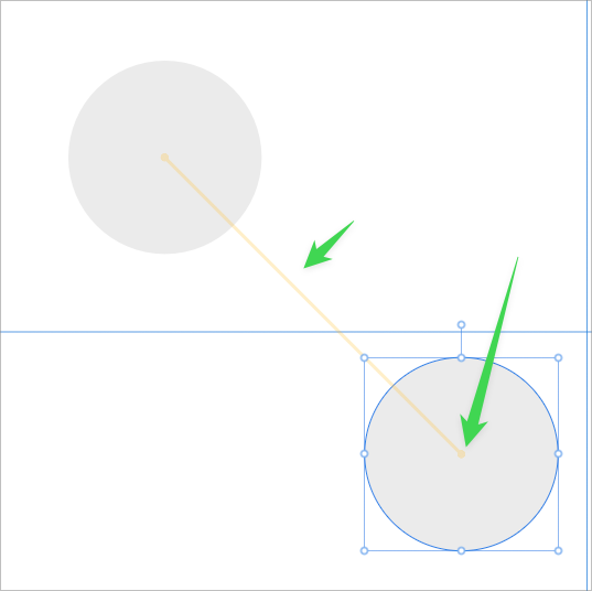
      I was wondering if making the guide 60% opacity and adding a small circle at either end much like the way it works in Affinity Designer would help with the aesthetics and comfort of use.
      Currently when the guide appears in VS, it's bold and "harsh" compared to the feel in Affinity where it seems to not distract and fades away after the action is taken. I realized it's not so much fading away as the guide is not full opacity and feels less clunky as a result.

      I had felt this way about the guide when it was first introduced, but now with the new addition of it working with the pen tool and line tool, it could pop up a lot while snapping is on and potentially distract some from the work...

      0_1731840181111_d8f8b5e5-23ca-408e-8b4e-7c6e08dec3cf-BLD 2024-11-17 at 05.34.22.png

      🍎 macOS Sequoia 15.3, Mac mini (M1, 2020), Chip Apple M1, Memory 16 GB
      Cintiq 27QHD Display and LG Ultra HD Display

      VectorStylerV 1 Reply Last reply Reply Quote 1
      • VectorStylerV Offline
        VectorStyler @Boldline
        last edited by

        @Boldline I added this to the backlog

        1 Reply Last reply Reply Quote 1
        • First post
          Last post