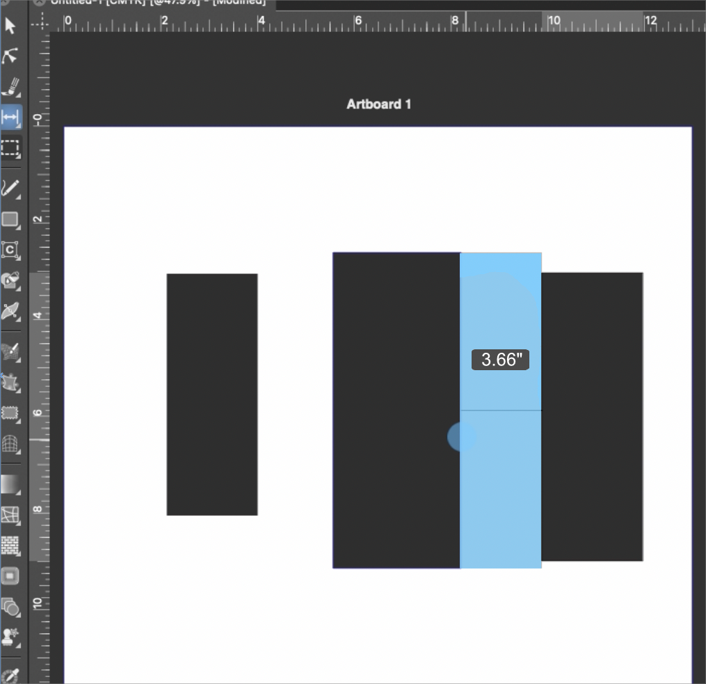
Gap Tool ideas
-
I was testing out the gap tool and really like it! I had a couple ideas for improving it and making it more useful.
First, should the color be a transparent gray or should it be the light blue transparent color used for other selections in the tools panel. I'm thinking for example of the alt/option modifier key used with the transform tool to get a temporary lasso selection.
Secondly, what about adding size information for the gaps? so as I am adjusting the gap with the low opacity blue shade fill, there's a number popping up in that gap telling me the new spacing amount?
Third, in the toolbar the hover text calls it the "adjust gap tool", but the documentation shortens it to "gap tool". Would it make more sense to have them be the same name, whichever is preferred?

-
@Boldline Preferences > Editing Options 2 > Show Editor Popups displays the moving distance.
But the gap remains the same, AFAIK.
How about dragging perpendicularly to the gap to widen or narrow the gap?
I mean when the gap is vertical, dragging horizontally moves the gap to the left or to the right, and
dragging upwards widens it and dragging downwards narrows it.(If the gap is horizontal or at an angle, dragging horizontally should widen or narrow the gap).
If this gets implemented, displaying the gap width would be even more useful.
-
@Boldline said in Gap Tool ideas:
First, should the color be a transparent gray or should it be the light blue transparent color used for other selections in the tools panel.
Maybe something completely transparent in the middle, like this?

-
@b77 oh true I could turn on the editor popups. just tested that out. Right now the part of me that loves some of the popups but not all of them would like the ability to switch on and off the specific popups I prefer, but the other side of me does not want to overcomplicate the preferences with too many more options. Sadly, I end up leaving the popups off most of the time as a result.
Right now I'm fine with dragging horizontally to widen the gap or leaving it how it currently is with the pulling it across. I'm open to hearing how that might improve the tool.
-
@b77 said in Gap Tool ideas:
Maybe something completely transparent in the middle, like this?
I don't mind that either. I was initially thinking the medium gray fill currently being used seemed too dark and also did not tie in with the other uses of somewhat transparent representation in VS.
-
@b77 said in Gap Tool ideas:
Maybe something completely transparent in the middle, like this?
I can try an opacity on the gap indicator.
-
@b77 said in Gap Tool ideas:
Preferences > Editing Options 2 > Show Editor Popups displays the moving distance.
So here is an example of where the popups being active would interfere in my work. I would turn this one off specifically and leave others on
