Remove selection info from the toolbar please - can be seen in the status bar
-
I strongly and passionately (!) recommend removing the information about the number of selected objects etc. from the context toolbar entirely. It is information and I would never look UP and at a toolbar for such information. I would always assume it would appear at the bottom somewhere.
Unfortunately it takes up a ton of space in the context toolbar and just adds detail making the toolbar less easy to navigate with the eyes. It simply doesn't belong there.
Fortunately, it is already possible to see this information, if you wish, in the status bar, where you can select different types of information. And it is the same info 1:1, so there.
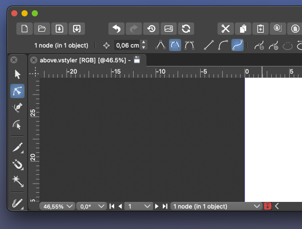
This information has disturbed my focus and navigation on the toolbar since day 1 of using VS.
")
🍏 macOS Sequoia Apple Silicon
-
@Ingolf At the risk of sounding like I'm picking a fight, I completely disagree with your point. I love having that option up there and it's the first place I look for that type of information. It's a handy place to check how many items are selected at any given time. I use the custom status bar for other things like the timer.
Perhaps in the future it can be a customized part of the menu at the top along with other options? -
@Ingolf Coming from AI, I don't mind it at all — I'm used to seeing this info there.
In any case, customizing the context panel is planned for Phase 3 of the Roadmap.
But hey, the best defaults are definitely important, and since the context panel is a point of
disagreement (you consider it too busy or not having the right buttons, IIRC), would a special thread
about the context panel be something you would participate in, with screenshots and all
the suggestions you have?I have a few improvement ideas myself, and it would be a mistake to make 10 threads about 10 parts
of the context panel, spread over 5 weeks. -
@b77 I think having dedicated threads to a certain upcoming roadmap feature is a good way to keep things organized and allow for deep discussion
-
@Ingolf I think the context toolbox must be customizable. This information is indeed redundant.
-
@VectorStyler said in Remove selection info from the toolbar please - can be seen in the status bar:
@Ingolf I think the context toolbox must be customizable. This information is indeed redundant.
I think the information is only redundant if the user only needs the item count and it's used at the top and at the bottom. It can be nice to have the option to set the bottom to different option and have both show different things that way. Maybe it would be helpful if the top one could also be customized the way that the bottom option does - or later on when customization for the contextual bar is focused on later in the roadmap, the user could have the option to add/remove those to the menu bar if he so chooses.
-
A thread would be fine.
I just think AI did this terribly wrong, non-standard also, and almost all other programs use the context bar for what it is meant to be, for settings. The more stuff there is in the interface, the less the eyes see.
I understand that customization is coming, but I continue to raise the opt-out flag. This should be an opt-in and never part of the default setting for the context toolbar.
Should it ever be part of a default then it should be if new users could be offered interface inspired presets like "Default" or "CorelDRAW" or "Illustrator" like Inkscape (though Inkskape only off keyboard shortcuts presets).
-
@Ingolf what didn't make any sense at all and that you've never explained, is that you want literally everything to be visible and readily accessible on the contextual menu bar but somehow also claim to no want it to be cluttered and then use basic vector programs as examples of this simplistic UI. Yet you ignore that these examples you give are severely lacking in tools and therefore have tons of extra room in the UI.
You demand a rarely used preference setting for the pencil tool be always available in the UI, but a tool that tells the number of items selected is a huge problem?
-
The latest version of Adobe Illustrator CC totally wastes space by communicating stuff I know:
This is not great inspiration and personally I find the information totally useless. Especially placed right there. It is a glimse from the Adobe UI past. Information about how much is selected ... takes up even more space, and I cannot think of many use cases where I desired such information and it would have been appropriate to find it in the bottom of the screen is a status bar or whatever. Seeing it non stop makes little sense.
We must remember that the phrase "It's much easier in Illustrator" is one of the rarest. It is an old and risky program to have as a source of inspiration. Vectorstyler is probably the only program I've seen that has taken so much inspiration from there, and while it's good for migration, it's bad if you use the bad ideas too.
-
@Boldline said in Remove selection info from the toolbar please - can be seen in the status bar:
these examples you give are severely lacking in tools and therefore have tons of extra room in the UI.
How much extra room they leave depends largely on the size of your monitor.
On my monitor, the indicator that @Ingolf is referring to in this thread is not at all an issue, because I have lots of room left on the context toolbar even with it in place. I would imagine that on a laptop with a smaller display, it would cause some buttons to fall of the right end of the toolbar.
You demand a rarely used preference setting for the pencil tool be always available in the UI,
How rarely a given setting for a tool is used will depend on the user and the workflow. This is one of the reasons that customization will be helpful. Only the rare user is likely to be 100% happy with the defaults, and it is practically guaranteed that there will be users who will not like them, no matter what those defaults are. @Ingolf will evidently be one of those, but once customization is available, that becomes less of a problem.
but a tool that tells the number of items selected is a huge problem?
Technically, that is an indicator rather than a tool, but if customization is made available they could be thought of as equivalent at some level.
-
I still haven't heard about anyone using it actively.
🍏 macOS Sequoia Apple Silicon
-
@fde101 I was referring to the simpler programs like Xara and Designer, etc. having more room in their UI because they lack the tools that could potentially fill up the space. I agree space can be limited in the VS UI, especially on a laptop. One thing that has been discussed was grouping the boolean tools for example, into a dropdown like the alignment panel is now.
I agree customization will make most of these conversations a moot point. @Ingolf 's method of workflow is more unique than some because of his focus on buttons to press with the mouse as opposed to keyboard shortcuts. That workflow is going to be diametrically opposed to the power user workflow with keyboard shortcuts and streamlined tools in the menu bars.
If one could make the case that the selection indicator is not needed in the contextual menu bar, then these options (#1 in screenshot below) could be under the transform tool where one might expect to find them and the options in circle #2 could be optional as well. This would clear out a lot of space.
When customization does come to the contextual menu bar, putting the tools in circle #1 back under the transform tool would almost seem necessary so that people could have the option.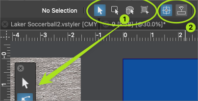
We can all agree no one is going to keep the default arrangement and that different levels of customization will occur. To me it does not make a lot of sense to start removing things now when a major update is scheduled for it in phase 3. Perhaps something more like @b77 proposed where the ideas are discussed between now and then
-
@Ingolf said in Remove selection info from the toolbar please - can be seen in the status bar:
I still haven't heard about anyone using it actively.
I mentioned before that I often use the indicator in the upper left for telling me about the selection and use the customizable one at the bottom of the UI to keep track of timers.
Just because I use it this way does not mean I think everyone does, or that the indicator bar should remain there or not in the long term. It's not about copying Illustrator or not (I didn't know Illustrator has this option as I only ever used up through CS6)
The indicator bar at the top, in its current form is not customizable like the one at the bottom and I would love to see it be given that flexibility and allow it to be something users can add more of or less of in the future as they customize the UI.
As I mentioned before, there are some sets of buttons in the UI that can be consolidated already - like the boolean operations and bring to front/back, etc... and the draw on top/below, etc.. those would free up space in large amounts. Even the indicator bar could be reduced in width it appears... there's a large gap on the left side, at least in my case. -
@Ingolf said in Remove selection info from the toolbar please - can be seen in the status bar:
I still haven't heard about anyone using it actively.
I for one find it a useful indicator and probably most beginners in vector graphics will find it even more so, and also former AI users.
Btw, at one point you suggested a dynamic line of text that shows the options and shortcuts for the current tool.
I agree, that would be nice to have, but will probably be placed at the bottom of the window.
(I suggested these dynamic tips to be displayed like a tooltip near the tool cursor, but nobody liked my idea…)So… should the app have two lines of text at the bottom — one with the dynamic tips and one with this object properties readout?
MacBook Pro (Intel) running Monterey 12.6.4
-
@VectorStyler said in Remove selection info from the toolbar please - can be seen in the status bar:
@Ingolf I think the context toolbox must be customizable. This information is indeed redundant.
It's redundant because in the default configuration the app displays the same info in the info bar/menu at the bottom.
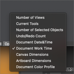
If it would display something else by default it wouldn't be redundant. Maybe 'Current Tools'?
-
@b77 I had mentioned the same thought earlier in the thread - that it's only redundant if the information is the same as below. if the top one could also be made customizable, that would help avoid redundancy. in the long term it could be an option that could be removed by the user if they desired to do so when UI customization arrives down the road.
-
@Boldline said in Remove selection info from the toolbar please - can be seen in the status bar:
if the top one could also be made customizable, that would help avoid redundancy.
Oh no, I hope this doesn't mean a new dropmenu there… it would make the context panel look busier than Ingolf or me would like.
Anyway… I'll try to prepare some mockups for a separate thread dedicated to the context panel — simplifying it visually and improving it.
I hope all of you contribute with ideas and opinions. -
@b77 I know you jest, but making the top info bar a dropdown does not take up any more room and solves the issue of redundancy
I'm interested in seeing your thread with ideas on how to improve the UI. Hopefully you'll be be offering great ways to streamline it without also asking for everything under the sun to be made available there at the same time!
🍎 macOS Tahoe 26.2, Mac mini (M1, 2020), Chip Apple M1, Memory 16 GB
Cintiq 27QHD Display and LG Ultra HD Display -
If we removed it now by MAGIC globally on installed computers, who would miss it? Who would report it missing? Why doesn't anyone else provide this info in their toolbars?
It was put there because Adobe has it there, fine, but does ANYONE use it?
🍏 macOS Sequoia Apple Silicon
-