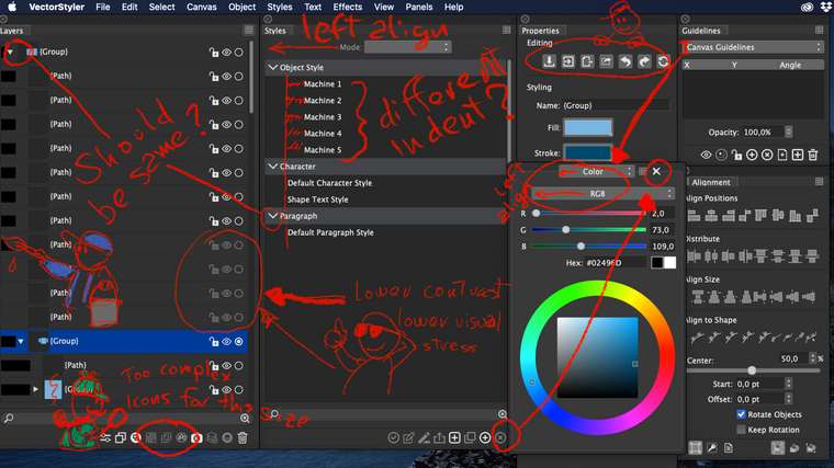
UI icons and some UX... :-)

-
Well... it's a beta and sure you are working on it. But maybe will help you whatever thought coming from the outer world. The icons needs a redesign and design consistence. Your app is very powerful in style managing and configurations... so maybe you will need to reinvent some previously inexistent icons.
Here some quick notes I've taken after five minutes looking for clues to get the right tools. Hope will help you in your hard work
")
-
Yes, will fix these (and more)
-
the new build should fix most of these issues.
-
I agree with all of exouchez's suggestions, with one caveat: The "lower contrast , lower visual stress" is a good point, but please, oh please, don't make the contrast any lower than it is now.
I've dealt with too many apps that use, e.g., light grey, 6 point type on a white background that's impossible to decipher without a microscope. Your app is turning out great; please don't make me want to throw my computer across the room.
-
will try