Layer panel customization after 1.2 changes
-
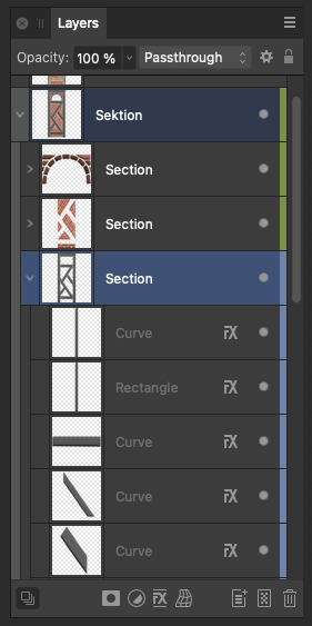
I'm sorry to say this, but the layers panel, which now appears to be a direct copy of Illustrator's, is just as cumbersome to use in my workflow as Illustrator itself. I am now forced to look at all sorts of noise before I can navigate visually through the content in the layers.
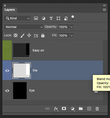
For some reason, Illustrator's layers panel is a hellish mess, while Photoshop CC 2024 is wonderfully user-friendly and visually clean.
Since the layers panel is alpha and omega in any workflow, and we all work differently, with some expecting an Illustrator copy and others having fled from Illustrator, screaming, it could be one of the more wonderful customizations to either be able to configure the layers panel, or easier to implement, to be able to choose between three models, each inspired by major players in the market, such as Adobe and Affinity.
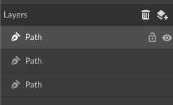
Note that Photoshop displays the color combined with the eye icon, and that Corel Vector simply shows only the lock and selection icons when the pointer hovers over the layer. So much visual calmness. There are many ways to simplify, but they are not as easy as making things overly complicated.
If, like me, you mostly navigate by names and thumbnails and very rarely hide or lock layers, and on top of that, you work with many layers and objects, then it's a dreadful model to have the same useless icon on the left side of every single layer/object, hundreds of rows down.


-
@Ingolf I added this to the backlog.
To understand better the issue: was the VS 1.1 layers panel better? and is the issue the location of the show / lock icons at the front of the line.
These might be easy to fix with some customization.
-
@VectorStyler said in Layer panel customization after 1.2 changes:
@Ingolf I added this to the backlog.
To understand better the issue: was the VS 1.1 layers panel better? and is the issue the location of the show / lock icons at the front of the line.
These might be easy to fix with some customization.Thank you, my friend. Yes, that's one way to put it. You could say that a supremely customizable program like Vectorstyler has the potential to embrace users of other programs more empathetically and practically. If you're coming from Illustrator with many years of experience, you might love the current layer setup. You might also come from Illustrator and be utterly tired of it, as I am. Or, you could be coming from Affinity because you missed features, but then be overwhelmed by the complexity in Vectorstyler.
But yes, I need to focus on what I use 98% of my time on: the layer thumbnail, layer name, and layer structure. I rarely change color, I seldom hide layers, and I occasionally lock layers, but generally not often.
In other words, I just don't need these to be so prominently placed FIRST. And therefore, Illustrator stands alone with them at the start, and even Photoshop doesn't do it either.
The symbols for lock and view/hide are unnecessarily large compared to the text; they could definitely be smaller, provided the clickable area to activate them remains the same as if they were large.
I think that a left-right customization per column of symbols, etc., would be easiest to implement if everything is to be optional. Personally, I could imagine having the view icon on the left and the rest on the right. Or the select icon farthest to the left, because it's fundamental, and hide/view on the right, because it's secondary.
Actually, I would really like to hide the color; I've simply stopped using colors for layers in all programs. Structure and actually readable thumbnails took over as software quality progressed.
Anyway, my real complaint was that the layers panel mirrored Illustrator exactly, and I hear few praising Illustrator's interface, on the contrary, switching to other programs' interfaces is a relief, so it's not harmless inspiration.
-
@Ingolf I added this to the backlog and will try to find a workable solution soon.
-
@VectorStyler said in Layer panel customization after 1.2 changes:
@Ingolf I added this to the backlog and will try to find a workable solution soon.
As always with me, no rush!

-
@Ingolf said in Layer panel customization after 1.2 changes:
Actually, I would really like to hide the color; I've simply stopped using colors for layers in all programs. Structure and actually readable thumbnails took over as software quality progressed.
On the opposite side of the topic, I use color layer all the time as I design. It helps a lot that each layer is color-coded and that making a selection uses the layer color.
I also hide layers and lock them and unlock them all the time as I work. VS for me requires I use numerous layers to be sure everything is accessible and can be easily locked and unlocked in order to reach and edit other parts of the design.
-
In any case, I find the color coding too wide, Illustrator has very nice narrow stripes.